What is Laney P Chart?
A Laney P’ Chart (pronounced "P-prime chart") is an enhanced version of the standard P chart, designed to handle a common problem called overdispersion — where the actual variation in your data is far greater than what the standard P chart expects based on the binomial distribution alone.
In a standard P chart, control limits are calculated purely from the proportion formula. When subgroup sizes are very large, even tiny real-world fluctuations cause the chart to generate an excessive number of false alarms — making it appear that the process is constantly out of control when it is actually behaving normally. The Laney P’ chart corrects this by incorporating an additional measure of between-subgroup variability into the control limit calculation.
When to use Laney P Chart?
- Use when monitoring the proportion or percentage of defective items in a process (e.g. % of failed units, % of incomplete forms).
- Use when subgroup sizes are large or vary significantly — this is when standard P charts most commonly produce false signals.
- Use when a standard P chart shows too many points outside control limits even though no real process change has occurred.
- Use when your data shows overdispersion — meaning the variation between subgroups is greater than what the binomial model predicts.
- If subgroup sizes are small and consistent, a standard P chart may be sufficient.
Understanding Overdispersion
Overdispersion occurs when real-world factors — such as different operators, machines, batches, or time-of-day effects — introduce extra variation between subgroups beyond what pure chance would predict. A standard P chart ignores this extra variation, leading to control limits that are too tight and too many false alarms.
The Laney P’ chart estimates this additional between-subgroup variation using a sigma-Z adjustment factor. If sigma-Z is close to 1, the standard P chart is adequate. If sigma-Z is significantly greater than 1, the Laney P’ chart is strongly recommended.
Guidelines for correct usage of Laney P Chart
- Data must represent counts of defective items out of a total inspected — for example, 12 defective parts out of 500 inspected.
- Each observation must be independent — the outcome of one item should not influence another.
- Check the sigma-Z value in the output — a value near 1.0 means the standard P chart is fine; a value well above 1.0 confirms you need the Laney P’ chart.
- Collect data from at least 25 subgroups before establishing control limits.
- Investigate assignable causes of overdispersion (e.g. shift differences, supplier batches) — the chart highlights instability but root cause investigation is always required.
Alternatives: When not to use Laney P Chart
-
- If subgroup sizes are small and consistent with no evidence of overdispersion, use a standard P Chart instead — it is simpler and equally valid under those conditions.
- If the sigma-Z value is close to 1.0, overdispersion is not present and a standard P Chart is sufficient — the Laney P' chart is unnecessary.
- If you are tracking the number of defective items rather than the proportion, and subgroup sizes are fixed, use an NP Chart instead.
- If a single item can have multiple defects and you are counting defects per unit rather than whether an item passed or failed, use Laney U' Chart instead.
- If the inspection area is fixed and identical for every subgroup, use a C Chart instead — it is designed for constant opportunity size.
- If your response variable is continuous measured data (e.g. dimensions, weight, temperature), use I-MR, Xbar-R, or Xbar-S charts instead.
- If the process involves short runs or mixed part types, use a Z-MR Chart instead, which handles variable targets and standards across different products.
- If you need to detect small, gradual shifts in proportion over time rather than sudden changes, consider CUSUM or EWMA variants for attribute data instead.
Example of Laney P Chart?
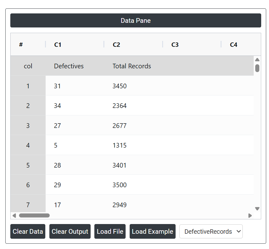
A manager at a mid-sized hospital aims to ensure that errors in the hospital's medical records are consistently under control. To monitor this, the manager tracks the total number of medical records processed daily and counts those that are incomplete or contain inaccuracies (defective records). Given the high volume of records—averaging over 2,500 per day—and significant overdispersion in the data, the manager opts to use a Laney P' chart rather than a traditional P chart. This choice helps account for the overdispersion and provides a more reliable way to monitor and maintain quality in patient record management. The following data was collected:
- Gathered the necessary data.
2. Now analyses the data with the help of https://qtools.zometric.com/ or https://intelliqs.zometric.com/.
3. To find Laney P Chart choose https://intelliqs.zometric.com/> Statistical module> Control Chart> Laney P Chart.
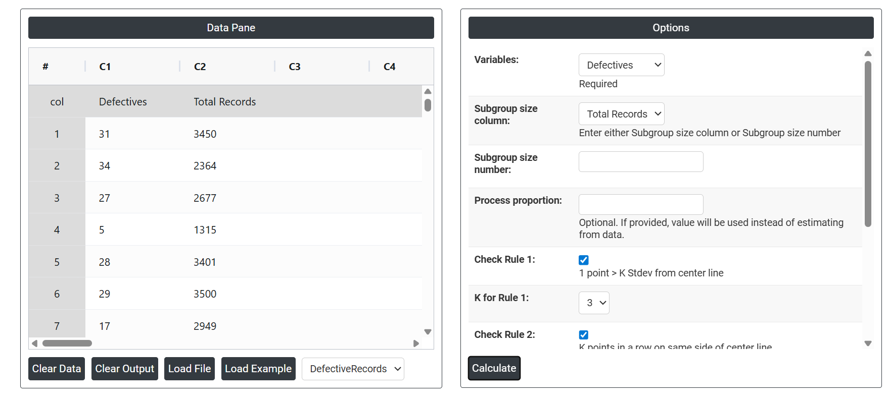
4. Inside the tool, feeds the data along with other inputs as follows:
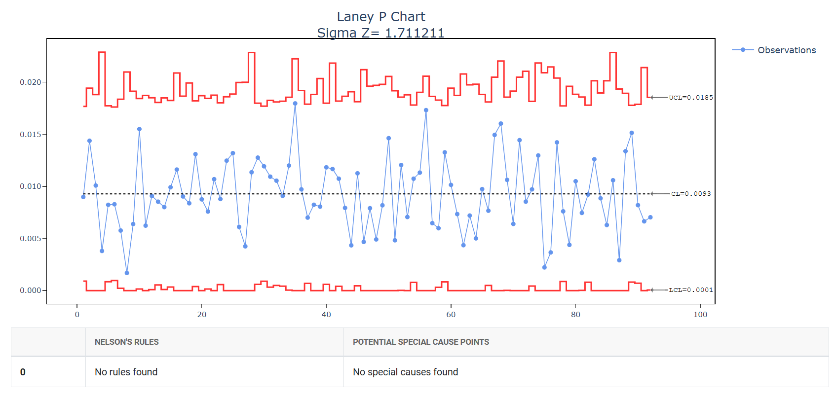
5. After using the above mentioned tool, fetches the output as follows:
How to generate Laney P Chart?
The guide is as follows:
- Login in to QTools account with the help of https://qtools.zometric.com/ or https://intelliqs.zometric.com/
- On the home page, choose Statistical Tool> Control Chart >Laney P Chart.
- Next, update the data manually or can completely copy (Ctrl+C) the data from excel sheet and paste (Ctrl+V) it here.
- Next, you need to select the desired Check Rules.
- Finally, click on calculate at the bottom of the page and you will get desired results.
On the dashboard of Laney P Chart, the window is separated into two parts.
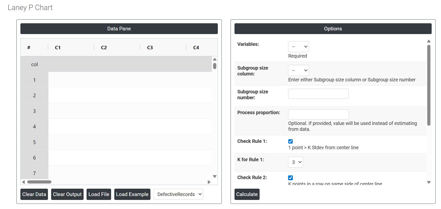
On the left part, Data Pane is present. Data can be fed manually or the one can completely copy (Ctrl+C) the data from excel sheet and paste (Ctrl+V) it here.
Load example: Sample data will be loaded.
Load File: It is used to directly load the excel data.
On the right part, there are many options present as follows:
- Variables: Select the column that contains the count of defective items found in each subgroup — for example, the number of rejected parts, failed units, or incomplete records per inspection lot. This is the primary data the chart uses to calculate the proportion defective for each plotted point.
- Subgroup Size Column: Select the column that contains the total number of items inspected in each subgroup. This is required because the proportion defective is calculated by dividing the defective count by the total inspected. Use this option when the number of items inspected varies from subgroup to subgroup — for example, 450 inspected in one lot and 620 in the next. Either this field or the Subgroup Size Number must be provided, not both.
- Subgroup Size Number: Enter a single fixed number if the total items inspected is the same for every subgroup. For example, if exactly 500 units are always inspected per lot, enter 500 here. This is simpler than using a column when inspection size never changes. If subgroup sizes vary, use the Subgroup Size Column instead.
- Process proportion: If process proportion is provided, this value is considered to be the centerline. If not, Zometric Q-Tools calculates the centerline from the data provided.
- Check Rule 1: 1 point > K Stdev from center line: Test 1 is essential for identifying subgroups that significantly deviate from others, making it a universally recognized tool for detecting out-of-control situations. To increase sensitivity and detect smaller shifts in the process, Test 2 can be used in conjunction with Test 1, enhancing the effectiveness of control charts.
- Check Rule 2: K points in a row on same side of center line: Test 2 detects changes in process centering or variation. When monitoring for small shifts in the process, Test 2 can be used in conjunction with Test 1 to enhance the sensitivity of control charts.
- Check Rule 3: K points in a row, all increasing or all decreasing: Test 3 is designed to identify trends within a process. This test specifically looks for an extended sequence of consecutive data points that consistently increase or decrease in value, signaling a potential underlying trend in the process behavior.
- Check Rule 4: K points in a row, alternating up and down:Test 4 is designed to identify systematic variations within a process. Ideally, the pattern of variation in a process should be random. However, if a point fails Test 4, it may indicate that the variation is not random but instead follows a predictable pattern.