What is Poisson Goodness Of Fit ?
When to use Poisson Goodness Of Fit?
- Use when your data consists of counts of events (not measurements) — such as defects per unit, errors per document, or failures per machine per month.
- Use when you want to validate the assumption of a Poisson process before applying C charts, U charts, or Poisson regression.
- Use when events are rare relative to the opportunity size — the Poisson distribution is appropriate when the probability of a single event is low but the number of opportunities is large.
- Use to diagnose overdispersion — if the data significantly fails the Poisson fit, the variance exceeds the mean, suggesting additional sources of variation that a standard C or U chart would miss.
Guidelines for correct usage of Poisson Goodness Of Fit
- Events must be independent — the occurrence of one event must not influence the likelihood of the next.
- The average rate of occurrence must be constant across all observation periods — if the rate changes over time, the Poisson model is not appropriate.
- Ensure expected frequencies in each count category are at least 1 to 5 — combine low-count categories if needed for a reliable test.
- A p-value below 0.05 indicates the data does not fit the Poisson distribution — investigate whether overdispersion, clustering, or changing rates are responsible.
Alternatives: When not to use Poisson Goodness Of Fit
- If count data fails the Poisson fit due to overdispersion, use Negative Binomial distribution or Laney U' / Laney P' charts
- If the response is categorical rather than a count, use Chi-Square Goodness of Fit
- If the response is continuous, use Normality Test or Individual Distribution Identification
- If events are not rare or the event rate is high, the Poisson assumption may not hold — consider Binomial distribution testing
Example of Poisson Goodness Of Fit?
A quality engineer wants to know whether the defects per mobile from a Poisson distribution. The engineer randomly selects 300 mobiles and records the number of defects per mobile. The test in following steps:
- Gathered the necessary data.
- Now analyses the data with the help of https://qtools.zometric.com/ or https://intelliqs.zometric.com/.
- To find Poisson Goodness Of Fit choose https://intelliqs.zometric.com/> Statistical module> Hypothesis Test> Poisson Goodness Of Fit.
- Inside the tool, feeds the data along with other inputs as follows:
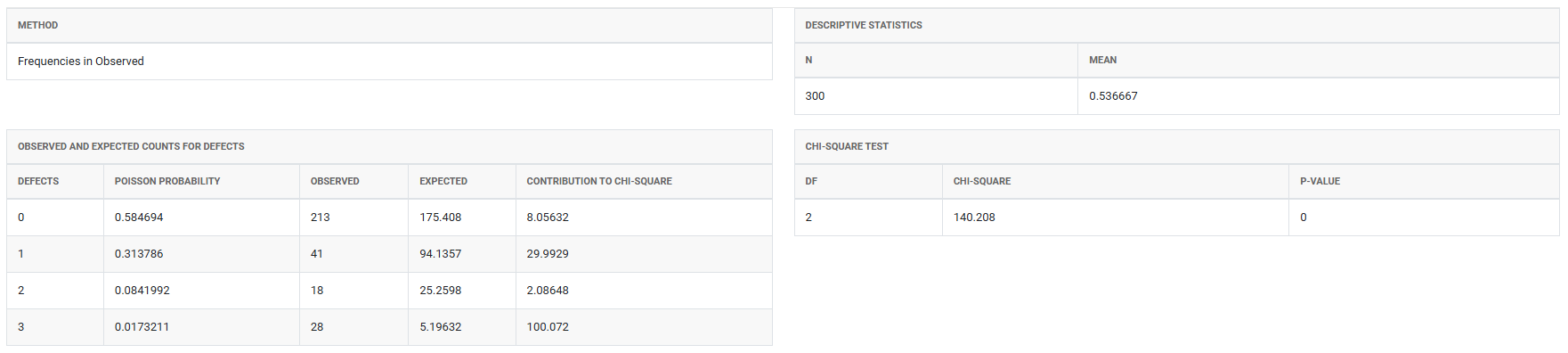
5. After using the above mentioned tool, fetches the output as follows:
How to do Poisson Goodness Of Fit
The guide is as follows:
- Login in to QTools account with the help of https://qtools.zometric.com/ or https://intelliqs.zometric.com/
- On the home page, choose Statistical Tool> Hypothesis Test >Poisson Goodness Of Fit .
- Next, update the data manually or can completely copy (Ctrl+C) the data from excel sheet and paste (Ctrl+V) it here.
- Fill the required options.
- Finally, click on calculate at the bottom of the page and you will get desired results.
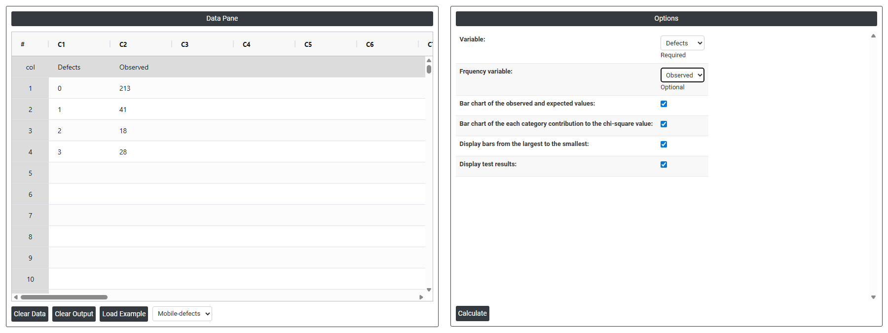
On the dashboard of Poisson Goodness Of Fit, the window is separated into two parts.
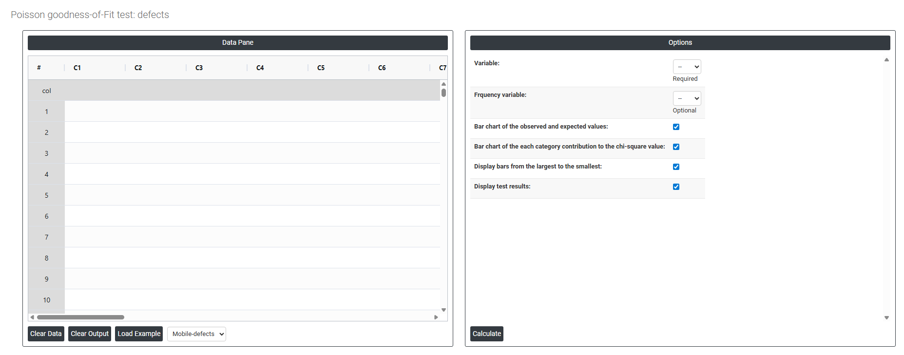
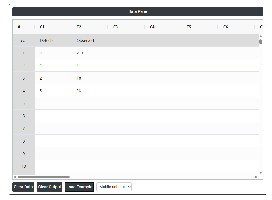
On the left part, Data Pane is present. In the Data Pane, each row makes one subgroup. Data can be fed manually or the one can completely copy (Ctrl+C) the data from excel sheet and paste (Ctrl+V) it here.
Load example: Sample data will be loaded.
Load File: It is used to directly load the excel data.
On the right part, there are many options present as follows:
- Variable Select the column containing the count data you want to test — for example, the number of defects per unit, errors per document, or failures per machine per inspection period. Each value in this column represents a count of how many times an event occurred within a defined opportunity or time interval. This is the primary input the test uses to evaluate whether the data follows a Poisson distribution. This field is required.
- Frequency Variable Select the column containing the frequency of each count value — that is, how many times each specific count appeared in the dataset. This field is optional and is used when your data is already summarised in a frequency table rather than listed as individual observations.
- For example, if your data shows that a count of 0 defects occurred 15 times, a count of 1 defect occurred 22 times, and a count of 2 defects occurred 8 times — you would enter the count values (0, 1, 2) in the Variable column and the corresponding frequencies (15, 22, 8) in the Frequency Variable column. If your data is in raw form with one observation per row, leave this field empty.
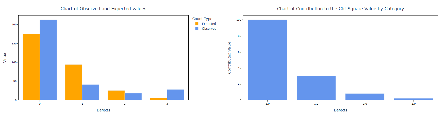
- Bar Chart of Observed and Expected Values When enabled, displays a side-by-side bar chart comparing the actual observed counts against the counts expected under a Poisson distribution. This is the most informative visual output — it immediately shows whether the shape of your observed data matches the theoretical Poisson curve or whether it deviates significantly, and in which direction (more spread out, more concentrated, or skewed differently than expected).
- Bar Chart of Each Category Contribution to the Chi-Square Value When enabled, displays a bar chart showing how much each individual count value contributes to the overall chi-square test statistic. The tallest bars represent the count values that deviate most from Poisson expectations — helping you identify exactly where the distribution breaks down rather than simply knowing that the overall fit is poor. This is particularly useful for diagnosing whether overdispersion, under dispersion, or a specific unusual count is driving the result.
- Display Bars from Largest to Smallest When enabled, sorts the bars in the contribution chart in descending order from the largest contributor to the smallest. This makes it easier to immediately identify which count values are most responsible for any departure from the Poisson distribution — focusing attention on the most significant deviations first rather than reading bars in sequential count order.
- Display Test Results When enabled, shows the full statistical test output — including the chi-square statistic, degrees of freedom, estimated Poisson mean (lambda), and p-value — directly alongside the chart. This allows you to view both the visual and numerical results together in one place, making it easier to interpret the overall conclusion without switching between separate output panels.