What is Bubble Plot?
A Bubble Plot is an enhanced scatterplot that displays the relationship between three continuous variables simultaneously on a two-dimensional chart. The horizontal (X) axis represents the first variable, the vertical (Y) axis represents the second, and the size of each plotted bubble represents the magnitude of the third variable. This makes the Bubble Plot a uniquely powerful tool for visualising multivariate data without the complexity of a three-dimensional chart.
Optionally, a fourth variable can be encoded through the colour or label of each bubble, making it possible to display four dimensions of information in a single clear visual ideal for identifying patterns, clusters, and outliers across complex, multi-factor datasets.
When to use Bubble Plot?
- Use when you want to explore relationships between three continuous variables simultaneously in a single visual.
- Use in comparative analysis for example, comparing products, regions, or process settings across multiple performance dimensions at once.
- Use when bubble size carries meaningful quantitative information such as volume, frequency, cost, or risk that adds important context to the X-Y relationship.
- Use for management and executive presentations where a visually compelling multi-dimensional comparison is needed without complex statistical output.
Guidelines for correct usage of Bubble Plot
- Ensure all three variables are continuous and measured on a meaningful numerical scale bubble plots are not appropriate for categorical or ordinal data.
- Scale bubble sizes proportionally and clearly bubbles too similar in size make the third variable impossible to distinguish visually.
- Always include a size legend on the chart so readers can correctly interpret what each bubble size represents without it, the third variable is meaningless to the audience.
- Avoid overplotting when bubbles overlap heavily, adjust transparency or split the data into separate panels by a grouping variable.
- Do not use a bubble plot when the third variable has very little range or variation all bubbles will appear nearly the same size and a standard scatterplot is more appropriate.
- Always label axes and provide units for all three variables unlabelled bubble plots are extremely difficult to interpret correctly.
Alternatives: When not to use Bubble Plot
| Situation | Use Instead |
| Only two variables need to be compared | Scatterplot |
| Need to detect trends or patterns over time | Run Chart or Time Series Plot |
| Need formal statistical relationship analysis | Correlation Analysis or Regression Model |
Example of Bubble Plot
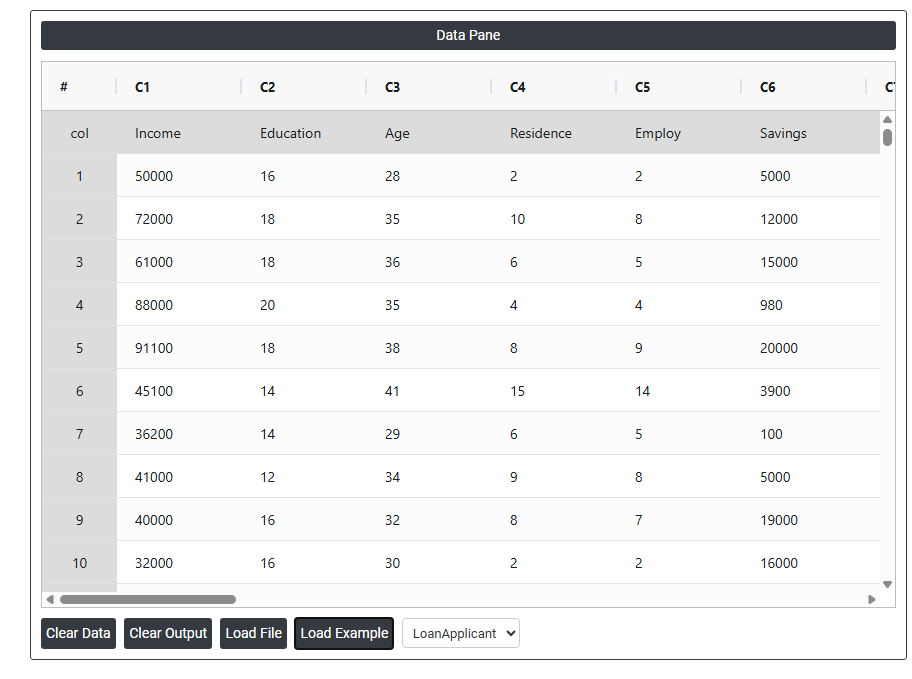
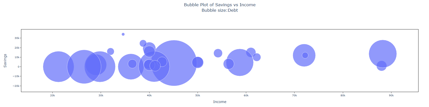
A bank requires eight key details from loan applicants: income, education level, age, duration at current residence, length of time with current employer, savings, debt, and the number of credit cards. To analyze and categorize this data effectively, a bank administrator gathers this information from 30 loan applicants. To visualize the financial profile of each applicant, the administrator creates a bubble plot comparing their income, savings, and credit card debt. The following steps:
- Gathered the necessary data.
- Now analyses the data with the help of https://qtools.zometric.com/ or https://intelliqs.zometric.com/.
- To find Bubble Plot choose https://intelliqs.zometric.com/> Statistical module> Graphical analysis > Bubble Plot.
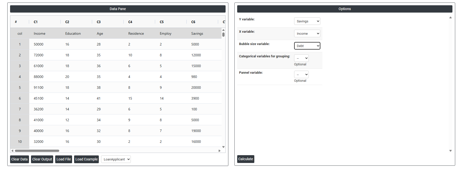
- Inside the tool, feed the data along with other inputs as follows:
6. After using the above-mentioned tool, fetches the output as follows:
How to do Bubble Plot
The guide is as follows:
- Login in to QTools account with the help of https://qtools.zometric.com/ or https://intelliqs.zometric.com/
- On the home page, choose Statistical Tool> Graphical analysis >Bubble Plot.
- Next, update the data manually or can completely copy (Ctrl+C) the data from excel sheet or paste (Ctrl+V) it or else there is say option Load Example where the example data will be loaded.
- Next, you need to fill the required options.
- Finally, click on calculate at the bottom of the page and you will get desired results.
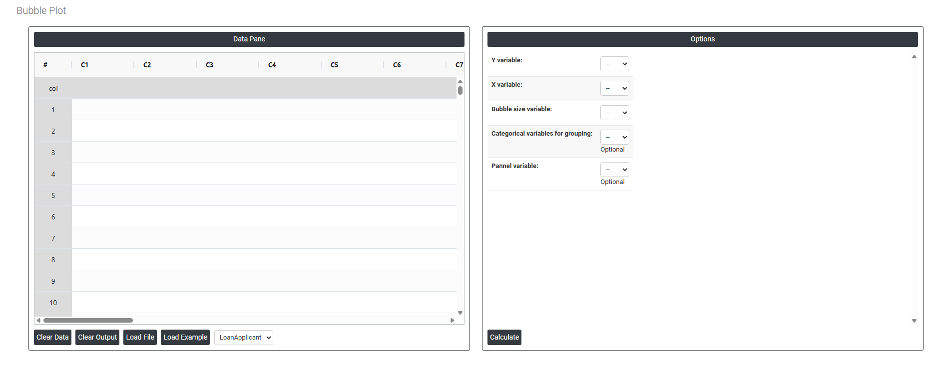
On the dashboard of Bubble Plot, the window is separated into two parts.
On the left part, Data Pane is present. In the Data Pane, each row makes one subgroup. Data can be fed manually or the one can completely copy (Ctrl+C) the data from excel sheet and paste (Ctrl+V) it here.
Load example: Sample data will be loaded.
Load File: It is used to directly load the excel data.
On the right part, we just need to give:
Y Variable The measurement plotted on the vertical axis (up and down). This is your outcome or the variable you want to track against something else. For example, selecting Savings as Y would place Income values along the vertical axis. Every bubble's vertical position is determined by this variable.
X Variable The measurement plotted on the horizontal axis (left and right). This is the variable you believe may influence or relate to the Y variable. For example, selecting Income as X would spread the bubbles left to right based on education level. The relationship between X and Y is what the chart helps you explore.
Bubble Size Variable Controls how large or small each bubble is drawn on the chart. A larger bubble means a higher value for this variable; a smaller bubble means a lower value. For example, if you select Debt as the bubble size variable, people with higher debt appear as larger bubbles, adding a third layer of information to the chart without adding a new axis.
Categorical Variable for Grouping An optional variable used to color or distinguish the bubbles by category. Each unique category gets its own color, making it easy to compare groups within the same chart.
Panel Variable Splits the chart into separate side-by-side panels, one for each category of the chosen variable. Instead of overlapping all groups in one chart, each group gets its own mini chart displayed alongside the others.