What is Contour Plot?
A Contour Plot is a two-dimensional graphical representation that displays the relationship between two continuous input variables (X and Y axes) and one continuous output variable (Z) visualised through a series of lines or filled regions called contours. Each contour line connects all combinations of the two input variables that produce the same predicted response value, creating a topographical map of the response surface laid flat on a plane.
Think of it like a weather map showing elevation instead of altitude, the contours show how a response such as yield, strength, or defect rate changes as two factors are varied simultaneously. Darker or lighter shading (in filled contour plots) indicates regions of higher or lower response values, making it immediately obvious where the optimal operating conditions lie and how sensitive the response is to changes in each factor.
| Plot Element | Description |
| X-axis | One continuous predictor variable (explanatory factor). |
| Y-axis | A second continuous predictor variable (explanatory factor). |
| Z variable | The response (outcome) variable whose values are encoded as contour levels. |
| Contour lines | Curves connecting all X-Y combinations that yield the same Z value. |
| Contour bands | Colored regions between lines representing ranges of Z values. |
| Mesh | The internal interpolation grid Minitab uses to estimate Z values between data points. |
When to use Contour Plot?
- You have one numeric response variable (Z) and exactly two continuous predictor variables (X and Y) stored in separate worksheet columns.
- You want a quick, model-free visualization of how the response changes across the combined space of two factors — without having to fit a regression or DOE model first.
- You need to locate the combinations of X and Y that maximize, minimize, or hit a target value of Z.
- You are conducting exploratory data analysis to understand interactions or curved relationships between two factors and a response before committing to formal modeling.
- You want to compare multiple response variables side-by-side by entering more than one Z variable; Minitab generates a separate contour graph for each.
- You are communicating process insights to stakeholders and need an intuitive "map" of the response surface.
- You are working in quality improvement, process optimization, or product development and need to identify operating windows that satisfy specifications.
- Your data spans a two-dimensional factor space and you want to visualize regions of risk or opportunity without building a full predictive model.
Guidelines for correct usage of Contour Plot
- Ensure X and Y values are evenly spaced to form a regular grid for better contour accuracy.
- Z represents the response variable, while X and Y are the input (explanatory) variables.
- If X and Y are not evenly spaced, interpolation is used, which may reduce accuracy if data is sparse.
- Use randomly collected data to avoid bias and ensure results represent the population.
- Make sure the data covers the full range of X and Y to avoid incomplete or misleading contours.
- Well-structured and distributed data improves the reliability and interpretation of the contour plot.
Alternatives: When not to use Contour Plot
- If you need to visualize the response surface in three dimensions simultaneously, use a Surface Plot instead it displays the same information as a contour plot but rendered as a 3D landscape, which can be easier to interpret for some audiences.
- If you have only one continuous predictor, use a Fitted Line Plot or Regression Plot instead a contour plot requires two input axes and is meaningless with a single factor.
- If the response variable is categorical (pass/fail, defect type), use a Binary Logistic or Nominal Logistic model plot instead contour plots are designed for continuous responses only.
- If you want to show actual raw data over time rather than a modelled response surface, use a Time Series Plot or Scatter Plot instead.
- If your goal is to compare distributions across groups rather than map a response surface, use Boxplots or Individual Value Plots instead.
- If the fitted model has poor R-squared values or fails residual checks, do not rely on the contour plot for decision-making fix the model first by collecting more data, transforming the response, or including missing terms before drawing conclusions from the surface.
Example of Contour Plot
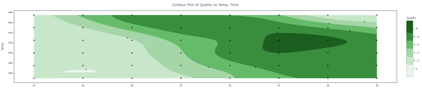
A food scientist is conducting an experiment to determine the most effective combination of heating time and temperature for a frozen meal. Multiple samples are prepared under varying conditions, and each sample is assessed for overall quality by a panel of trained evaluators. The results are then analyzed using a contour plot, which helps visualize how the quality response changes across different time–temperature combinations and supports identification of the optimal processing conditions. The following steps:
- Gathered the necessary data.
- Now analyses the data with the help of https://qtools.zometric.com/ or https://intelliqs.zometric.com/.
- To find Contour Plot choose https://intelliqs.zometric.com/> Statistical module> Graphical analysis > Contour Plot
- Inside the tool, feed the data along with other inputs as follows:
6. After using the above-mentioned tool, fetches the output as follows:
How to do Contour Plot
The guide is as follows:
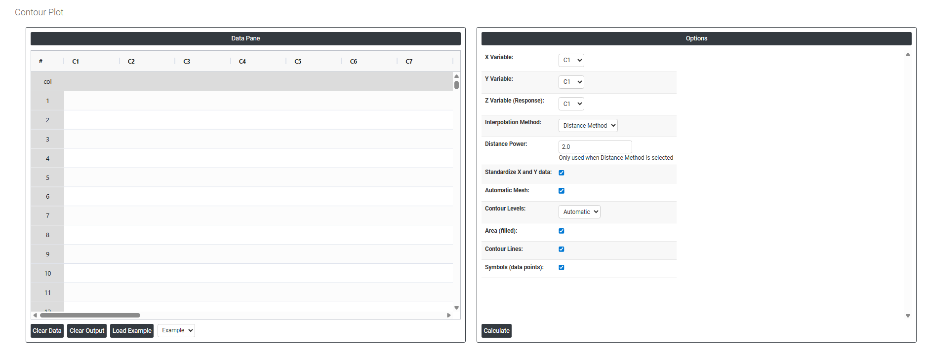
- Login in to QTools account with the help of https://qtools.zometric.com/ or https://intelliqs.zometric.com/
- On the home page, choose Statistical Tool> Graphical analysis >Contour Plot.
- Next, update the data manually or can completely copy (Ctrl+C) the data from excel sheet or paste (Ctrl+V) it or else there is say option Load Example where the example data will be loaded.
- Next, you need to fill the required options.
- Finally, click on calculate at the bottom of the page and you will get desired results.
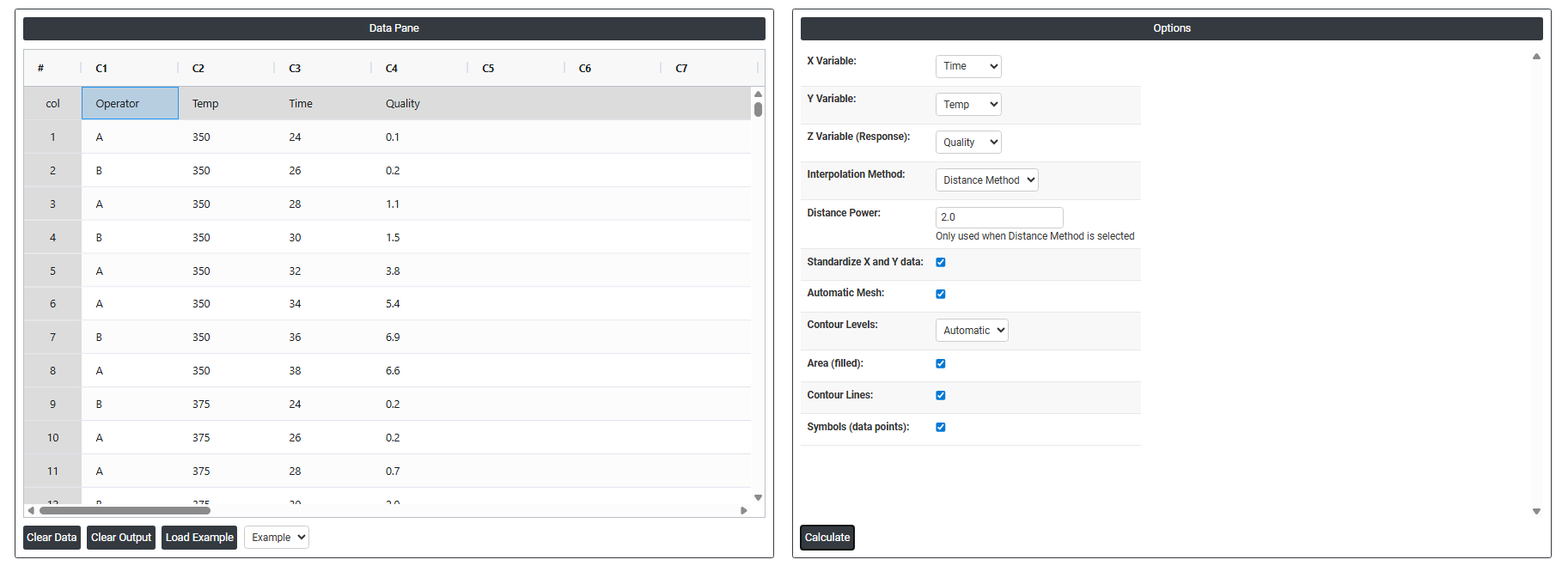
On the dashboard of Contour Plot, the window is separated into two parts.
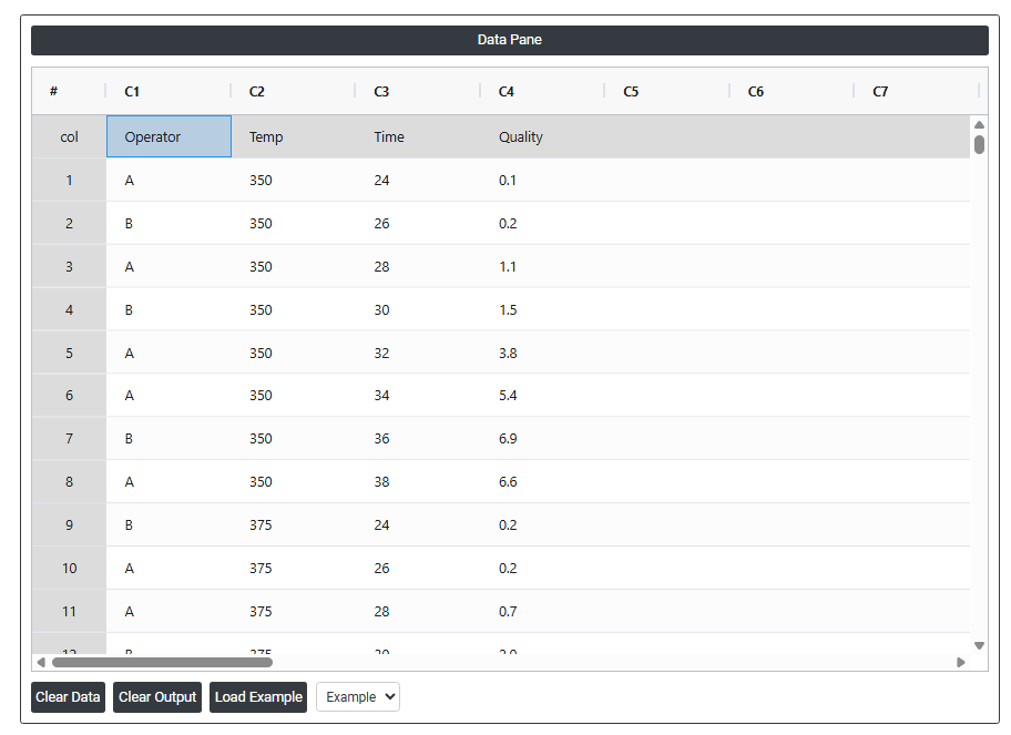
On the left part, Data Pane is present. In the Data Pane, each row makes one subgroup. Data can be fed manually or the one can completely copy (Ctrl+C) the data from excel sheet and paste (Ctrl+V) it here.
Load example: Sample data will be loaded.
On the right part, we just need to give:
- X Variable: Select the column containing the data to be plotted along the horizontal axis. This is one of the two predictor variables that defines the two-dimensional grid over which the response surface is mapped. The X variable is typically a continuous process factor such as temperature, speed, or concentration whose range determines the width of the contour plot.
- Y Variable: Select the column containing the data to be plotted along the vertical axis. This is the second predictor variable that, together with the X variable, forms the two-dimensional plane on which the response values are estimated and displayed as contour bands. The Y variable should also be continuous and represent a meaningful process input.
- Z Variable (Response): Select the column containing the response values — the output being measured at each combination of X and Y. The contour plot uses these Z values to draw lines or filled regions connecting points of equal response value across the X-Y plane, creating a map of how the response changes as both predictors vary simultaneously.
- Interpolation Method Defines the mathematical technique used to estimate response values at locations between the actual data points filling in the gaps across the X-Y grid to create a smooth contour surface. The available method is:
-
- Distance Method — estimates the response at any unmeasured location by calculating a weighted average of the surrounding observed data points, where closer points receive more influence than distant ones. This method works well for irregularly spaced data and does not require a fitted regression model.
- Distance Power Only active when the Distance Method is selected. Controls how strongly proximity influences the interpolation — specifically, how quickly the weight assigned to a neighbouring data point decreases as its distance from the estimation point increases.
-
- A higher power value makes the interpolation more local — nearby points dominate strongly and distant points are almost ignored, producing a surface that follows the data closely but may appear less smooth.
- A lower power value spreads influence more evenly across all surrounding points, producing a smoother surface that is less sensitive to individual data points but may miss sharp local features.
- The default is typically 2, which provides a good balance between local accuracy and surface smoothness for most datasets.
- Standardise X and Y Data: When checked, rescales the X and Y variables to have a mean of zero and a standard deviation of one before the interpolation is performed. This is important when the X and Y variables are measured on very different scales — for example, temperature in the hundreds and pressure in single digits. Without standardisation, the variable with the larger numeric range would dominate the distance calculations, distorting the contour shape. Standardisation ensures both variables contribute equally to the interpolated surface.
- Automatic Mesh When checked, the tool automatically determines the resolution and density of the grid used to compute and draw the contour surface selecting a mesh size appropriate for the range and spread of the data. When unchecked, you can manually specify a finer or coarser mesh to control the smoothness and detail of the contour plot.
- Contour Levels Defines how many contour lines or bands are drawn on the plot, each representing a different response value threshold. When set to Automatic, the tool selects an appropriate number of evenly spaced levels based on the range of the response data. You can override this with a specific number to increase or decrease the detail shown more levels reveal finer gradations in the response surface while fewer levels produce a cleaner, simpler chart.
- Area (Filled): When checked, fills the regions between contour lines with distinct colours or shades creating a colour-banded map where each colour represents a range of response values. Filled contours make it immediately intuitive to identify high-response and low-response regions at a glance, and are particularly effective for presentations and reports where visual impact matters.
- Contour Lines: When checked, draws the actual boundary lines between response level bands on the plot. Contour lines mark the exact locations where the response transitions from one level to the next. They can be displayed with or without filled areas using both together gives the clearest picture, combining colour-coded regions with precise boundary lines and their associated response values.
- Symbols (Data Points): When checked, overlays the actual observed data point locations on the contour plot as symbols showing exactly where real measurements were taken across the X-Y space. This is useful for assessing how well the interpolated surface is supported by actual data — regions with dense data points are more reliably estimated, while regions with sparse or no data points represent extrapolation that should be interpreted with caution.