What is Boxplot?
A box plot, or box-and-whisker plot, is a graphical representation that displays the distribution of a dataset. It consists of a box extending from the first quartile (Q1) to the third quartile (Q3), with a horizontal line indicating the sample median. The interquartile range (IQR) is the difference between Q1 and Q3. Whiskers extend from the box to the outermost data points within the range of Q1 - 1.5IQR to Q3 + 1.5IQR, while points outside this range are considered outliers and plotted individually. Box plots are non-parametric, illustrating sample variation without assuming any specific statistical distribution, and work best with sample sizes of at least 20.
When to use Boxplot?
Box plots are commonly used in data analysis and visualization for several purposes. Here are some situations where box plots are particularly useful:
- To show distributions of numeric data values, especially when you want to compare them between multiple groups.
- Comparing Distributions: When you need to compare the distribution of a dataset across different groups or categories, box plots provide a clear visual comparison of medians, variability, and outliers.
- Identifying Outliers: Box plots are effective for detecting outliers in the data. Points plotted beyond the whiskers indicate potential outliers that may require further investigation.
- Summarizing Large Datasets: For large datasets, box plots offer a concise summary of the central tendency, variability, and overall distribution without being cluttered by individual data points.
- Assessing Symmetry and Skewness: The position of the median line within the box and the length of the whiskers can help you quickly assess whether the data is symmetric or skewed.
- Comparing Multiple Data Sets: When you have multiple datasets and you want to compare their distributions side by side, box plots provide a standardized way to present this information clearly and efficiently.
- Non-parametric Data: Box plots are useful when you do not want to make assumptions about the underlying statistical distribution of the data, as they are non-parametric.
- Exploratory Data Analysis (EDA): During the initial stages of data analysis, box plots help in understanding the general characteristics of the data, such as spread, central tendency, and the presence of outliers.
Guidelines for correct usage of Boxplot
- If sample size is too small, boxplot may not show meaningful quartiles and outliers.
- For sample sizes less than 20, consider using an Individual value plot.
- Sample data should be selected randomly and used to make inferences about a population.
- Non-random data collection may lead to results that don't represent the population.
Alternatives: When not to use Boxplot
- Histograms: Histograms are better suited than boxplots when you need a more detailed view of the distribution, want to analyse specific intervals or ranges, detect multimodal patterns, deal with large datasets, or understand the skewness of the distribution.
- Scatterplot: Scatter plots are better suited than boxplots when you need to analyse the relationship between two continuous variables, detect outliers, identify nonlinear relationships, reveal heteroscedasticity, or detect clustering patterns in the data.
- Bar Charts: Bar charts are better suited than box plots when you need to display categorical data or ordinal data where intervals between categories are not meaningful. Simplify the visualization for non-statistical audiences.
Example of Boxplot
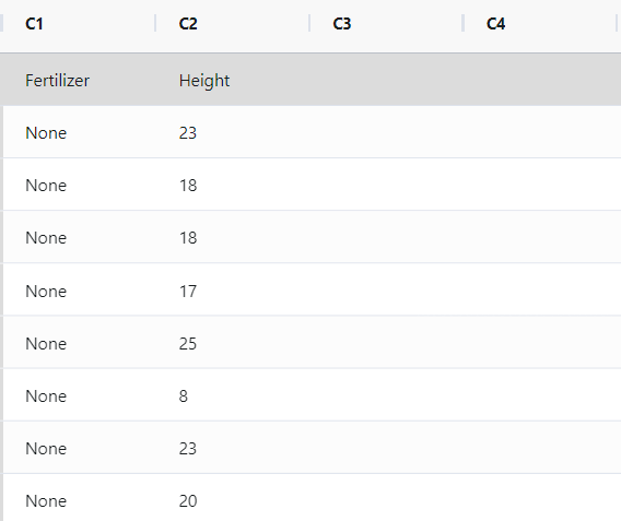
The goal of a plant fertilizer manufacturer is to develop a fertilizer formula that maximizes plant height growth. In order to test different fertilizer formulas, a scientist sets up three sets of 50 identical seedlings. These sets include a control group with no fertilizer, a group treated with the manufacturer's fertilizer called GrowFast, and a group treated with a competitor's fertilizer called SuperPlant. After being placed in a controlled greenhouse environment for three months, the scientist measures the heights of the plants.
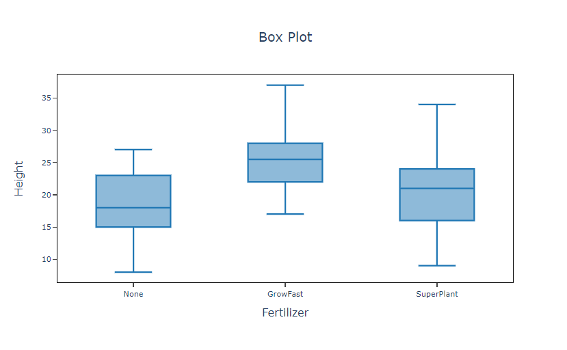
As part of the initial investigation, the scientist constructs a boxplot representing the plant heights from the three groups. This boxplot is used to assess the variations in plant growth between the group without any fertilizer, the group treated with the manufacturer's fertilizer, and the group treated with the competitor's fertilizer. The following steps:
- Gathered the necessary data.
- Now analyses the data with the help of https://qtools.zometric.com/ or https://intelliqs.zometric.com/.
- To find Boxplot choose https://intelliqs.zometric.com/> Statistical module> Graphical analysis> Boxplot Chart.
- Inside the tool, feed the data along with other inputs as follows:
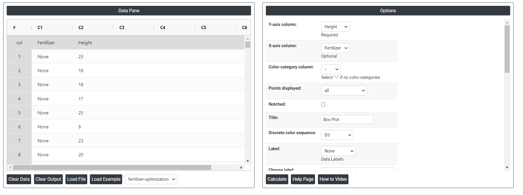
- After using the above mentioned tool, fetches the output as follows:
How to do Boxplot
The guide is as follows:
- Login in to QTools account with the help of https://qtools.zometric.com/ or https://intelliqs.zometric.com/
- On the home page, choose Statistical Tool> Graphical analysis >Boxplot Chart.
- Next, update the data manually or can completely copy (Ctrl+C) the data from excel sheet or paste (Ctrl+V) it or else there is say option Load Example where the example data will be loaded.
- Next, you need to map the columns with the parameters.
- Finally, click on calculate at the bottom of the page and you will get desired results.
On the dashboard of Boxplot, the window is separated into two parts.
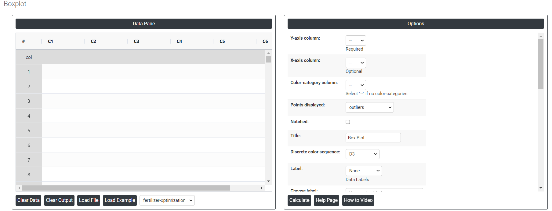
On the left part, Data Pane is present. In the Data Pane, each row makes one subgroup. Data can be fed manually or the one can completely copy (Ctrl+C) the data from excel sheet and paste (Ctrl+V) it here.
Load example: Sample data will be loaded.
Load File: It is used to directly load the excel data.
On the right part, there are many options present as follows:
Y-axis column: It represents a numerical variable. This numerical variable is often a measurement or a count that you want to analyze or compare across different categories or groups.
X-axis column: It represents categorical variables or groups. These categories are usually non-numeric and represent different groups or levels within your data that you want to compare.
Color-category column: Categorical form will be shown in color bases.
Points displayed: Displaying points of outliers or suspected outliers or both at a time.
Notched: It tells you how dense the central part of your data is.
Discrete color sequence: To differentiate between multiple groups or categories, making it easier to compare their distributions. It enhances clarity and readability by visually distinguishing each group. Color-coding can also highlight specific data points or subgroups, providing additional information. This approach improves the plot's visual appeal and facilitates quicker, more accurate interpretations.
Label: This will do the data labels, which contains three options:
- Outlier: Data values that are far away from other data values, can strongly affect your results.
- All quartiles: Quartiles are values that divide a sample of data into four equal parts. Quickly evaluate a data set's spread and central tendency.
- Mean: The mean in a box plot to provide additional information about the data's central tendency.
Choose label: It contains two options:
- Use Y value labels: Labeling the Y value in the boxplot.
- Use labels from selected column: Labeling the selected column in the boxplot.
Interquartile range box: The interquartile range box represents the middle 50% of the data. It shows the distance between the first and third quartiles (Q3-Q1).
Range box: It extend from the minimum value to the maximum value. Also known as the interquartile range (IQR) box.
Median Line: The median lines are labeled with the medians (y-values).
Mean Line: It provides points of reference on the graph.
Mean Symbol: This represents the mean of the data.
Median Symbol: This represents the median of the data.
X-axis line(low): The x-axis line (low) in a box plot, or the lower whisker, indicates the lowest value within 1.5 times the interquartile range (IQR) below the first quartile (Q1) and helps identify outliers below this threshold. It provides insight into the lower tail of the distribution and aids in comparative analysis of data spread across groups.
X-axis line (low & high): The x-axis line (low and high) in a box plot represents the following:
- Low Value: This is the minimum value in the data set, excluding outliers.
- High Value: This is the maximum value in the data set, excluding outliers.
Y-axis line(low): It represents the minimum value of the dataset, excluding outliers. This helps to visualize the lowest point within the normal range of the data.
Y-axis line (low & high): The Y-axis lines (low and high) represent the range of the data, indicating the minimum and maximum values (excluding outliers).They help visualize the spread and variability of the dataset, providing a quick summary of its distribution.
X-axis tick(low): Label the lower end of the X-axis. Provide context for the distribution of data points at the lower range.
Y-axis tick(low): Display the minimum value in the data set. Identify potential outliers by showing the lowest data point within the whisker.
X-axis tick labels(low): It is used to indicate the categories or groups being compared. They ensure clear identification of each category when space is limited, enhancing readability.
Y-axis tick labels(low): It is used to mark and display the minimum values of the data sets being plotted. This helps in identifying the lowest data points within each category or group, providing a clear understanding of data distribution and outliers.
Gridlines on X-axis ticks: It shows the reference lines at X values.
Gridlines on Y-axis ticks: It shows the reference lines at Y values.
Download as Excel: This will display the result in an Excel format, which can be easily edited and reloaded for calculations using the load file option.