What is Descriptive Statistics?
Descriptive Statistics is a foundational analytical tool that calculates and presents a comprehensive set of numerical summaries describing the key characteristics of your data. It covers three main dimensions — central tendency (where the data is centred), spread (how much the data varies), and shape (how the data is distributed).
Rather than making inferences or predictions, descriptive statistics simply describe what is already present in the data. It is typically the first step in any statistical investigation — giving you a clear, objective understanding of your dataset before applying more advanced techniques.
When to use Descriptive Statistics?
- Use as the first step in any data analysis — to understand the basic structure and behaviour of your dataset before applying any other tool.
- Use when you need to summarise and communicate data clearly to a team, manager, or stakeholder who needs a concise numerical overview.
- Use when comparing multiple groups or datasets — descriptive statistics for each group reveal differences in centre and spread at a glance.
- Use to check for outliers, skewness, or unusual patterns before proceeding with formal statistical analysis.
Key Statistics Explained
| Statistic | What it tells you |
| Mean | The arithmetic average — the balancing point of all measurements |
| Median | The middle value — less affected by outliers than the mean |
| Standard Deviation | How much measurements typically spread around the mean |
| Variance | The squared spread — used in further statistical calculations |
| Minimum / Maximum | The smallest and largest values observed in the dataset |
| Range | The total spread from minimum to maximum value |
| Skewness | Whether data leans left (negative) or right (positive) of centre |
| Kurtosis | Whether the distribution has heavier or lighter tails than normal |
| N (Sample Size) | The total number of observations included in the analysis |
Guidelines for correct usage of Descriptive Statistics
- Always report both a measure of centre and a measure of spread together — reporting only the mean without the standard deviation gives an incomplete picture.
- When data is skewed or contains outliers, use the median rather than the mean as the primary measure of centre — it is more representative.
- Check skewness and kurtosis values to assess whether normality can be assumed before applying parametric statistical methods.
- Collect at least 20 to 30 observations for statistics like standard deviation and skewness to be stable and meaningful.
Alternatives: When not to use Descriptive Statistics
| Situation | Use Instead |
| Need visual distribution shape alongside numbers | Graphical Summary |
| Need to test for significant differences between groups | Hypothesis Tests (t-test, ANOVA) |
| Need to understand relationships between variables | Correlation or Regression Analysis |
| Data is categorical (labels, groups) | Bar Chart |
| Need to detect trends or shifts over time | Run Chart or Control Chart |
Example of Descriptive Statistics
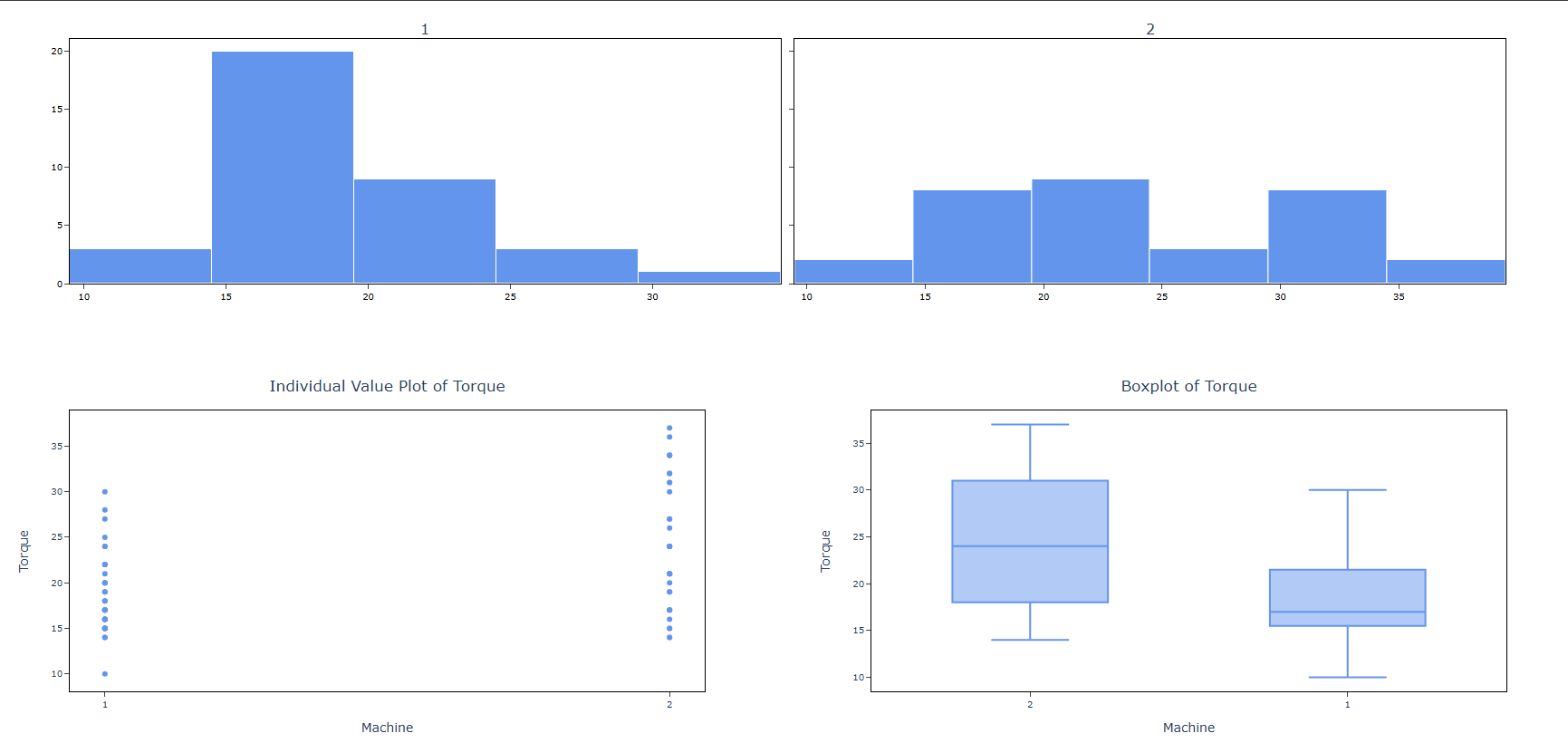
A quality control engineer needs to ensure that the caps on shampoo bottles are fastened correctly. If the caps are fastened too loosely, they may fall off during shipping. If they are fastened too tightly, they may be too difficult to remove. The target torque value for fastening the caps is 18. The engineer collects a random sample of 68 bottles and tests the amount of torque that is needed to remove the caps. The following steps:
- Gathered the necessary data.
- Now analyses the data with the help of https://qtools.zometric.com/ or https://intelliqs.zometric.com/.
- To find Descriptive Statistics choose https://intelliqs.zometric.com/> Statistical module> Graphical analysis > Descriptive Statistics.
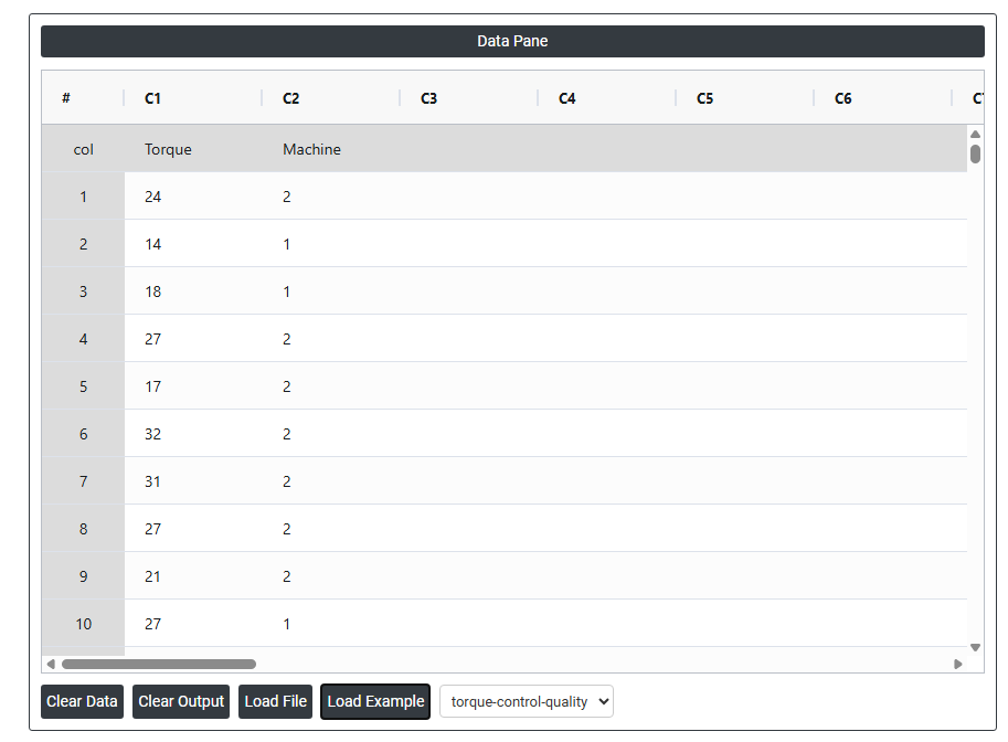
- Inside the tool, feed the data along with other inputs as follows:
6. After using the above-mentioned tool, fetches the output as follows:
How to do Descriptive Statistics
The guide is as follows:
- Login in to QTools account with the help of https://qtools.zometric.com/ or https://intelliqs.zometric.com/
- On the home page, choose Statistical Tool> Graphical analysis > Descriptive Statistics.
- Next, update the data manually or can completely copy (Ctrl+C) the data from excel sheet or paste (Ctrl+V) it or else there is say option Load Example where the example data will be loaded.
- Next, you need to fill the required options.
- Finally, click on calculate at the bottom of the page and you will get desired results.
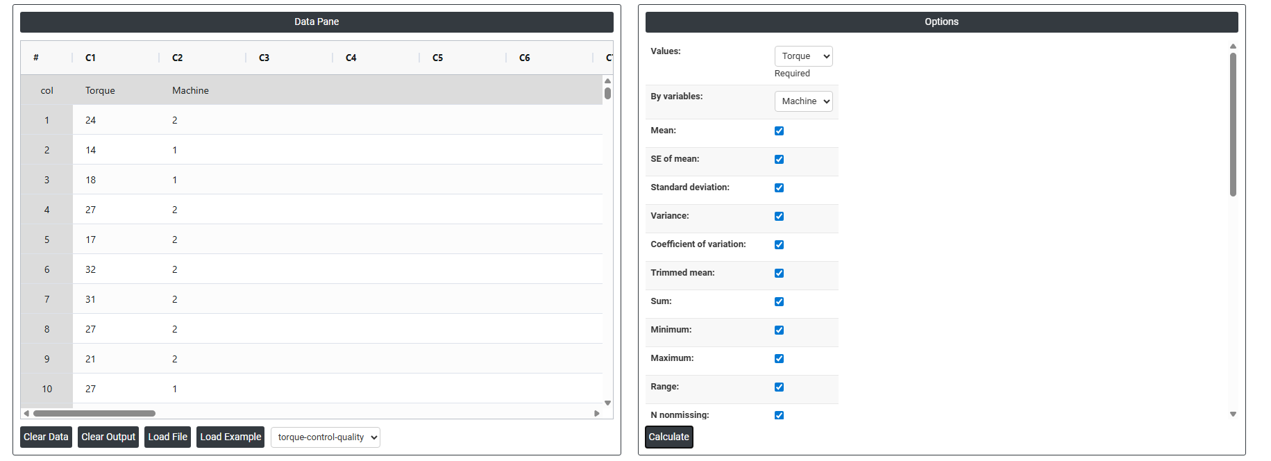
On the dashboard of Descriptive Statistics, the window is separated into two parts.
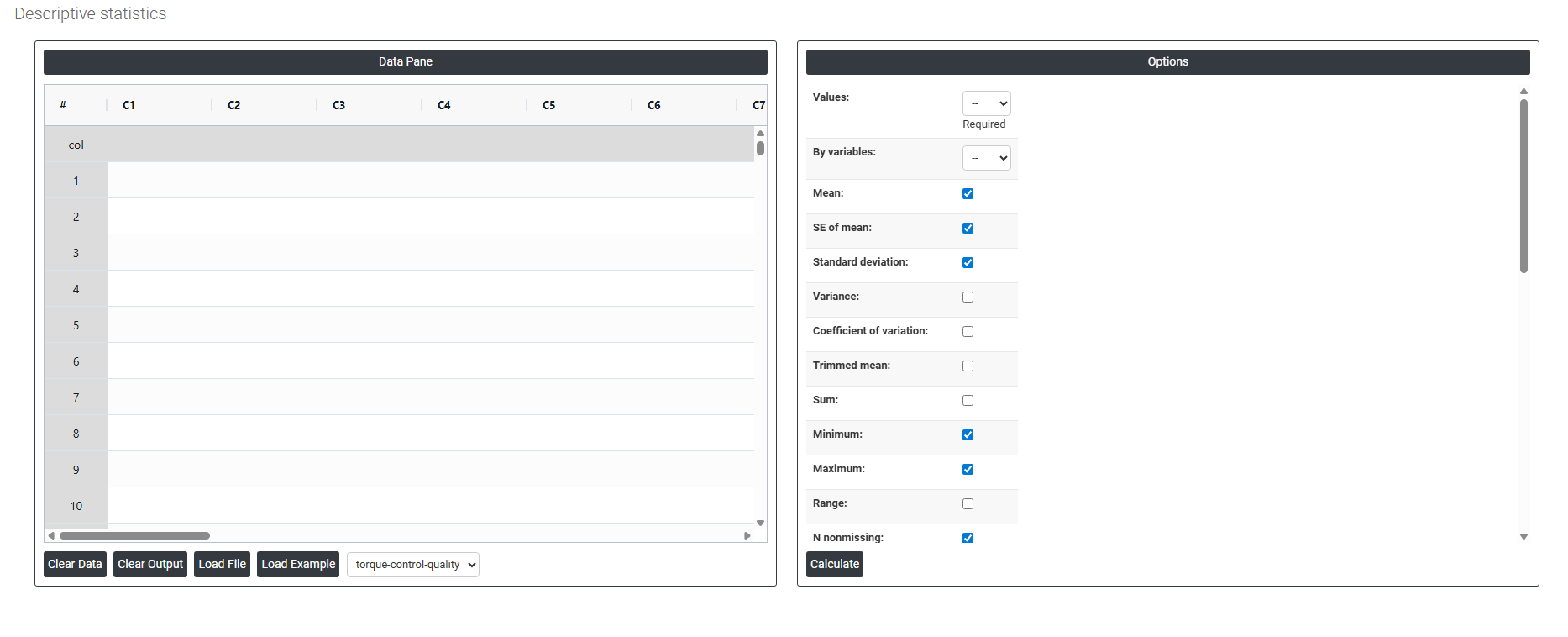
On the left part, Data Pane is present. In the Data Pane, each row makes one subgroup. Data can be fed manually or the one can completely copy (Ctrl+C) the data from excel sheet and paste (Ctrl+V) it here.
Load example: Sample data will be loaded.
Load File: It is used to directly load the excel data.
On the right part, we just need to give:
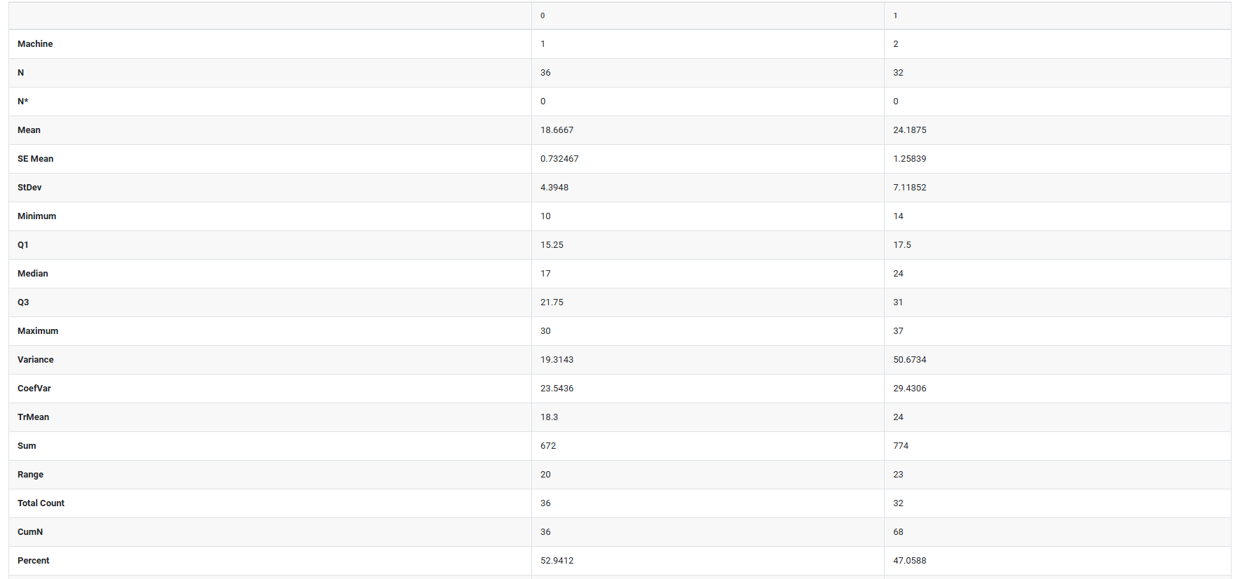
Values: The variable(s) containing the actual data you want to analyze for example, Torque readings or machine so select the column.
By Variables: An optional grouping variable. If selected, the statistics are calculated separately for each group (e.g., by Machine type), so you can compare groups side by side.
Mean: The arithmetic average. Add all values, divide by the count. The most common way to summarize where your data sits.
SE of mean (Standard Error of the Mean): Estimates how much your sample mean might differ from the true population mean. A small SE means your mean estimate is reliable; a large SE means there is more uncertainty.
Trimmed mean: The mean calculated after removing a small percentage of the lowest and highest values. This reduces the influence of extreme outliers and gives a more stable center estimate.
Median: The middle value when all data points are sorted in order. Half the values fall above it, half below. More reliable than the mean when data is skewed or contains outliers.
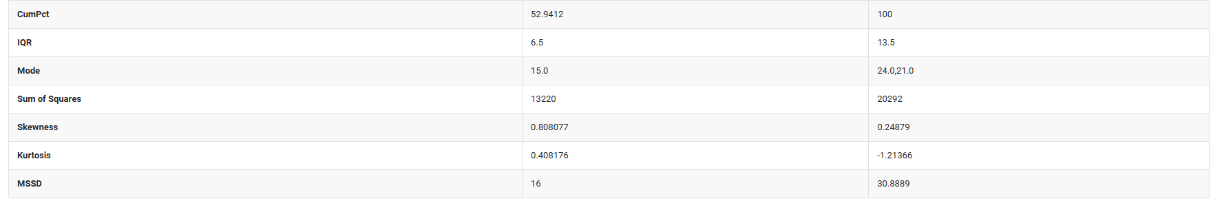
Mode: The value that appears most often in the dataset. Useful for identifying the most common measurement or category.
Sum: The total of all values added together. Useful when the cumulative amount matters, not just the average.
Standard deviation: Measures the average distance of each data point from the mean. A small value means data is tightly clustered; a large value means it is widely spread.
Variance: The standard deviation squared. Less intuitive to interpret directly, but it is used in many statistical calculations and tests behind the scenes.
Coefficient of variation (CV): Expresses the standard deviation as a percentage of the mean (SD ÷ Mean × 100). This lets you compare variability between datasets that have different units or very different average sizes.
Range: The simplest spread measure Maximum minus Minimum. Easy to understand but highly sensitive to a single extreme value.
Interquartile range (IQR): The spread of the middle 50% of your data (Q3 minus Q1). Because it ignores the top and bottom 25%, it is resistant to outliers and a reliable measure of typical spread.
MSSD (Mean of Successive Squared Differences): Measures variability between consecutive data points in the order they were collected. Particularly useful in process monitoring and time-series data to detect whether a process is unstable or drifting over time.
Sum of squares: The sum of each value squared. Not directly interpretable on its own, but it is a key building block used internally in variance, regression, and ANOVA calculations.
Minimum: The smallest value in the entire dataset.
Maximum: The largest value in the entire dataset.
First quartile (Q1): The 25th percentile. One quarter of all values fall at or below this point.
Third quartile (Q3): The 75th percentile. Three quarters of all values fall at or below this point.
N nonmissing: The number of data points that have a valid recorded value and are included in the analysis.
N missing: The number of data points with no value (blank or null). High missing counts may indicate a data collection problem.
N total: The total number of rows = N nonmissing + N missing.
Cumulative N: A running total of observations as you move down through the rows or groups.
Percent: Each group's count expressed as a percentage of the total number of observations.
Cumulative Percent: A running total of percentages. The last row always reaches 100%.
Skewness: Measures how asymmetric the distribution is around the mean.
- Zero = perfectly symmetric
- Positive = the tail stretches to the right (a few very high values pulling the mean up)
- Negative = the tail stretches to the left (a few very low values pulling the mean down)
Kurtosis: Measures how heavy or light the tails of the distribution are compared to a normal (bell-shaped) distribution.
- High kurtosis = more extreme outliers than expected
- Low kurtosis = fewer extreme values, flatter distribution
Histogram of data: A bar chart that shows how frequently values fall within defined intervals (bins). Best for seeing the overall shape whether data is normal, skewed, bimodal, and so on.
Individual value plot: Plots every single data point as an individual dot on a number line. Nothing is hidden or averaged. Best for spotting outliers and seeing the true raw spread of your data.
Boxplot of data: A box-and-whisker chart that summarizes the median, Q1, Q3, and outliers in a single compact visual. Excellent for comparing the spread and center of multiple groups side by side.
Show variables as columns: Transposes the results table so each variable becomes a column instead of a row. Particularly useful when you are comparing many variables and want them laid out side by side for easy comparison.
Download as Excel: This will display the result in an Excel format, which can be easily edited and reloaded for calculations using the load file option.