What is Fit Line Model?
When to use Fit Line Model ?
- Both your variables are numbers (not categories)
- There's a visible trend points go up or down together
- Response variable must be continuous
- Record data in the order it is collected
- To predict an outcome for a new input
- To measure how strongly two things are related
- Data is noisy and you need to see the bigger pattern
- Comparing trends across different groups or time periods
Use a different model if:
- Multiple predictors → Fit Regression Model
- Categorical predictor → One-Way ANOVA
Guidelines for correct usage of Fit Line Model
- Use exactly one continuous predictor and a continuous response variable.
- Ensure the data represents the target population accurately; biased or incomplete data will produce unreliable results.
- Collect sufficient data points to ensure reliable estimates and accurate representation of the relationship between variables.
- Ensure measurement accuracy by recording variables as precisely as possible; errors in measurement directly affect the fit line.
- Record data in the order it was collected to help detect any time-based patterns or trends in residuals.
- After fitting, verify the model using residual plots and summary statistics; residuals should appear random any pattern indicates a poor fit.
- If more than one predictor is needed, use Fit Regression Model; for categorical predictors, use One-Way ANOVA instead.
Alternatives: When not to use Fit Line Model
- If you have more than one predictor, use Fit Regression Model instead for accurate multi-variable analysis.
- If you have one categorical predictor with no continuous predictors, use One-Way ANOVA instead.
Example of Fit Line Model
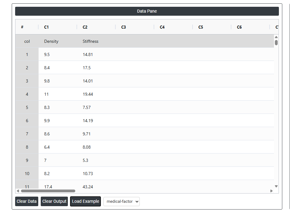
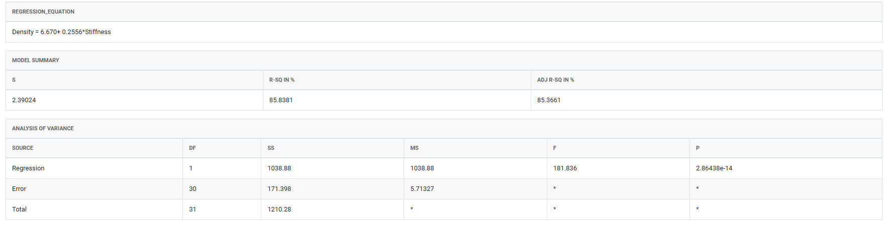
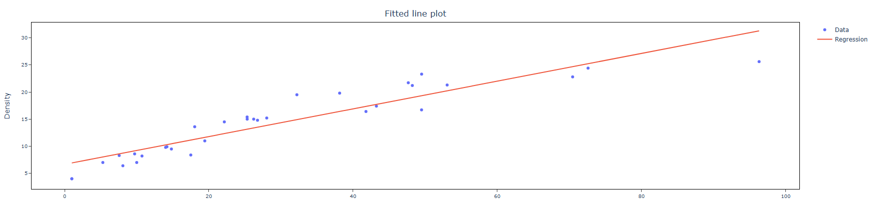
A materials engineer at a furniture manufacturing site wants to determine if there is a relationship between the density and stiffness of particle board. To investigate this, the engineer collects measurements of stiffness and density from a sample of board pieces and applies simple linear regression to analyze the association. To evaluate this, the engineer performs the following steps:
- Gathered the necessary data.
- Now analyses the data with the help of https://qtools.zometric.com/ or https://intelliqs.zometric.com/.
- To find Fit Line Model choose https://intelliqs.zometric.com/> Statistical module> Regression>Fit Line Model.
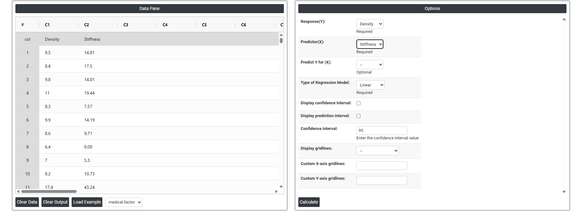
- Inside the tool, feeds the data along with other inputs as follows:
5. After using the above mentioned tool, fetches the output as follows:
How to do Fit Line Model
The guide is as follows:
- Login in to QTools account with the help of https://qtools.zometric.com/ or https://intelliqs.zometric.com/
- On the home page, choose Statistical Tool>Regression >Fit Line Model .
- Click on Fit Line Model and reach the dashboard.
- Next, update the data manually or can completely copy (Ctrl+C) the data from excel sheet and paste (Ctrl+V) it here.
- Fill the required options given on the left side.
- Finally, click on calculate at the bottom of the page and you will get desired results.
On the dashboard of Fit Line Model, the window is separated into two parts.
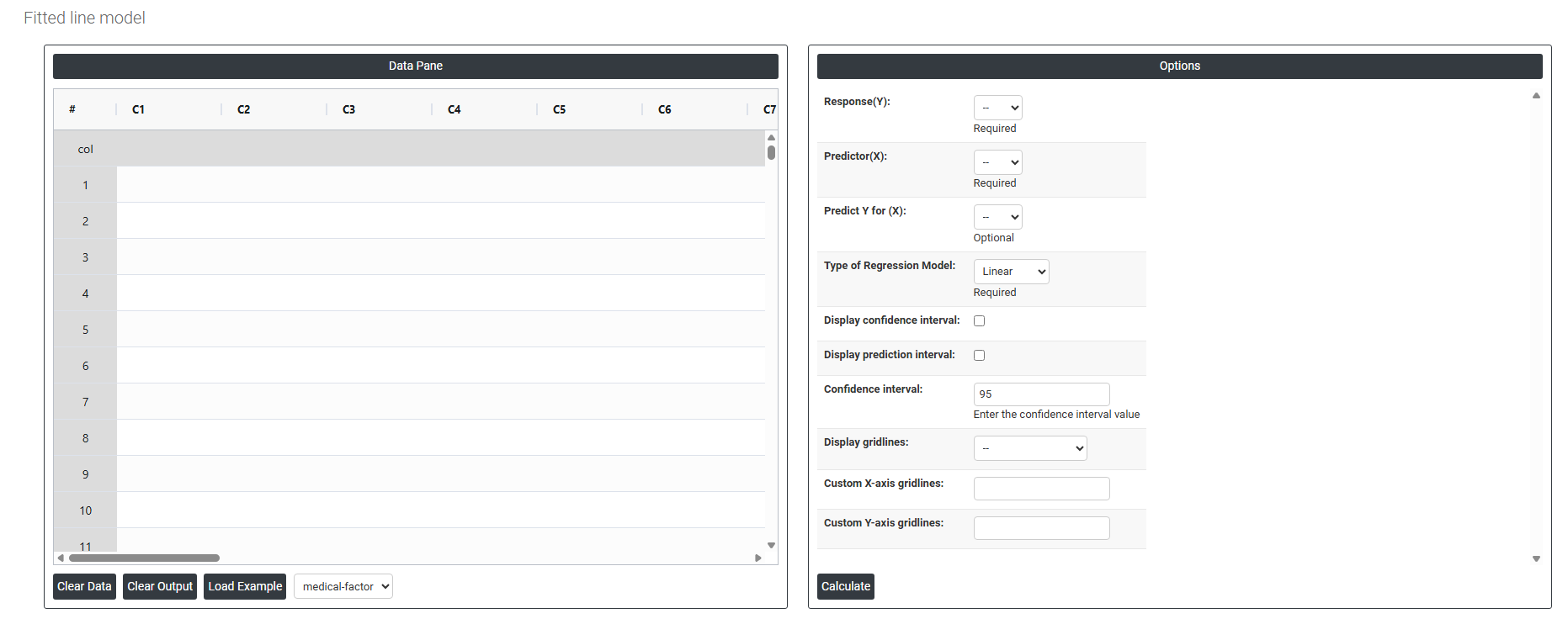
On the left part, Data Pane is present. In the Data Pane, each row makes one subgroup. Data can be fed manually or the one can completely copy (Ctrl+C) the data from excel sheet and paste (Ctrl+V) it here.
Load example: Sample data will be loaded.
Load File: It is used to directly load the excel data.
On the right part, there are many options present as follows:
- Response — The output variable you want to predict or analyze (e.g. sales, temperature). This is the Y-axis of your chart.
- Predictor — The input variable used to explain or predict the response (e.g. time, pressure). This is the X-axis of your chart.
- Type of Regression Model — Defines the shape of the fit line;
- Linear — Fits a straight line through the data, assuming a constant and consistent relationship between the predictor and response. Best used when the data shows a steady increase or decrease without any bending or curving.
- Quadratic — Fits a curved line that can bend once (U-shape or arch), capturing relationships where the response first increases then decreases, or vice versa. Use this when the data shows a single curve or turning point.
- Cubic — Fits a more flexible curve that can bend twice, capturing more complex relationships with multiple rises and falls in the data. Use this when neither a straight line nor a simple curve adequately describes the data pattern.
- Display CI (Confidence Interval) — Shows a band around the fit line indicating where the true regression line is likely to fall based on your data.
- Display Prediction Interval — Shows a wider band indicating the range where a single new data point is likely to fall in the future.
- Confidence Interval (%) — Sets the certainty level for the intervals (default is 95%), meaning you are 95% confident the true value falls within the displayed range.
- Display Gridlines — Adds reference grid lines to the chart background to make it easier to read and interpret data point positions.
- Custom X Axis Gridlines — Lets you manually set gridline positions on the X-axis at specific values that matter to your analysis.
- Custom Y Axis Gridlines — Lets you manually set gridline positions on the Y-axis at specific values for better readability and focus.