
Histogram Distplot
A histogram is a graphical representation of the distribution of numerical data using adjacent bars. Each bar represents a range of values (bins), and its height corresponds to the frequency of data within that range.
Last reviewed
Key takeaway
A histogram is a graphical representation of the distribution of numerical data using adjacent bars.
On this page
What is Histogram?
A histogram is a graphical representation of the distribution of numerical data using adjacent bars. Each bar represents a range of values (bins), and its height corresponds to the frequency of data within that range. The horizontal axis shows the bins, while the vertical axis shows the frequency.
Histograms are used for continuous data, while bar graphs are for categorical data.
When to use Histogram?
Here are some situations where they are particularly useful:
- Data Distribution Analysis: It provides a visual representation of the frequency distribution of data. They help you understand the shape of the distribution, identify the central tendency (mean, median, mode), and assess the spread or variability of the data. It can reveal patterns such as normal distribution, skewed distribution, bimodal distribution, or outliers.
- Data Exploration: They are useful for exploring a dataset and gaining insights into the values it contains. They allow you to see the frequency and concentration of values within specific ranges or bins. This can help you identify clusters, gaps, or unusual patterns in the data.
- Outlier Detection: It can help you identify outliers or extreme values in a dataset. Outliers are often visible as bars that are significantly taller or shorter than the rest of the bars. By examining the tails or extreme ends of the histogram, you can spot values that deviate from the main distribution.
- Data Preprocessing: It can aid in data preprocessing tasks. For example, they can be used to assess the distributional characteristics of a variable before deciding on appropriate data transformations, such as normalization or log transformations. It can also help in determining the optimal binning strategy for discretizing continuous variables.
- Comparison of Distributions: They are useful for comparing the distributions of different variables or datasets. By plotting multiple histograms on the same graph, you can visually compare their shapes, ranges, and central tendencies. This can be helpful in identifying similarities, differences, or relationships between variables.
- Quality Control and Process Improvement: It widely used in quality control to monitor and improve processes. They can be used to visualize process output data and assess whether it meets desired specifications or falls within acceptable limits. Deviations or abnormalities in the histogram can indicate potential issues or opportunities for improvement.
Guidelines for correct usage of Histogram
- Sample size should be 20 or greater for effective representation of data
- They are suitable when sample size is at least 20
- Small sample sizes may lead to insufficient data in each histogram bar
- Consider using Individual value plot if sample size is less than 20
- Random selection of sample data is important
- Random samples allow for generalizations and inferences about the population
- Non-randomly collected data may not accurately represent the population.
Alternatives: When not to use Histogram
- Individual Value Plot: If the sample size is smaller than 20, it is advisable to opt for an Individual value plot as an alternative.
Example of Histogram Distplot
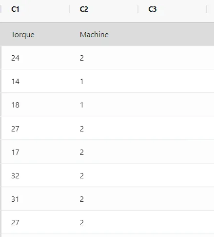
A quality engineer is conducting a comparison between pistons from two different suppliers. The engineer randomly selects and measures the lengths of 100 pistons from each supplier. To compare the distributions of the sample data, the engineer creates a histogram with fit and groups. The following steps:
- Gathered the necessary data.
- Now analyses the data with the help of https://qtools.zometric.com/ or https://intelliqs.zometric.com/.
- To find Histogram Distplot choose https://intelliqs.zometric.com/> Statistical module> Graphical analysis > Histogram Distplot.
- Inside the tool, feed the data along with other inputs as follows:
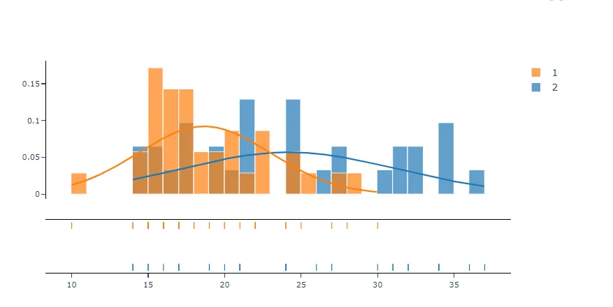
6. After using the above-mentioned tool, fetches the output as follows:
How to do Histogram Distplot
The guide is as follows:
- Login in to QTools account with the help of https://qtools.zometric.com/ or https://intelliqs.zometric.com/
- On the home page, choose Statistical Tool> Graphical analysis > Histogram Distplot.
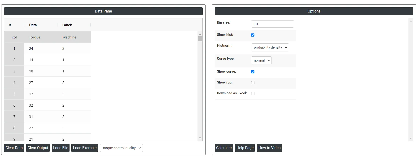
- Next, update the data manually or can completely copy (Ctrl+C) the data from excel sheet or paste (Ctrl+V) it or else there is say option Load Example where the example data will be loaded.
- Next, you need to map the columns with the parameters.
- Finally, click on calculate at the bottom of the page and you will get desired results.
On the dashboard of Histogram Distplot, the window is separated into two parts.
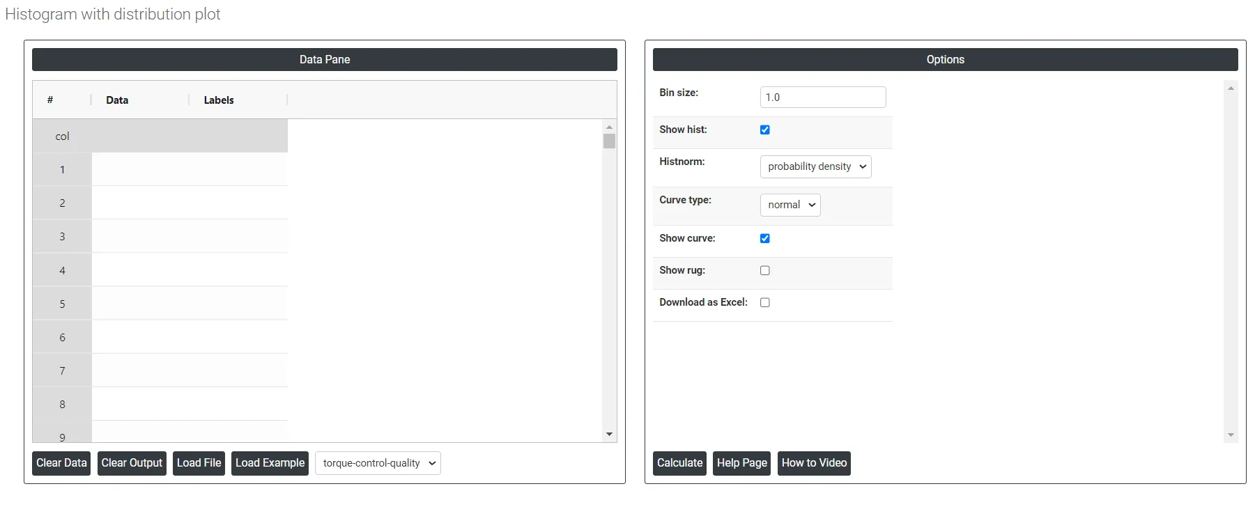
On the left part, Data Pane is present. In the Data Pane, each row makes one subgroup. Data can be fed manually or the one can completely copy (Ctrl+C) the data from excel sheet and paste (Ctrl+V) it here.
Load example: Sample data will be loaded.
Load File: It is used to directly load the excel data.
On the right part, we just need to give:
Bin Size: The bin size, also known as bin width or bin interval, refers to the width of each interval or bin used in a histogram. When constructing a histogram, the data range is divided into a set of equal-sized intervals, and the number of data points falling into each interval is counted to create the histogram.
Curve type:
- KDE: In the context of histograms, the "kde" curve type refers to the Kernel Density Estimation curve. While histograms display the distribution of data through bins and bars, a KDE curve provides a smooth estimate of the underlying probability density function (PDF) of the data.
- Normal: In the context of histograms, the "normal" curve type refers to the normal distribution curve, also known as the Gaussian curve or bell curve. The normal distribution is a symmetric probability distribution that is widely used in statistics and probability theory.
Histnorm:
- Percent: Each bin's height represents the percentage of data points relative to the total number of data points in the dataset.
- Probability: Each bin's height represents the probability of a data point falling within that bin. The sum of all bin heights will equal 1.
- Probability Density: The probability density histnorm calculates the probability density function (PDF) by normalizing the histogram counts such that the area under the histogram equals 1.
- Density: The frequency of data points within each bin normalized by the bin width. Instead of just showing the raw counts of data points in each bin, a density histogram represents the data in a way that the area under the histogram sums to one, making it possible to compare distributions with different sample sizes or bin widths
Download as Excel: This will display the result in an Excel format, which can be easily edited and reloaded for calculations using the load file option.