What is Histogram?
A histogram is a graphical representation of the distribution of numerical data using adjacent bars. Each bar represents a range of values (bins), and its height corresponds to the frequency of data within that range. The horizontal axis shows the bins, while the vertical axis shows the frequency.
Histograms are used for continuous data, while bar graphs are for categorical data.
When to use Histogram?
Here are some situations where they are particularly useful:
- Data Distribution Analysis: It provides a visual representation of the frequency distribution of data. They help you understand the shape of the distribution, identify the central tendency (mean, median, mode), and assess the spread or variability of the data. It can reveal patterns such as normal distribution, skewed distribution, bimodal distribution, or outliers.
- Data Exploration: They are useful for exploring a dataset and gaining insights into the values it contains. They allow you to see the frequency and concentration of values within specific ranges or bins. This can help you identify clusters, gaps, or unusual patterns in the data.
- Outlier Detection: It can help you identify outliers or extreme values in a dataset. Outliers are often visible as bars that are significantly taller or shorter than the rest of the bars. By examining the tails or extreme ends of the histogram, you can spot values that deviate from the main distribution.
- Data Preprocessing: It can aid in data preprocessing tasks. For example, they can be used to assess the distributional characteristics of a variable before deciding on appropriate data transformations, such as normalization or log transformations. It can also help in determining the optimal binning strategy for discretizing continuous variables.
- Comparison of Distributions: They are useful for comparing the distributions of different variables or datasets. By plotting multiple histograms on the same graph, you can visually compare their shapes, ranges, and central tendencies. This can be helpful in identifying similarities, differences, or relationships between variables.
- Quality Control and Process Improvement: It widely used in quality control to monitor and improve processes. They can be used to visualize process output data and assess whether it meets desired specifications or falls within acceptable limits. Deviations or abnormalities in the histogram can indicate potential issues or opportunities for improvement.
Guidelines for correct usage of Histogram
- Sample size should be 20 or greater for effective representation of data
- They are suitable when sample size is at least 20
- Small sample sizes may lead to insufficient data in each histogram bar
- Consider using Individual value plot if sample size is less than 20
- Random selection of sample data is important
- Random samples allow for generalizations and inferences about the population
- Non-randomly collected data may not accurately represent the population.
Alternatives: When not to use Histogram
- Individual Value Plot: If the sample size is smaller than 20, it is advisable to opt for an Individual value plot as an alternative.
Example of Histogram (Flexi)
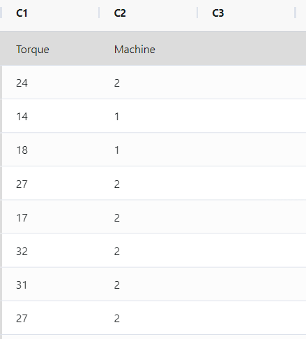
In order to verify the proper fastening of shampoo bottle caps, a quality control engineer must ensure that they are neither too loose nor too tight. If the caps are not securely fastened, they may fall off during shipping, while excessively tight caps may be difficult to remove. To assess the torque required to remove the caps, the engineer gathers a random sample of 68 bottles and performs tests.
As part of the initial investigation, the engineer constructs a histogram of the torque measurements to examine the distribution of the data. The following steps:
- Gathered the necessary data.
- Now analyses the data with the help of https://qtools.zometric.com/ or https://intelliqs.zometric.com/.
- To find Histogram(Flexi) choose https://intelliqs.zometric.com/> Statistical module> Graphical analysis > Histogram(Flexi).
- Inside the tool, feed the data along with other inputs as follows:
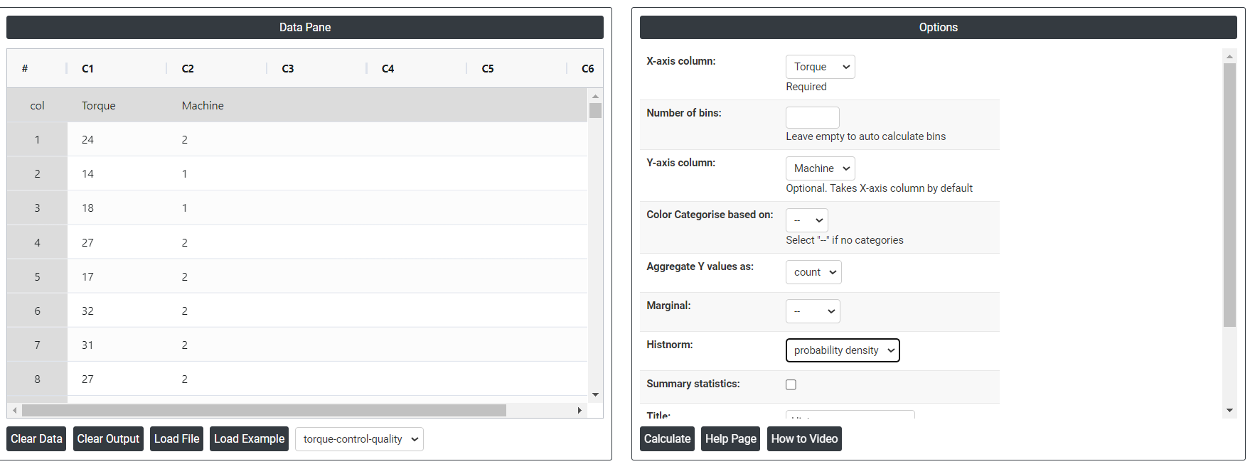
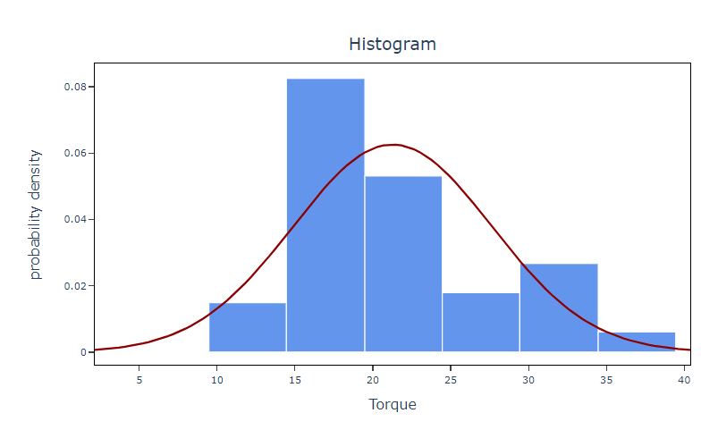
6. After using the above-mentioned tool, fetches the output as follows:
How to do Histogram (Flexi)
The guide is as follows:
- Login in to QTools account with the help of https://qtools.zometric.com/ or https://intelliqs.zometric.com/
- On the home page, choose Statistical Tool> Graphical analysis > Histogram(Flexi).
- Next, update the data manually or can completely copy (Ctrl+C) the data from excel sheet or paste (Ctrl+V) it or else there is say option Load Example where the example data will be loaded.
- Next, you need to map the columns with the parameters.
- Finally, click on calculate at the bottom of the page and you will get desired results.
On the dashboard of Histogram (Flexi), the window is separated into two parts.
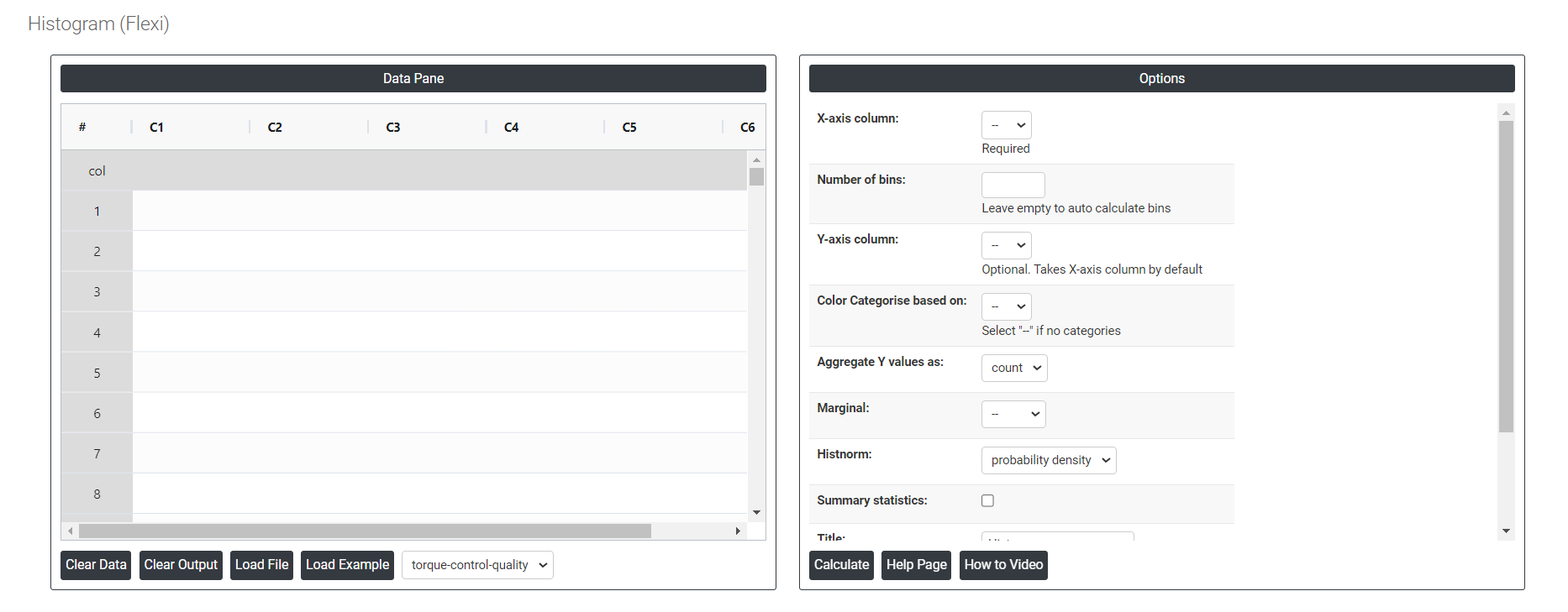
On the left part, Data Pane is present. In the Data Pane, each row makes one subgroup. Data can be fed manually or the one can completely copy (Ctrl+C) the data from excel sheet and paste (Ctrl+V) it here.
Load example: Sample data will be downloaded.
Load File: It is used to directly load the excel data.
On the right part, we just need to give:
Number of bins: Number of intervals or groups into which the data range is divided.
Aggregate Y value:
- Sum: The total count of all data points represented in the histogram.
- Average (Avg): The mean value of the data points, calculated as the sum of all data points divided by the number of data points.
- Minimum (Min): The smallest value in the data set, represented by the leftmost edge of the histogram.
- Maximum (Max): The largest value in the data set, represented by the rightmost edge of the histogram.
- Count: It represents the count or frequency of data points in each bin. Each bin's height represents the number of data points falling within that bin.
Summary Statistics: It will show the results of count, mean, stdev, min, max, 25%, 50% and 75%.
Histnorm:
- Percent: Each bin's height represents the percentage of data points relative to the total number of data points in the dataset.
- Probability: Each bin's height represents the probability of a data point falling within that bin. The sum of all bin heights will equal 1.
- Probability Density: The probability density histnorm calculates the probability density function (PDF) by normalizing the histogram counts such that the area under the histogram equals 1.
- Density: The frequency of data points within each bin normalized by the bin width. Instead of just showing the raw counts of data points in each bin, a density histogram represents the data in a way that the area under the histogram sums to one, making it possible to compare distributions with different sample sizes or bin widths
Marginal: In the context of histograms, "marginal" typically refers to the individual distribution of a single variable, represented by a histogram, without considering the relationship or interactions with other variables.
Color Categorization: Color categorization in graphs assigns distinct colors to different categories or groups within the data, facilitating visual differentiation and understanding of data distribution across segments.
Bar Color: Bar color in graphs denotes the use of specific colors for individual bars representing different categories or groups of data, aiding in clear and immediate identification of each segment's representation. It is not applicable if color categories is selected.
Download as Excel: This will display the result in an Excel format, which can be easily edited and reloaded for calculations using the load file option.