What is Laney U Chart?
A Laney U’ Chart is an enhanced version of the standard U chart, built to handle overdispersion in defect count data. It monitors the average number of defects per unit when a single item can have more than one defect — for example, a circuit board may have multiple solder defects, or a report may contain several errors.
Just like the Laney P’ chart fixes the P chart, the Laney U’ chart fixes the U chart by applying a sigma-Z correction that absorbs extra between-subgroup variability. This prevents the chart from generating a flood of false alarms when inspection area sizes are large or inconsistent.
When to use Laney U Chart?
- Use when tracking the number of defects per unit where a single item can have multiple defects — such as scratches on a panel, errors in a document, or faults in a cable.
- Use when the inspection area (number of units inspected) varies between subgroups — the U chart family handles variable inspection sizes, unlike the C chart.
- Use when a standard U chart shows excessive false alarms or control limits that seem unrealistically tight for your process.
- Use when the sigma-Z value is significantly above 1, confirming that extra between-subgroup variation is inflating the standard U chart signals.
Guidelines for correct usage of Laney U Chart
- Data must represent counts of defects (not defective items) — each unit can contribute more than one defect to the count.
- Record the number of units inspected per subgroup accurately — this is used to calculate the defects-per-unit rate for each plotted point.
- Check the sigma-Z value — if it is close to 1.0, the standard U chart is sufficient; if it is well above 1.0, the Laney U’ chart is the correct choice.
- Collect at least 25 subgroups to establish stable and reliable control limits.
- Investigate assignable causes of between-subgroup variation — the chart identifies instability but does not explain it; root cause analysis is always required.
Alternatives: When not to use Laney U Chart
- If subgroup sizes are fixed and consistent with no overdispersion, use a standard U Chart
- If the inspection area is fixed and identical for every subgroup, use C Chart instead — it is simpler and appropriate for constant opportunity size.
- If you are tracking whether each item is defective or not (rather than counting individual defects), use Laney P’ Chart or P Chart
- If the response is continuous measured data, use I-MR, Xbar-R, or Xbar-S charts
Example of Laney U Chart?
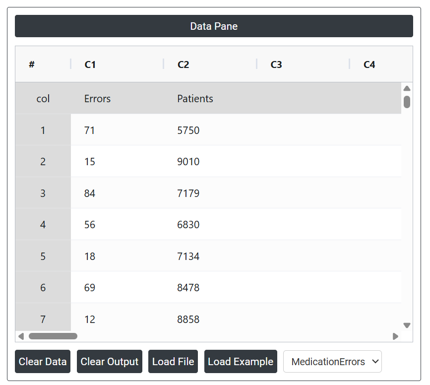
The quality director for a group of hospitals aims to evaluate the medication error rate, which includes mistakes such as administering medication at the wrong time, giving an incorrect dose, or providing the wrong medication. Over 32 weeks, the director tracks the number of patients and medication errors weekly. Due to the large number of patients, with an average subgroup size exceeding 7,500, and evidence of overdispersion in the data, the director opts to use a Laney U' chart instead of a standard U chart to monitor and analyze the medication error trends. The manager follows these steps:
- Gathered the necessary data.
2. Now analyses the data with the help of https://qtools.zometric.com/ or https://intelliqs.zometric.com/.
3. To find U Chart choose https://intelliqs.zometric.com/> Statistical module> Control Chart> Laney U Chart.
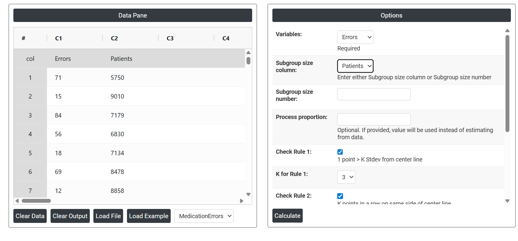
4. Inside the tool, feeds the data along with other inputs as follows:
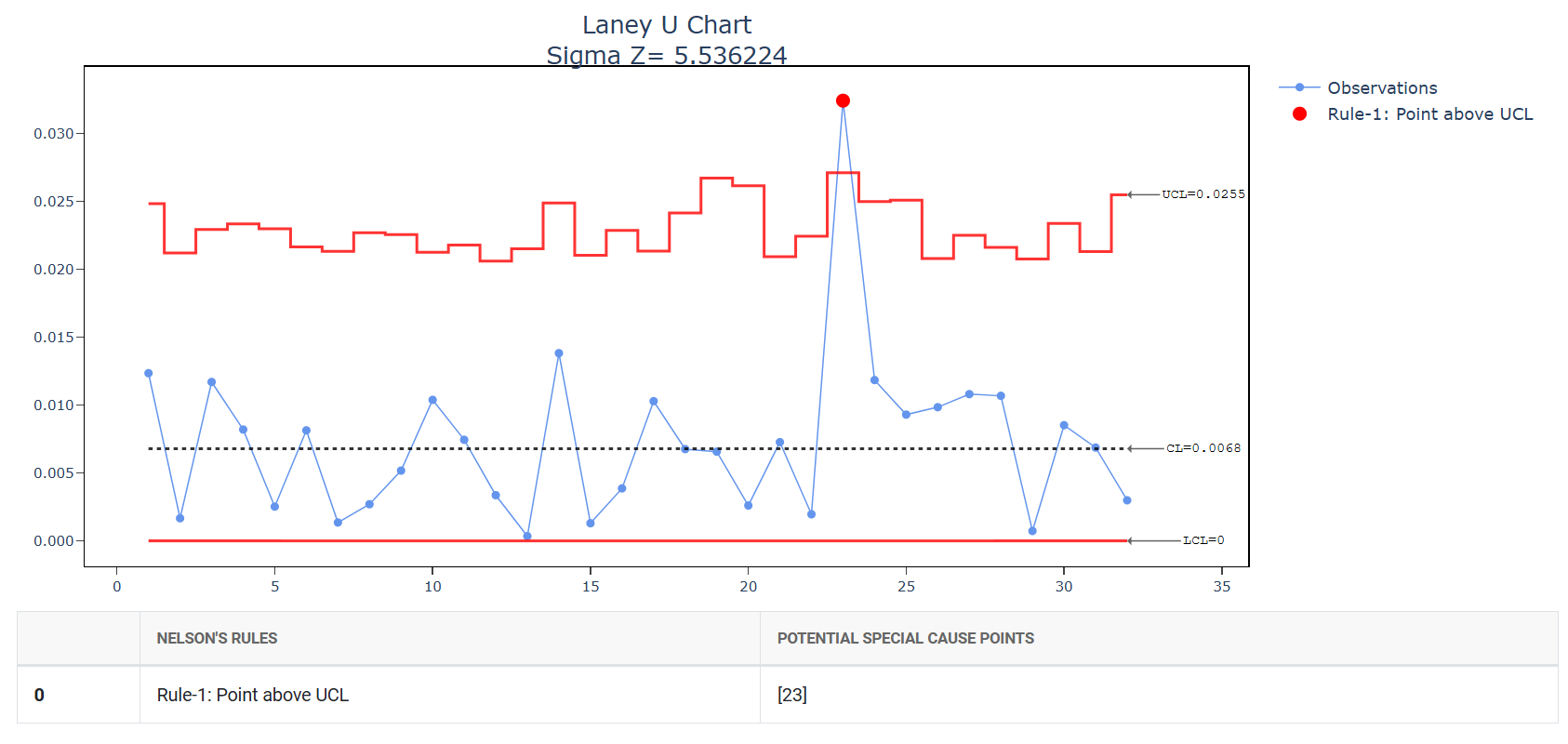
5. After using the above mentioned tool, fetches the output as follows:
How to generate Laney U Chart?
The guide is as follows:
- Login in to QTools account with the help of https://qtools.zometric.com/ or https://intelliqs.zometric.com/
- On the home page, choose Statistical Tool> Control Chart >Laney U Chart .
- Next, update the data manually or can completely copy (Ctrl+C) the data from excel sheet and paste (Ctrl+V) it here.
- Next, you need to select the desired Check Rules.
- Finally, click on calculate at the bottom of the page and you will get desired results.
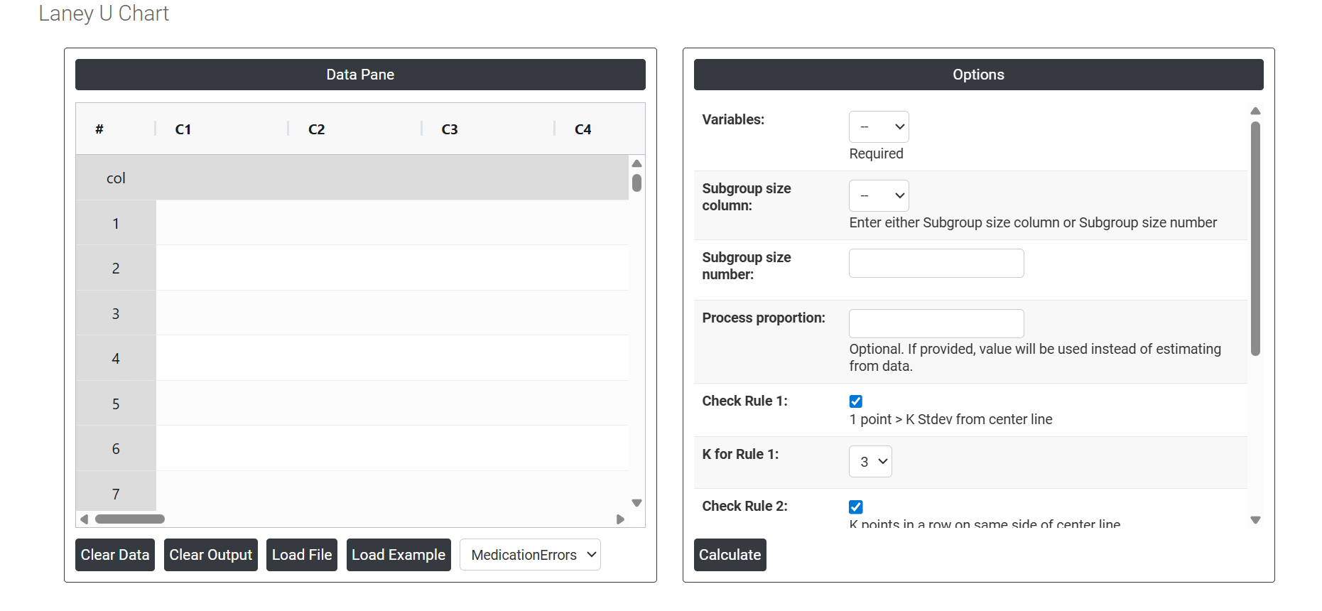
On the dashboard of Laney U Chart, the window is separated into two parts.