What is Main Effects Plot?
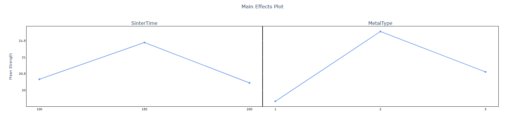
A Main Effects Plot is a visual tool that displays how the average response value changes across the different levels of each factor in your study. For every factor, it draws a line connecting the mean response at each level — making it immediately visible whether changing a factor has a large or small effect on the outcome.
A steep slope in the line indicates a strong effect — meaning that factor significantly influences the response. A flat or nearly horizontal line indicates a weak or negligible effect — that factor has little practical impact on the outcome.
Simple Definitions:A chart that shows how the average result changes when you move from one level of a factor to another — helping you quickly identify which factors have the greatest influence on your process.
When to use Main Effects Plot?
- Use after running a designed experiment (DOE) or factorial study to visually summarise which factors matter most.
- Use to compare the relative importance of multiple factors on a continuous response variable at a glance.
- Use during process optimisation to identify which input variables to focus on for achieving the desired output.
- Use as a communication tool to present findings to non-statistical audiences — the visual format is intuitive and easy to understand.
Guidelines for correct usage of Main Effects Plot
- The Main Effects Plot shows individual factor effects only — it does not account for interactions between factors. Always check an interaction plot before drawing final conclusions.
- The response variable must be continuous for the plotted means to be meaningful.
- Compare slopes relative to each other, not in absolute terms — a steeper slope always indicates a stronger effect than a shallower one.
- Use alongside ANOVA results or regression coefficients to confirm that visually large effects are also statistically significant.
- Ensure data comes from a balanced or well-designed study — unbalanced designs can distort the plotted means and lead to misleading visual comparisons.
Alternatives: When not to use Main Effects Plot
- If the response is categorical, plotting means is not appropriate — use bar charts or mosaic plots to visualise category proportions.
- If you are working with a single continuous predictor, use a Fitted Line Plot or Scatter Plot instead for a more informative view.
- If your goal is formal hypothesis testing rather than visualisation, use ANOVA or Regression Analysis to obtain p-values and confidence intervals.
Example of Main Effects Plot
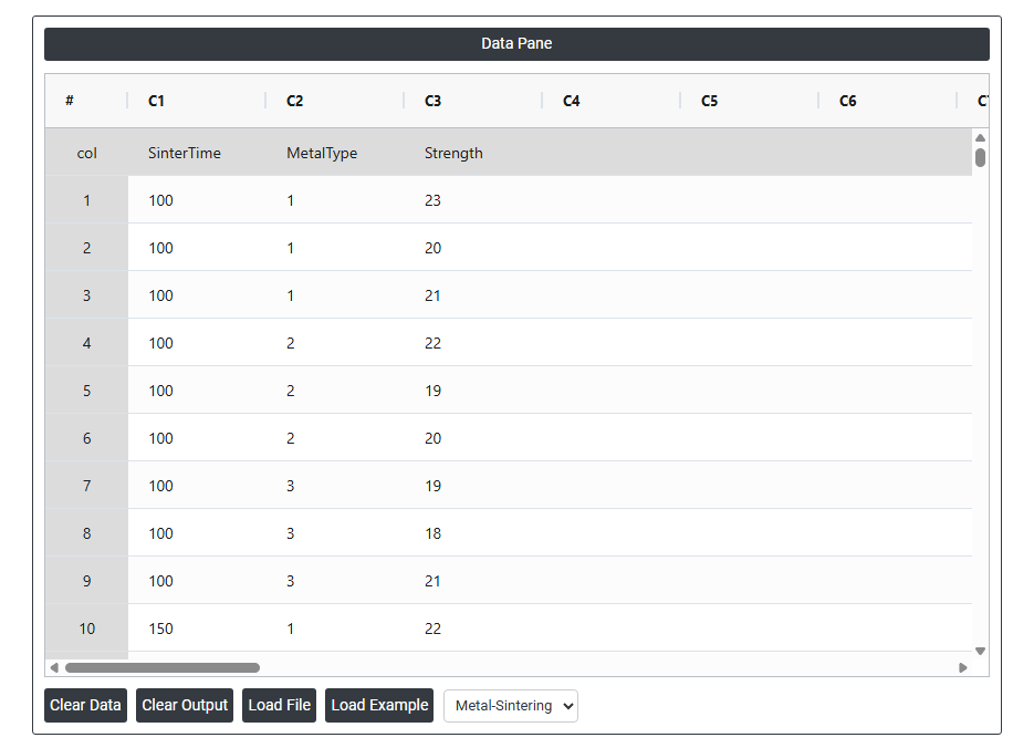
An engineer wants to assess the relationship between sintering time and the compressive strength of three different metals. The engineer measures the compressive strength of five specimens of each metal type at each sintering time: 100 minutes, 150 minutes, and 200 minutes. The engineer performs a general linear model (GLM) ANOVA, and includes a main effects plot in the output. The following steps:
- Gathered the necessary data.
- Now analyses the data with the help of https://qtools.zometric.com/ or https://intelliqs.zometric.com/.
- To find Main Effects Plot choose https://intelliqs.zometric.com/> Statistical module> Anova>Main Effects Plot.
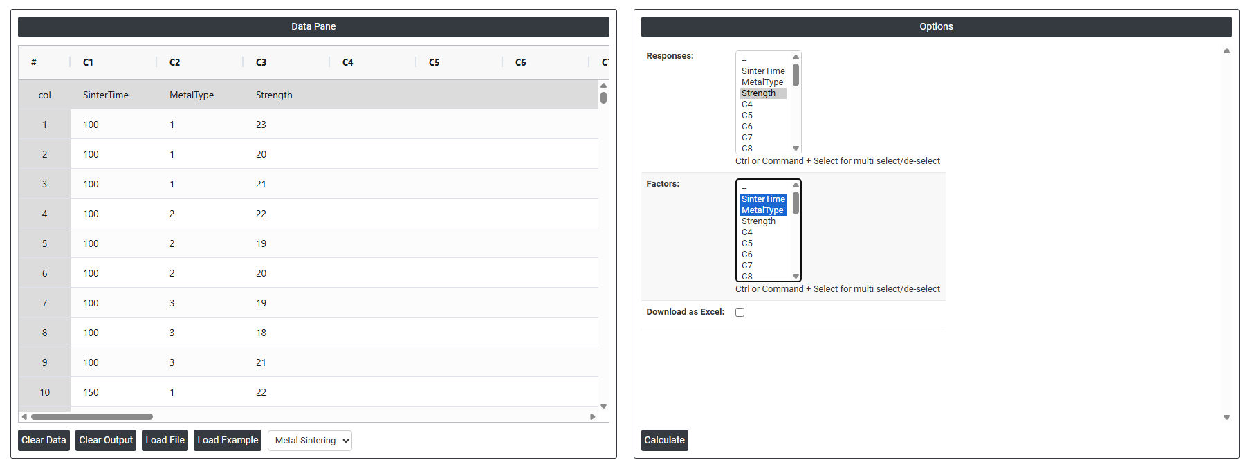
- Inside the tool, feeds the data along with other inputs as follows:
5. After using the above mentioned tool, fetches the output as follows:
How to do Main Effects Plot
The guide is as follows:
- Login in to QTools account with the help of https://qtools.zometric.com/ or https://intelliqs.zometric.com/
- On the home page, choose Statistical Tool> Anova >Main Effects Plot
- Next, update the data manually or can completely copy (Ctrl+C) the data from excel sheet and paste (Ctrl+V) it here.
- Fill the required options.
- Finally, click on calculate at the bottom of the page and you will get desired results.
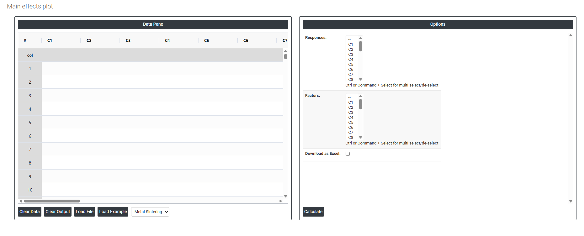
On the dashboard of Main Effects Plot, the window is separated into two parts.
On the left part, Data Pane is present. In the Data Pane, each row makes one subgroup. Data can be fed manually or the one can completely copy (Ctrl+C) the data from excel sheet and paste (Ctrl+V) it here.
Load example: Sample data will be loaded.
Load File: It is used to directly load the excel data.
On the right part, there are many options present as follows:
- Responses Select the column(s) containing your continuous outcome or measurement data the variable you are trying to understand or improve. Use Ctrl or Command + Click to select multiple response columns if you want to generate separate main effects plots for more than one response variable at the same time. Each selected response will produce its own plot showing how the factors influence that particular outcome.
- Factors Select the column(s) that contain the input variables or grouping variables whose effect on the response you want to visualise. Use Ctrl or Command + Click to select multiple factors. Each selected factor will appear as a separate line in the main effects plot showing how the average response changes as you move from one level of that factor to another. Factors can be categorical (e.g. machine type, operator, material) or numeric (e.g. temperature setting, pressure level).
- Download as Excel Exports the underlying data used to generate the main effects plot including the mean response values calculated at each factor level into an Excel file.