What is Moving Average Chart?
A Moving Average Chart monitors the process mean by plotting the average of the most recent group of observations rather than each individual data point. Each plotted value is calculated by averaging a specified number of the latest measurements — called the span — and sliding that window forward by one point each time.
This smoothing effect reduces the impact of random short-term noise in the data, making gradual trends and slow process drifts easier to detect. It is particularly useful when individual measurements are too noisy or variable to reveal a meaningful trend on their own.
When to use Moving Average Chart?
- Use when data is individual continuous measurements and you want to detect slow, gradual shifts rather than sudden jumps.
- Use when individual measurements are noisy or highly variable and a standard I chart produces too many distracting signals.
- Use in processes where trends develop slowly over time — such as tool wear, chemical concentration drift, or gradual equipment degradation.
- Use when the span (number of points to average) is set appropriately — a span of 3 to 10 is common depending on how much smoothing is needed.
Guidelines for correct usage of Moving Average Chart
- Choose a span that balances smoothing and responsiveness — a small span (e.g. 3) reacts quickly but smooths less; a large span (e.g. 10) smooths more but is slower to detect shifts.
- Collect data in time order — the moving average is meaningless if data is not sequentially recorded.
- Be aware that the moving average chart is not as sensitive to sudden, sharp shifts as a standard I chart — use CUSUM or EWMA for detecting abrupt changes.
- Data points used in the moving average are not independent of each other since they share overlapping observations — this is expected and by design.
- Establish control limits using at least 20 to 25 data points before interpreting the chart for process signals.
Alternatives: When not to use Moving Average Chart
- If you need to detect sudden, large process shifts quickly, use I-MR Chart or Xbar-R Chart instead — they react faster to abrupt changes.
- If you need to detect very small, sustained shifts with high sensitivity, use CUSUM or EWMA Chart instead — they are more powerful for small shifts.
- If data is collected in subgroups rather than individual measurements, use Xbar-R or Xbar-S Chart
- If the response is attribute data (proportions or counts), use appropriate attribute charts such as P, NP, C, or U charts
Example of Moving Average Chart?
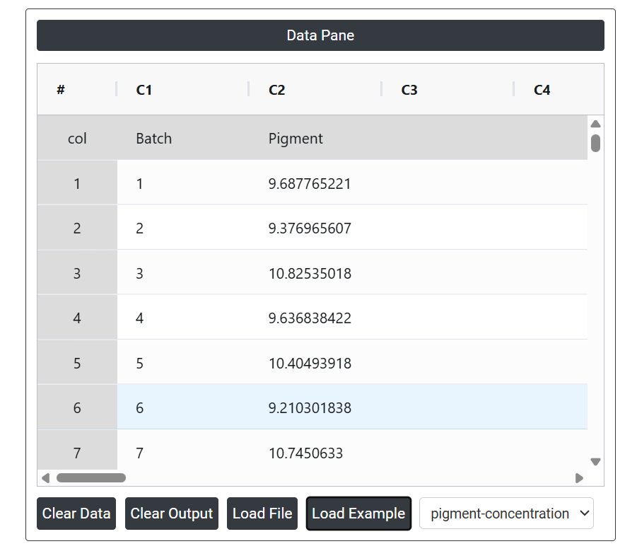
A quality engineer at a plastic manufacturing company wants to ensure that their batch process remains under control. To achieve this, the engineer measures the pigment concentration in each of the 35 batches. The following steps:
- Gathered the necessary data.
- Now analyses the data with the help of https://qtools.zometric.com/ or https://intelliqs.zometric.com/.
- To find Moving Average Chart choose https://intelliqs.zometric.com/> Statistical module> Control Chart > Moving Average Chart.
- Inside the tool, feed the data along with other inputs as follows:
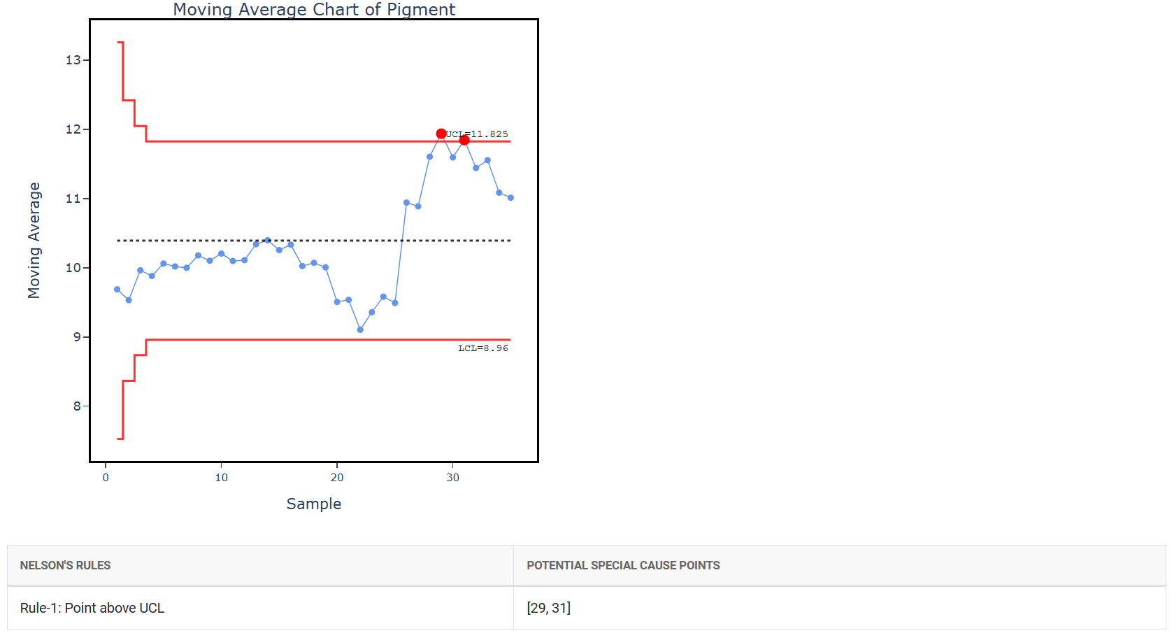
5. After using the above-mentioned tool, fetches the output as follows:
How to generate Moving Average Chart?
The guide is as follows:
- Login in to QTools account with the help of https://qtools.zometric.com/ or https://intelliqs.zometric.com/
- On the home page, choose Statistical Tool> Control Chart > Moving Average Chart.
- Next, update the data manually or can completely copy (Ctrl+C) the data from excel sheet or paste (Ctrl+V) it or else there is say option Load Example where the example data will be loaded.
- Finally, click on calculate at the bottom of the page and you will get desired results.
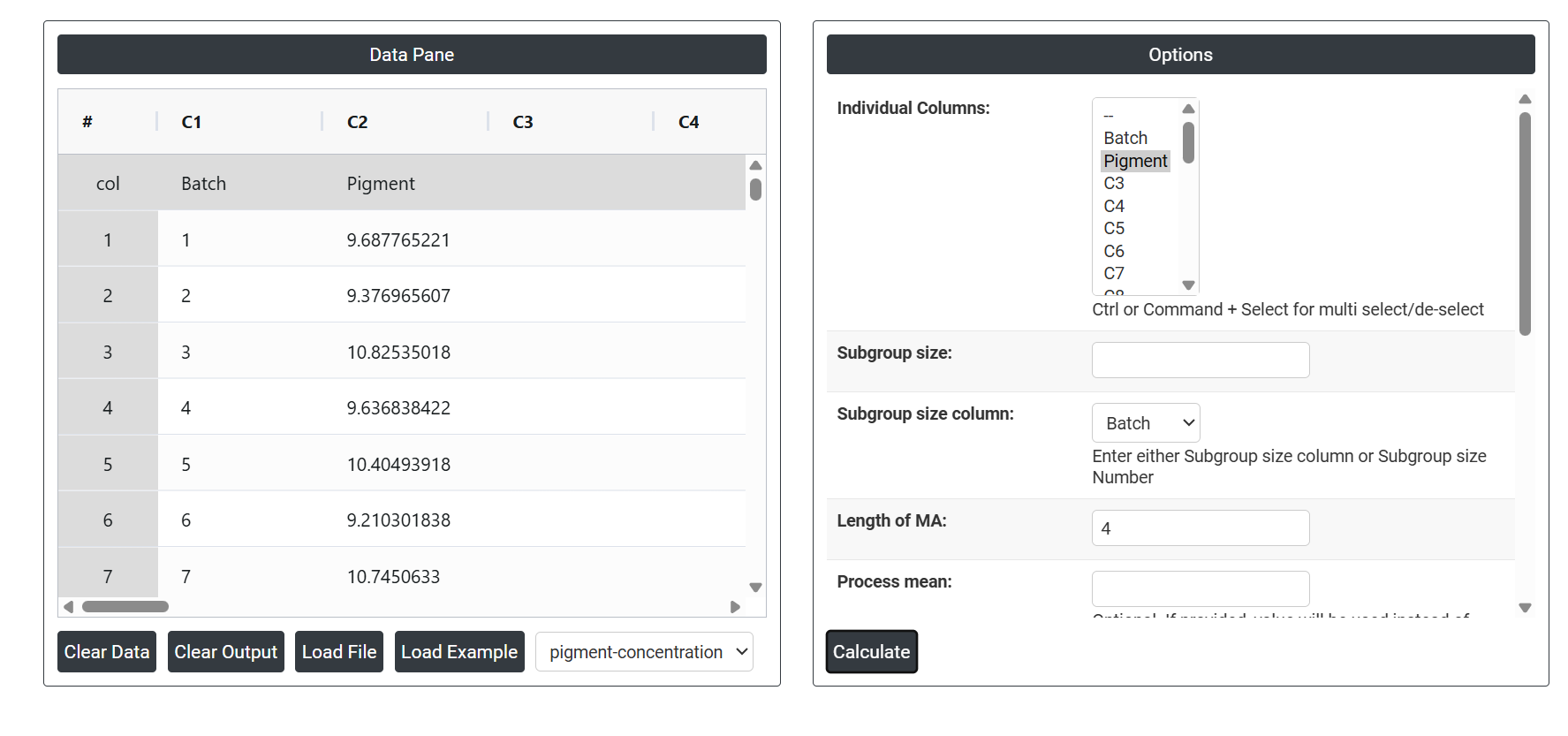
On the dashboard of Moving Average Chart the window is separated into two parts.
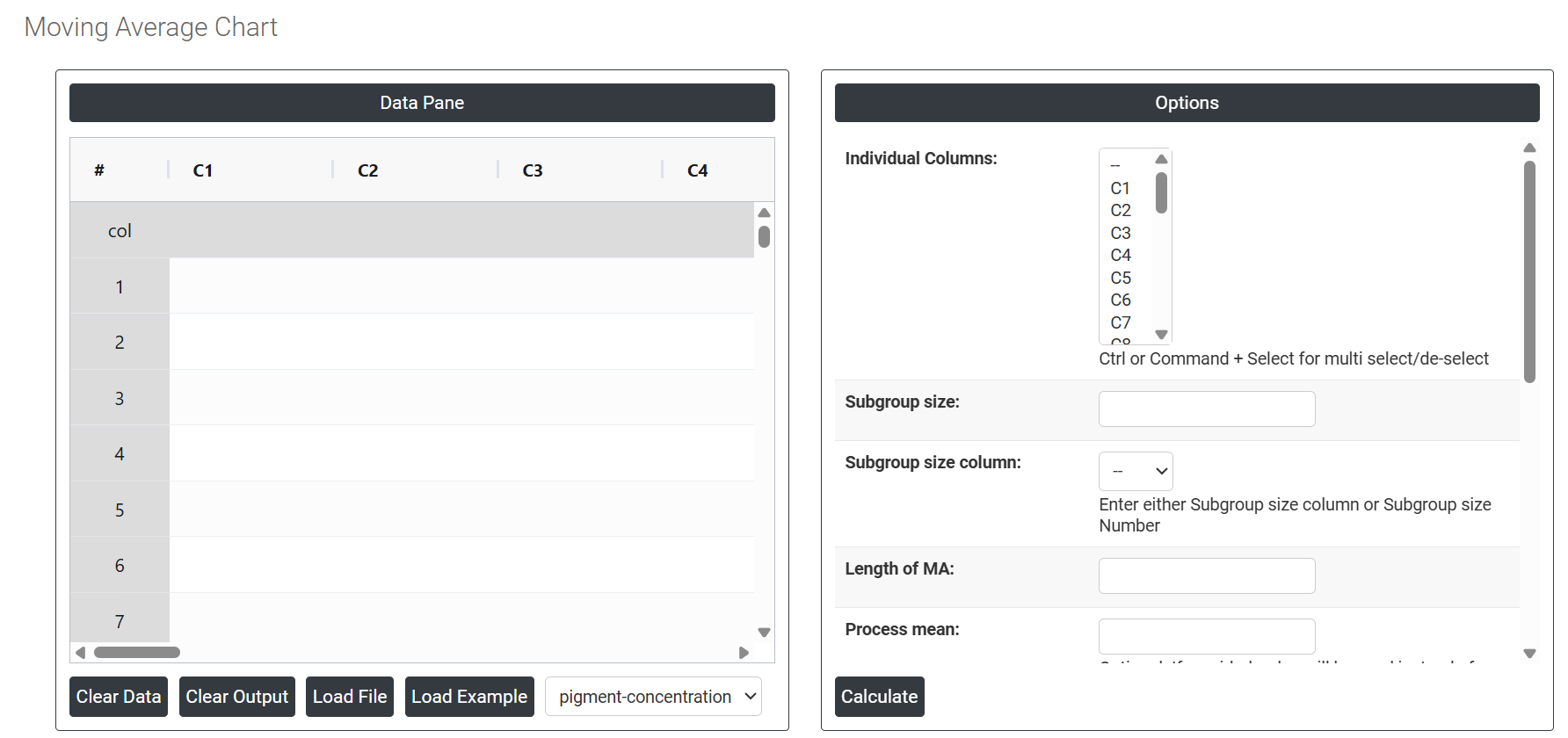
On the left part, Data Pane is present. In the Data Pane, each row makes one subgroup. Data can be fed manually or the one can completely copy (Ctrl+C) the data from excel sheet and paste (Ctrl+V) it here.
Load example: The sample data will be loaded.
Load File: It is used to directly load the excel data.
On the right part, there are many options present as follows:
- Individual Columns: Select the column(s) containing your measurement data. Use Ctrl or Command + Click to select multiple columns at once. These are the actual observed values — such as dimensions, weights, or any continuous quality characteristic — that the chart will use to calculate the moving averages and plot over time.
- Subgroup Size: Enter a fixed number if all subgroups contain the same number of observations. When subgroup size is 1, the chart treats each row as an individual measurement. When subgroup size is greater than 1, the chart first calculates the average of each subgroup and then applies the moving average to those subgroup means.
- Subgroup Size Column: Select the column that defines subgroup membership when subgroup sizes vary between time periods. Either this field or the Subgroup Size Number must be provided — not both. Use this option when the number of observations per subgroup changes throughout the dataset.
- Length of MA: Defines the span — the number of consecutive data points averaged together to form each plotted moving average value. A smaller span (e.g. 3) reacts more quickly to process changes but provides less smoothing. A larger span (e.g. 10) smooths out more noise and reveals gradual trends more clearly but is slower to respond to sudden shifts. Choose a span that matches how quickly your process is expected to change.
- Process mean: It is the average value of a set of measurements or observations from a process. It represents the central tendency of the process data over time and is a key indicator of the process performance. If not, Zometric Q-Tools calculates the centerline from the data provided.
- Process SD: Optional. If you have a known or historically validated standard deviation for the process, enter it here. When provided, this value is used directly to calculate control limits rather than estimating spread from the current data — useful when you want the chart to reflect a well-established process baseline.
-
SD Estimation Method for Subgroup Size = 1 Controls how standard deviation is estimated when data consists of individual measurements (subgroup size of 1). Two options are available:
- Average Moving Range — estimates standard deviation by averaging the moving ranges between consecutive observations. This is the standard default and works reliably for most processes.
- Median Moving Range — uses the median of the moving ranges instead of the average, making the estimate more resistant to the influence of outliers or unusual spikes in the data.
- SD Estimation method for Between subgroup: This leaves the user with two choices for the calculation. Choosing average moving range as the estimation method or median moving range method changes the result.
- Average moving range Sd estimation method: It involves calculating the difference between consecutive values in a data set and then taking the average of those differences.
- Median moving range Sd estimation method: The MMR is calculated by taking the median of the moving ranges between consecutive data points.
-
SD Estimation Method for Subgroup Size > 1 Controls how standard deviation is estimated when data is collected in subgroups of two or more. Three options are available:
- Pooled Stdev — combines the standard deviations from all subgroups into a single pooled estimate, giving a stable and accurate overall measure of within-subgroup variation.
- Rbar — estimates standard deviation from the average of subgroup ranges. Simpler to calculate and reliable for subgroup sizes of 2 to 8.
- Sbar — estimates standard deviation from the average of subgroup standard deviations. More accurate than Rbar for subgroup sizes greater than 8.
- Length Moving Range: Defines how many consecutive subgroup means are used to calculate each moving range value. The default is 2, meaning each moving range is the absolute difference between two consecutive subgroup averages. Increasing this value smooths the estimate but reduces sensitivity to short-term shifts.
-
Use Unbiasing Constant: When checked, applies a statistical correction factor to remove the small mathematical bias that naturally occurs when estimating standard deviation from sample data. This improves the accuracy of control limit calculations and is recommended to keep enabled in most situations.
- Check Rule 1: 1 point > K Stdev from center line: Test 1 is essential for identifying subgroups that significantly deviate from others, making it a universally recognized tool for detecting out-of-control situations. To increase sensitivity and detect smaller shifts in the process, Test 2 can be used in conjunction with Test 1, enhancing the effectiveness of control charts.
- X Scale: Controls how the horizontal axis of the chart is labelled and displayed. You can adjust this to show time stamps, observation numbers, batch identifiers, or custom labels — making the chart easier to read and directly traceable to specific production events or time periods.