Pareto Chart
What is Pareto Chart?
A Pareto chart, a specialized bar chart, visually depicts the Pareto principle (80/20 rule) in prioritizing problems or causes. It displays bars representing categories or nominal variables ordered by their frequency counts, with the highest frequency on the left. This prioritization helps identify the "vital few" factors contributing to most of the effects (approximately 80%), enabling focused improvement efforts on these key areas.
When to use Pareto Chart?
The Pareto chart is particularly useful in the following situations:
- Problem Solving: Identify the most significant problems to address.
- Quality Control: Determine which defects to prioritize.
- Process Improvement: Highlight key areas for improvement.
- Decision Making: Focus efforts and resources on the most impactful issues.
In summary, a Pareto chart is a valuable tool for prioritization, problem-solving, root cause analysis, quality improvement, decision-making, and performance evaluation. It is most effective when dealing with complex data sets and when you want to identify and concentrate on the factors that have the most significant impact.
Guidelines for correct usage of Pareto Chart
- Collect summary data or raw data.
- Summarized data represents categories and can be in the form of counts or calculated values like means.
- Raw data represents individual occurrences or defects, with each observation in a separate row.
- Create a chart using either summarized data or raw data.
- Ensure the validity of your results by following the mentioned guidelines.
Alternatives: When not to use Pareto Chart
- Non-Discrete Data: If the data is continuous or not easily categorized into distinct groups, a Pareto may not be suitable.
- Small Data Sets: When you have a very small sample size, the Pareto chart may not provide meaningful insights, as the distribution of issues or causes might not be significant enough to show a clear Pareto principle (80/20 rule).
- Qualitative Data: Qualitative data or categorical data without a natural order or ranking, a Pareto chart may not be effective.
- Lack of Variation: If all data points are relatively similar or show little variation, a Pareto chart might not help in identifying the most critical issues. The differences between the items would be too subtle to discern any clear pattern.
- Histogram: Histograms are especially helpful when dealing with large datasets and continuous variables, whereas Pareto charts are more suitable for discrete variables.
- Bar Chart: Bar charts are effective when you want to show a clear comparison between different groups, whereas Pareto charts prioritize items based on cumulative frequencies or impact.
- Scatter Plot: Scatter plots are commonly used in statistical analysis and research to examine the strength and direction of relationships, whereas Pareto charts focus on the frequency or impact of individual items.
- Box Plot: Box plots are useful when you want to compare distributions or identify the spread and skewness of data. They are particularly valuable when dealing with large datasets and multiple variables, while Pareto charts are more suitable for prioritization purposes.
Example of Pareto Chart
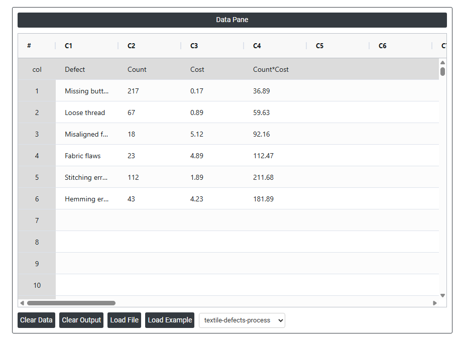
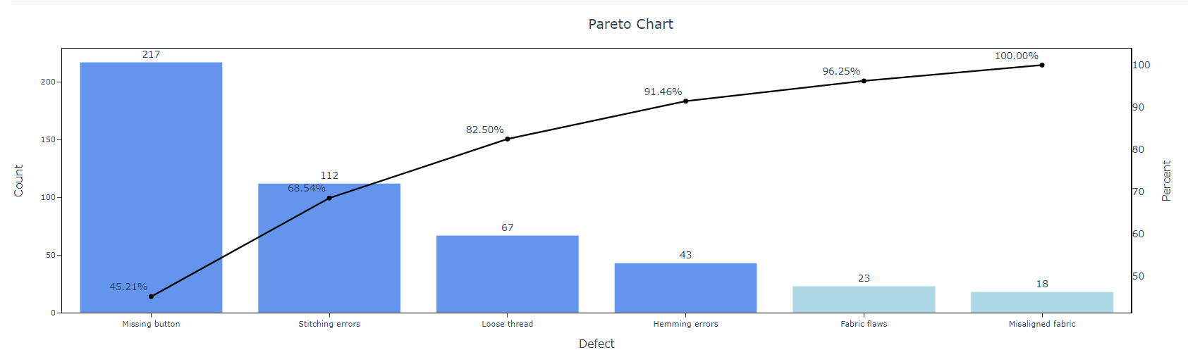
To prioritize improvement projects, an inspector from a clothing manufacturer examines various sources of clothing defects. The inspector carefully monitors and records the quantity and nature of these defects throughout the manufacturing process.
Subsequently, an engineer utilizes the data collected by the inspector to develop a Pareto chart. This chart helps to prioritize the defects identified by the inspector, highlighting the most significant or frequently occurring issues that require immediate attention. The following steps:
- Gathered the necessary data.
- Now analyses the data with the help of https://qtools.zometric.com/ or https://intelliqs.zometric.com/.
- To find pareto chart choose https://intelliqs.zometric.com/> Statistical module> Graphical analysis> Pareto Chart.
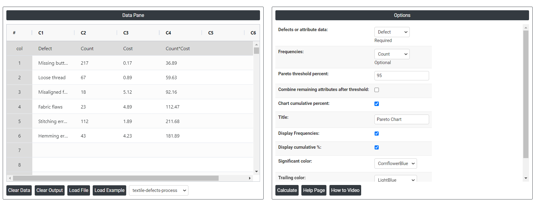
- Inside the tool, feed the data along with other inputs as follows:
- After using the above mentioned tool, fetches the output as follows:
How to do Pareto Chart
The guide is as follows:
- Login in to QTools account with the help of https://qtools.zometric.com/ or https://intelliqs.zometric.com/
- On the home page, choose Statistical Tool> Graphical analysis >Pareto Chart.
- Next, update the data manually or can completely copy (Ctrl+C) the data from excel sheet or paste (Ctrl+V) it or else there is say option Load Example where the example data will be loaded.
- Next, you need to map the columns with the parameters.
- Finally, click on calculate at the bottom of the page and you will get desired results.
On the dashboard of Pareto Chart, the window is separated into two parts.
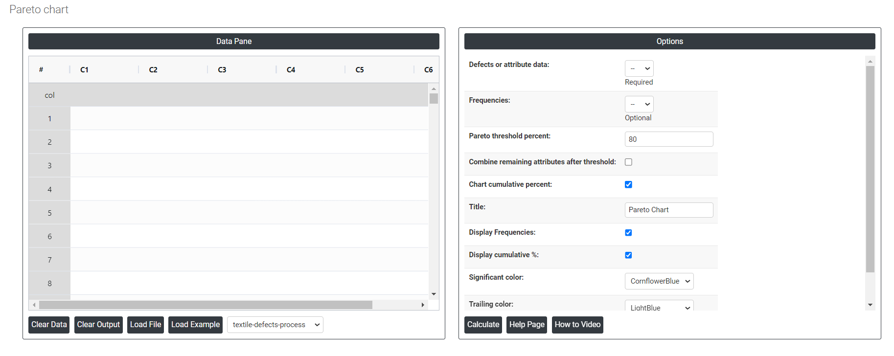
On the left part, Data Pane is present. In the Data Pane, each row makes one subgroup. Data can be fed manually or the one can completely copy (Ctrl+C) the data from excel sheet and paste (Ctrl+V) it here.
Load example: Sample data will be loaded.
Load File: It is used to directly load the excel data.
On the right part, there are many options present as follows:
- Defects or attribute data: In a Pareto chart, attribute data refers to qualitative or categorical data that describes the characteristics or attributes of a particular item or category. It refers to refer to the specific types of issues or categories being analyzed for their frequency and impact. Attribute data is non-numeric and typically represented by labels, categories, or discrete values.
- Frequencies: In a Pareto chart, frequencies represent the number of occurrences or observations of a specific category or event.
- Pareto threshold percent: In a Pareto chart, the Pareto threshold percent refers to the percentage value that is used to determine the cutoff point for identifying significant contributors. The Pareto threshold percent is the point on the chart where the cumulative percentage of the factors reaches or exceeds the specified threshold. It helps determine which factors contribute significantly to the overall effect.
- Combining remaining attributes after threshold: In a Pareto chart, combining remaining attributes after a certain threshold means grouping together all the attributes or categories that fall below a specified threshold and treating them as a single category or group. This is done to simplify the chart and focus on the most significant contributors.
- Chart cumulative percent: In a Pareto chart, the cumulative percent refers to the cumulative percentage of the total value or frequency represented by each category or group in the chart. It helps in analyzing the contribution of each category to the overall total.
- Significant color: The significant color is used to highlight the most important categories or defects that contribute to the largest portion of the problem. This helps to quickly identify which areas need the most attention.
- Trailing color: The color used for the cumulative line that runs across the chart, illustrating the cumulative percentage of the total number of defects or occurrences. This line helps visualize the concept of the Pareto Principle, where a small number of causes often account for the majority of the problems.
- Download as Excel: This will display the result in an Excel format, which can be easily edited and reloaded for calculations using the load file option.