What is Run chart?
A Run Chart is one of the simplest and most powerful time-series tools in process analysis. It plots individual data values in the order they were collected over time, with a horizontal median line drawn across the chart. Its purpose is to reveal patterns, trends, shifts, and non-random behaviour in the process that would be completely invisible if the data were analysed as a static group without time context.
Unlike a control chart, a run chart does not use statistically calculated control limits. Instead, it applies probability-based pattern tests to the sequence of data points — making it simpler to construct and ideal for early process monitoring before enough data exists to build a formal control chart.
When to use Run chart?
- Use when you want to monitor a process over time and detect whether measurements are behaving randomly or showing signs of systematic change.
- Use in the early stages of process monitoring before you have enough data to calculate statistically valid control chart limits.
- Use when you want a simple, easy-to-explain visual for communicating process behaviour to a team or management without complex statistics.
- Use to verify that a process improvement has been sustained over time after a corrective action has been implemented.
Run Chart Pattern Tests
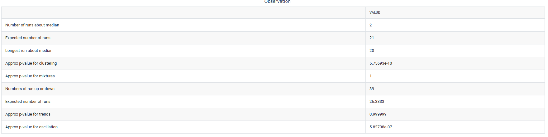
A run chart applies four probability-based tests to detect non-random patterns. A flag is raised when the pattern is statistically unlikely to occur by pure chance:
| Pattern Detected | What It Signals |
| Clustering | Too few runs — data groups on one side, suggesting process shifts or stratified data sources |
| Mixtures | Too many runs — data alternates excessively, suggesting two data sources being combined |
| Trends | Long consecutive sequences all moving in one direction — tool wear, drift, or degradation |
| Oscillation | Data alternates up and down regularly — over-adjustment or cyclic process effects |
Guidelines for correct usage of Run chart
- Always record and plot data in the exact order it was collected — rearranging data by value or category destroys the time-based information the chart depends on.
- Collect at least 20 to 25 data points for the probability-based pattern tests to produce reliable and meaningful results.
- The run chart uses the median as the centre line — not the mean — making it more robust against the influence of extreme outliers.
- A run chart detects non-random patterns — it does not replace a control chart once enough data exists to calculate statistically valid control limits.
- Investigate every flagged pattern for a root cause — a signal always means the process is behaving non-randomly, and that always has an explanation.
Alternatives: When not to use Run chart
| Situation | Use Instead |
| Sufficient data exists for statistically valid limits | Control Chart (I-MR, Xbar-R, P chart, etc.) |
| Need to detect very small sustained shifts | CUSUM or EWMA Chart |
| Data is not collected or recorded in time order | Histogram or Descriptive Statistics |
| Need to compare variation across multiple groups | Multi-Vari Chart or Boxplot |
| Response is attribute data (pass/fail counts) | P Chart, NP Chart, or Laney P’ Chart |
Example of Run chart
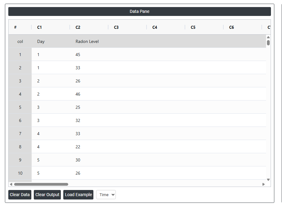
A quality engineer aims to assess the consistency of a radon detection device by recording radon levels twice daily over 20 days. To explore potential trends, the engineer creates a run chart to check for nonrandom patterns in the membrane device measurements. The following steps:
- Gathered the necessary data.
- Now analyses the data with the help of https://qtools.zometric.com/ or https://intelliqs.zometric.com/.
- To find Run chart choose https://intelliqs.zometric.com/> Statistical module> Graphical analysis > Run chart.
- Inside the tool, feed the data along with other inputs as follows:
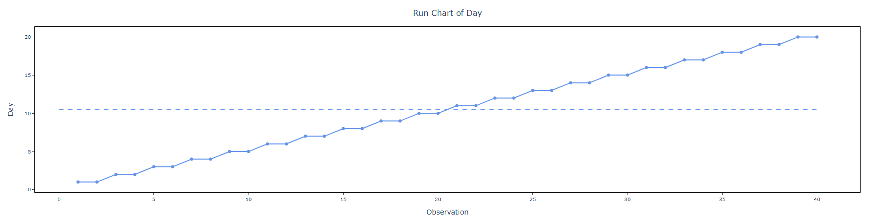
6. After using the above-mentioned tool, fetches the output as follows:
How to do Run chart
The guide is as follows:
- Login in to QTools account with the help of https://qtools.zometric.com/ or https://intelliqs.zometric.com/
- On the home page, choose Statistical Tool> Graphical analysis >Run chart.
- Next, update the data manually or can completely copy (Ctrl+C) the data from excel sheet or paste (Ctrl+V) it or else there is say option Load Example where the example data will be loaded.
- Next, you need to fill the required options.
- Finally, click on calculate at the bottom of the page and you will get desired results.
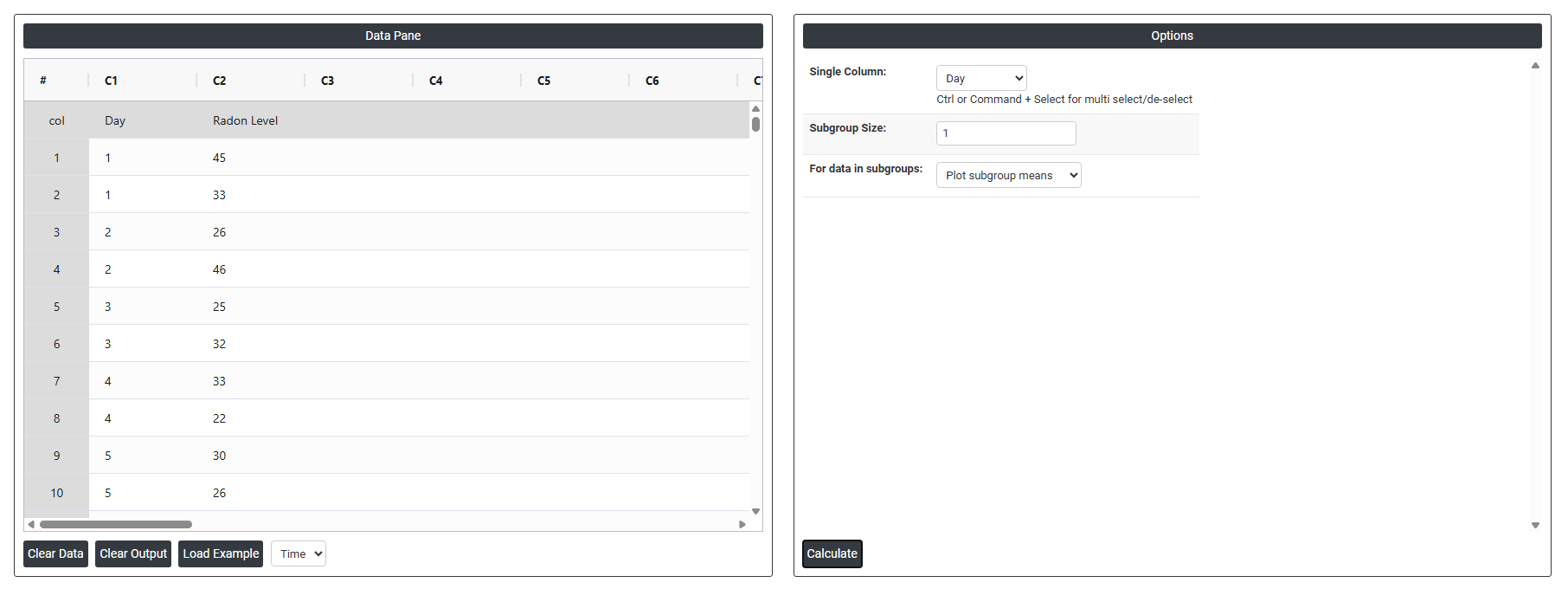
On the dashboard of Run chart, the window is separated into two parts.
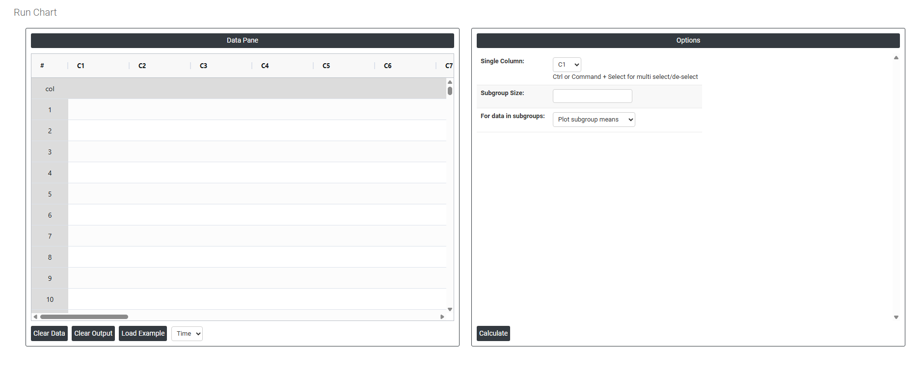
On the left part, Data Pane is present. In the Data Pane, each row makes one subgroup. Data can be fed manually or the one can completely copy (Ctrl+C) the data from excel sheet and paste (Ctrl+V) it here.
Load example: Sample data will be loaded.
On the right part, we just need to give:
- Single Column The column that contains the data you want to plot. For example, if you are tracking daily Radon levels, you select the Radon Level column here. The chart will then plot each value in the exact order it was recorded, from first to last.
- Subgroup Size Tells the chart how many consecutive data points to group together at each time point. If you enter 1, every single row is plotted as its own individual point — the most common setting. If you enter 5, the tool groups every 5 rows together and plots their average as one point. For example, if you take 5 Radon readings every day, entering 5 would plot one daily average per point instead of 5 separate dots.
For data in subgroups This option becomes relevant only when your subgroup size is greater than 1. It controls how the grouped data is handled and displayed on the chart. If your data is simply one reading per row in time order, you do not need this setting — a subgroup size of 1 covers everything you need. - Plot Subgroup Means Each point on the chart represents the average of all values within that subgroup. For example, if your subgroup size is 5 and your five Radon readings for Monday are 2, 4, 3, 5, 6 the chart plots a single point at 4.0 (the average of those five values). Use this when you want to track the typical center of your process at each time point and smooth out the individual variation within each group.
- Plot Subgroup Medians Each point on the chart represents the middle value of that subgroup when the readings are sorted in order. Using the same example — readings 2, 3, 4, 5, 6 sorted in order the chart plots a single point at 4 (the middle value). Use this when your data has occasional extreme values or outliers that you do not want pulling the plotted point up or down. The median is less sensitive to those extremes than the mean.