What is Scatter Plot 2D?
A 2D Scatter Plot is a type of data visualization that represents the relationship between two continuous variables in a two-dimensional (2D) space. Each data point in the plot corresponds to an ordered pair of values for the two variables, plotted on the Cartesian coordinate plane. The x-axis typically represents one variable, while the y-axis represents the other. The position of each point in the plot indicates the specific values of both variables for that particular data point.
When to use Scatter Plot 2D?
Here are some situations where a 2D scatter plot is particularly useful:
- Relationship exploration: Scatter plots help in understanding the relationship between two variables. They can reveal if there is a positive or negative correlation, a linear or nonlinear relationship, or if there is no apparent relationship at all.
- Outlier detection: Scatter plots can highlight any outliers in the data. Outliers are data points that significantly deviate from the general pattern, and they can provide valuable insights or indicate potential errors or anomalies in the dataset.
- Cluster identification: Scatter plots can reveal the presence of clusters or groups within the data. If certain data points tend to cluster together, it suggests that they share similar characteristics or exhibit similar behavior.
- Comparison of groups: Scatter plots can be used to compare the distribution or relationship between two variables across different groups or categories. By assigning different colors or symbols to each group, it becomes easier to analyze any differences or similarities between them.
- Trend visualization: Scatter plots can help visualize trends over time or another continuous variable. By plotting the data points in chronological or sequential order, patterns such as increasing or decreasing trends can be identified.
- Data distribution: Scatter plots provide insights into the distribution of data points along the two variables. They can reveal the concentration or dispersion of data points, giving an indication of the spread and density of the data.
Guidelines for correct usage of Scatter Plot 2D
- Data for an effective graph should consist of one or more pairs of numeric or date/time columns.
- Each pair of columns should have the same number of rows.
- Up to three columns of categorical data can be included for grouping.
- The sample size should be medium to large for clearer patterns in the data.
- A scatterplot with a fitted regression line is most effective with a sample size of approximately 40 or greater.
- The fitted regression line may be less accurate if the sample size is less than 40.
- Randomly selecting the sample data is important for making generalizations about the population.
- Non-randomly collected data may not accurately represent the population.
- Record the data in the order it is collected to evaluate time-related patterns.
Alternatives: When not to use Scatter Plot 2D
- Time Series Plot: A Time Series Plot is suitable when you have data collected in chronological order at regular intervals and you want to visualize the data over time.
Example of Scatter Plot 2D
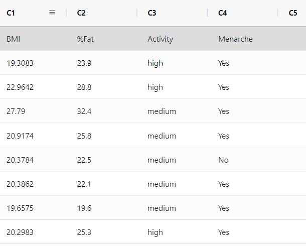
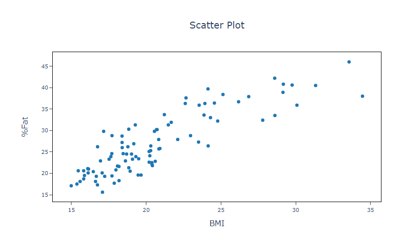
The researcher, who specializes in medical studies, focuses on examining obesity among teenage girls. Due to the challenges and costs associated with directly measuring body fat percentage, the researcher aims to ascertain the effectiveness of body mass index (BMI) as a reliable indicator of body fat percentage. To achieve this, the researcher gathers data on BMI, body fat percentage, and additional personal factors from a group of 92 adolescent girls. As a preliminary step in the investigation, the researcher constructs a scatterplot depicting the correlation between body fat percentage and BMI, allowing for an evaluation of the relationship between these two variables. The following steps:
- Gathered the necessary data.
- Now analyses the data with the help of https://qtools.zometric.com/ or https://intelliqs.zometric.com/.
- To find Scatter Plot 2D choose https://intelliqs.zometric.com/> Statistical module> Graphical analysis > Scatter Plot 2D.
- Inside the tool, feed the data along with other inputs as follows:
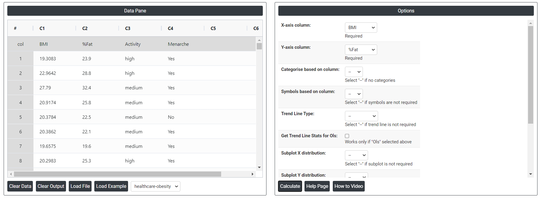
- After using the above mentioned tool, fetches the output as follows:
How to do Scatter Plot 2D
The guide is as follows:
- Login in to QTools account with the help of https://qtools.zometric.com/ or https://intelliqs.zometric.com/
- On the home page, choose Statistical Tool> Graphical analysis >Scatter Plot 2D.
- Next, update the data manually or can completely copy (Ctrl+C) the data from excel sheet or paste (Ctrl+V) it or else there is say option Load Example where the example data will be loaded.
- Next, you need to map the columns with the parameters.
- Finally, click on calculate at the bottom of the page and you will get desired results.
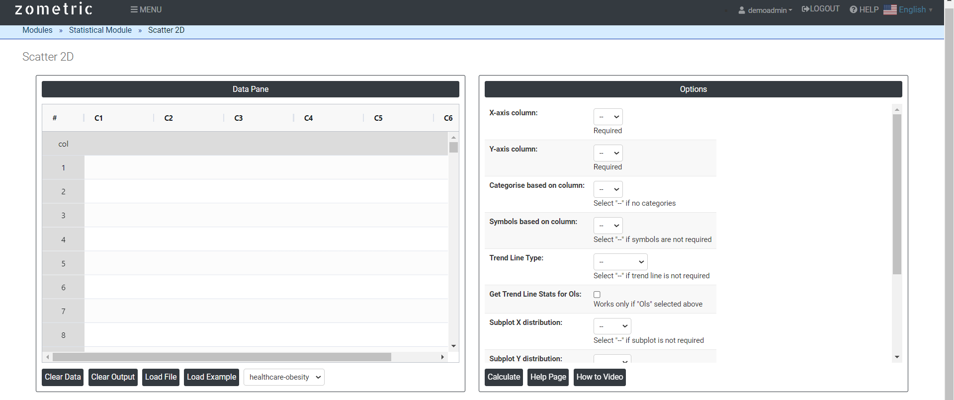
On the dashboard of Scatter Plot 2D, the window is separated into two parts.
On the left part, Data Pane is present. In the Data Pane, each row makes one subgroup. Data can be fed manually or the one can completely copy (Ctrl+C) the data from excel sheet and paste (Ctrl+V) it here.
Load example: Sample data will be loaded.
Load File: It is used to directly load the excel data.
On the right part, there are many options present as follows:
Trend Line Type: In a 2D scatter plot, a trend line, also known as a line of best fit or regression line, is a line that represents the general direction or trend of the data points. It is used to understand the relationship between two variables plotted on the scatter plot.
- OLS: In the context of a scatter plot, an OLS trend line refers to a straight line that represents the best fit of the data points using the OLS method.
- Lowess: The Lowess (Locally Weighted Scatterplot Smoothing) trend line is a non-parametric regression method used to estimate the underlying trend or relationship between two variables. Unlike the OLS trend line, which assumes a linear relationship, the Lowess trend line can capture more complex and nonlinear patterns in the data.
- Expanding: In a 2D scatter plot, an expanding trend line refers to a trend line that adjusts and expands as more data points are added to the plot. Instead of using a fixed set of data points to calculate the trend line, an expanding trend line takes into account all available data points up to the current point being plotted.
Subplot Distribution: The subplot distribution allows for the simultaneous visualization and comparison of multiple scatter plots, making it easier to observe patterns, relationships, or differences between different datasets or variables. Each subplot can represent a different subset of data or a different combination of variables, providing a comprehensive view of the data from different perspectives.
Discrete color sequence: A Discrete Color Sequence refers to a set of distinct colors used to differentiate categorical data points in a plot, such as a 2D scatter plot. This approach is particularly useful when visualizing data with multiple categories or groups, as it allows for clear and immediate distinction between these groups.
Color scale: It allows you to better visualize the data patterns and highlight specific ranges of values.
Download as Excel: This will display the result in an Excel format, which can be easily edited and reloaded for calculations using the load file option.