What is Time Series Plot ?
A Time Series Plot displays data values in the order they were collected over time placing time on the horizontal axis and the measured variable on the vertical axis. Each point is plotted sequentially and connected by a line, making it straightforward to visualise trends, cycles, seasonal patterns, sudden shifts, and unusual observations in the data.
Unlike control charts, a Time Series Plot does not calculate statistical control limits. It is a visual exploration tool often the first step in any time-ordered analysis, providing a clear picture of overall data behaviour before applying more complex methods.
Simple Definitions: A simple line graph that displays your measurements in the order they were collected making trends, patterns, shifts, and unusual points immediately visible at a glance before any formal analysis begins.
When to use Time Series Plot?
- Use as the first step in any time-ordered data analysis to get a visual overview of the data before applying statistical models.
- Use to detect trends, cycles, seasonal patterns, or sudden level shifts in measurements recorded over time.
- Use to identify unusual observations or outliers that may warrant investigation before further analysis.
- Use when you need a simple, easy-to-communicate visual of process or product behaviour over time.
- Use to compare multiple variables over the same time period by overlaying multiple series on the same plot.
Guidelines for correct usage of Time Series Plot
- Plot data in true chronological order out-of-sequence data produces a meaningless graph.
- Label the time axis with meaningful time units dates, shifts, batch numbers, or sequence numbers.
- Use the plot to formulate hypotheses and direct further analysis it is an exploratory tool, not a standalone decision-making tool.
- When comparing multiple series, use different colours or markers with a clear legend.
- Investigate potential causes such as process changes, seasonal effects, or equipment events that align with observed pattern changes.
Alternatives: When not to use Time Series Plot
- If you need to distinguish common cause from special cause variation with statistical control limits, use I-MR, Xbar-R, or appropriate control charts
- If data is not time-ordered and sequence is irrelevant, a histogram, boxplot, or scatter plot is more appropriate.
- If comparing distributions across groups or categories rather than over time, use boxplots or individual value plots
Example of Time Series Plot
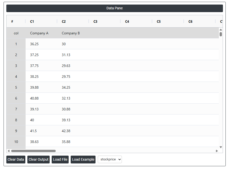
A stock broker analyzes the monthly performance of two stocks over the past two years. To better visualize their trends, the broker creates a time series plot comparing the performance of both stocks. The following steps:
- Gathered the necessary data.
2. Now analyses the data with the help of https://qtools.zometric.com/ or https://intelliqs.zometric.com/.
3. To find Time Series Plot choose https://intelliqs.zometric.com/> Statistical module> TimesSeries >Time Series Plot.
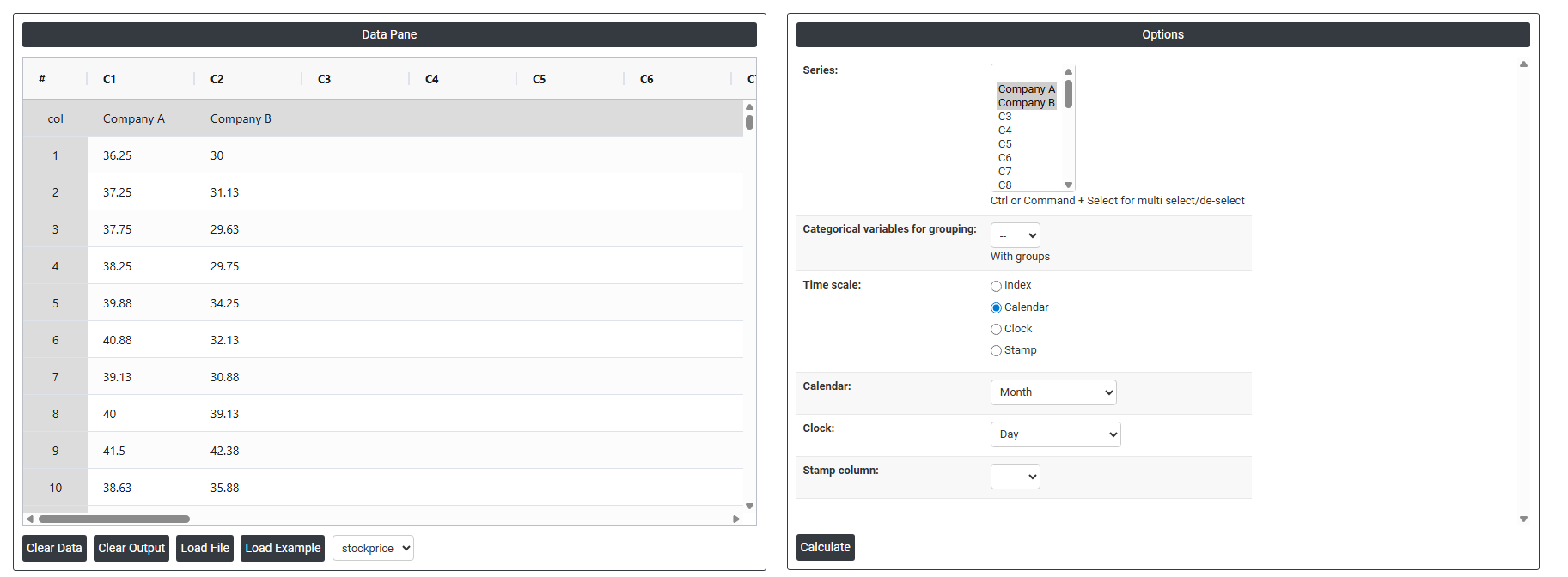
4. Inside the tool, feed the data along with other inputs as follows:
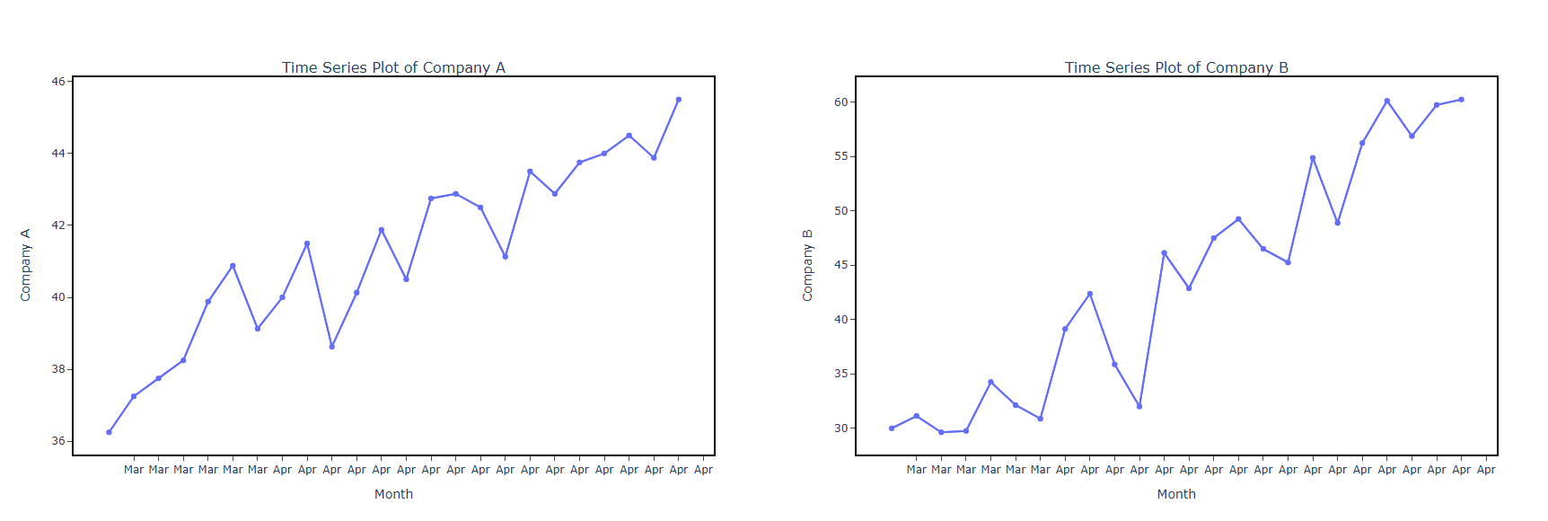
5. After using the above mentioned tool, fetches the output as follows:
How to do Time Series Plot
The guide is as follows:
- Login in to QTools account with the help of https://qtools.zometric.com/ or https://intelliqs.zometric.com/
- On the home page, choose Statistical Tool> TimesSeries >Time Series Plot.
- Next, update the data manually or can completely copy (Ctrl+C) the data from excel sheet or paste (Ctrl+V) it or else there is say option Load Example where the example data will be loaded.
- Next, you need to fill the required options.
- Finally, click on calculate at the bottom of the page and you will get desired results.
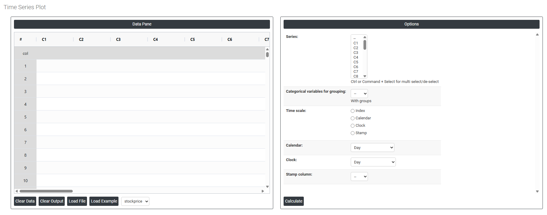
On the dashboard of Time Series Plot, the window is separated into two parts.
On the left part, Data Pane is present. In the Data Pane, each row makes one subgroup. Data can be fed manually or the one can completely copy (Ctrl+C) the data from excel sheet and paste (Ctrl+V) it here.
Load example: Sample data will be loaded.
Load File: It is used to directly load the excel data.
On the right part, there are many options present as follows:
- Series: Select the column(s) containing the data values to be plotted over time. Use Ctrl or Command + Click to select multiple columns if you want to display several variables on the same time axis. Each selected column will appear as a separate line on the plot.
- Categorical Variables for Grouping: Select a column containing group identifiers such as machine, shift, or product type to split the time series into separate lines or panels by group. This makes it easy to compare how different groups behave over the same time period on one plot.
- Time Scale Controls how the horizontal axis is labelled. Three main options are available:
- Index — plots points in simple sequential order (1, 2, 3...) without reference to calendar or clock time. Use when the exact time between observations is unknown or irrelevant.
- Calendar — labels the axis using actual calendar dates. Multiple sub-options allow you to define the scale resolution:
- Day, Month, Quarter, Year — single-unit scales
- Day-Month, Month-Quarter, Month-Year, Quarter-Year, Day-Month-Year, Month-Quarter-Year — combined hierarchical scales that show both a primary and secondary time grouping on the axis
- Clock — Labels the axis using time-of-day values. Sub-options include:
- Day-Hour, Hour-Minute, Minute-Second — for plots where the observation frequency is within a single day
- Day-Hour-Minute, Hour-Minute-Second — for finer time resolution within a day
- Stamp Column — Uses a specific data column as the axis label. Select the column containing date/time stamps or any custom labels you want displayed on the horizontal axis — useful when observation times are irregular or when you want to show specific event identifiers on the axis.