What is View Normal Probability?
A Normal Probability Plot is a graphical diagnostic tool used to assess whether a dataset follows a normal (bell-curve) distribution. It plots your data values against the values that would be expected if the data were perfectly normal. If the data is normally distributed, the points fall approximately along a straight diagonal reference line. Any significant bending, curving, or deviation from that line signals non-normality.
Many statistical methods — including control charts, capability analysis, and regression — assume normally distributed data. The normal probability plot is the fastest and most intuitive way to verify or challenge that assumption before proceeding with further analysis.
Simple Definitions: A diagnostic chart that checks whether your data is normally distributed if the points follow a straight line, the data is normal; if the line bends or curves, it is not.
When to use View Normal Probability?
- Use before running capability analysis, regression, or hypothesis tests that assume normality — to confirm the assumption is valid.
- Use when you suspect your data may be skewed, heavy-tailed, or multimodal and want a visual confirmation before choosing an analysis method.
- Use after applying a transformation (e.g. Box-Cox) to verify that the transformed data is now sufficiently normal for further analysis.
- Use when comparing multiple datasets to visually assess which are normally distributed and which require special handling
Guidelines for correct usage of View Normal Probability
- Look for points that follow the central diagonal reference line closely — minor deviations at the tails are acceptable but significant curves indicate non-normality.
- Use the confidence interval bands displayed on the plot — points within these bands are consistent with normality.
- Complement the visual with a formal normality test such as Anderson-Darling — the p-value confirms what the plot visually suggests.
- Collect at least 20 to 30 data points for the plot to give a reliable and meaningful assessment of distribution shape.
- With fewer than 20 observations, the pattern can appear straight even when data is non-normal — do not rely on small-sample probability plots alone.
Alternatives: When not to use View Normal Probability
| Situation | Use Instead |
| Need to identify which specific distribution fits best | Individual Distribution Identification |
| Need a formal statistical test result for normality | Anderson-Darling or Ryan-Joiner Normality Test |
| Data is attribute-based (counts or proportions) | Not applicable — normality applies to continuous data only |
| Want to visualise overall data shape and spread | Histogram or Graphical Summary |
Example of View Normal Probability
The following steps to be performed for View normal probability distribution :
- Fill the required data input.
- Now analyses the data with the help of https://qtools.zometric.com/ or https://intelliqs.zometric.com/.
- To find View Normal Probability choose https://intelliqs.zometric.com/> Statistical module> Graphical analysis > View Normal Probability.
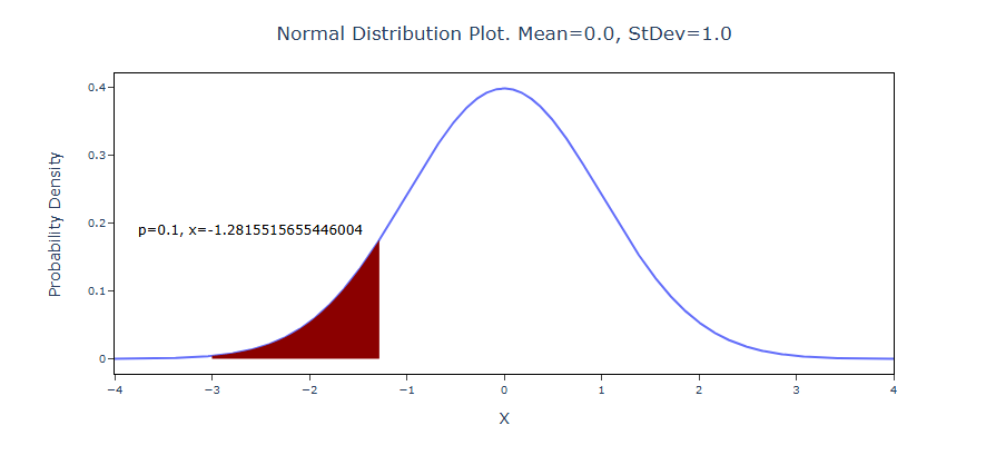
- After using the above-mentioned tool, fetches the output as follows:
How to do View Normal Probability
The guide is as follows:
- Login in to QTools account with the help of https://qtools.zometric.com/ or https://intelliqs.zometric.com/
- On the home page, choose Statistical Tool> Graphical analysis> View Normal Probability.
- Fill the required options.
- Finally, click on calculate at the bottom of the page and you will get desired results.
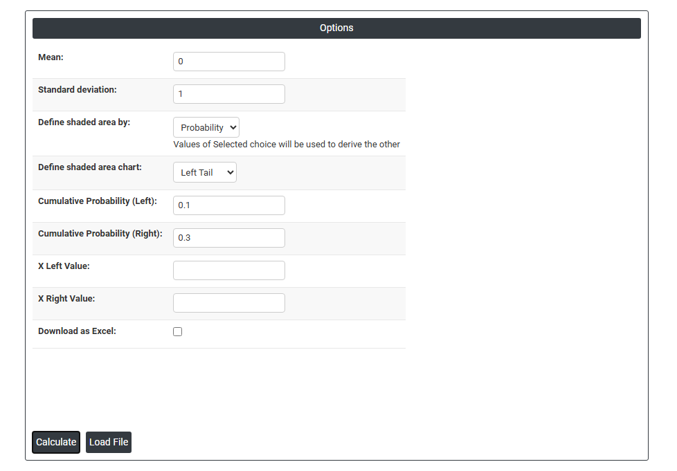
On the dashboard of View Normal Probability, the window is separated into two parts.
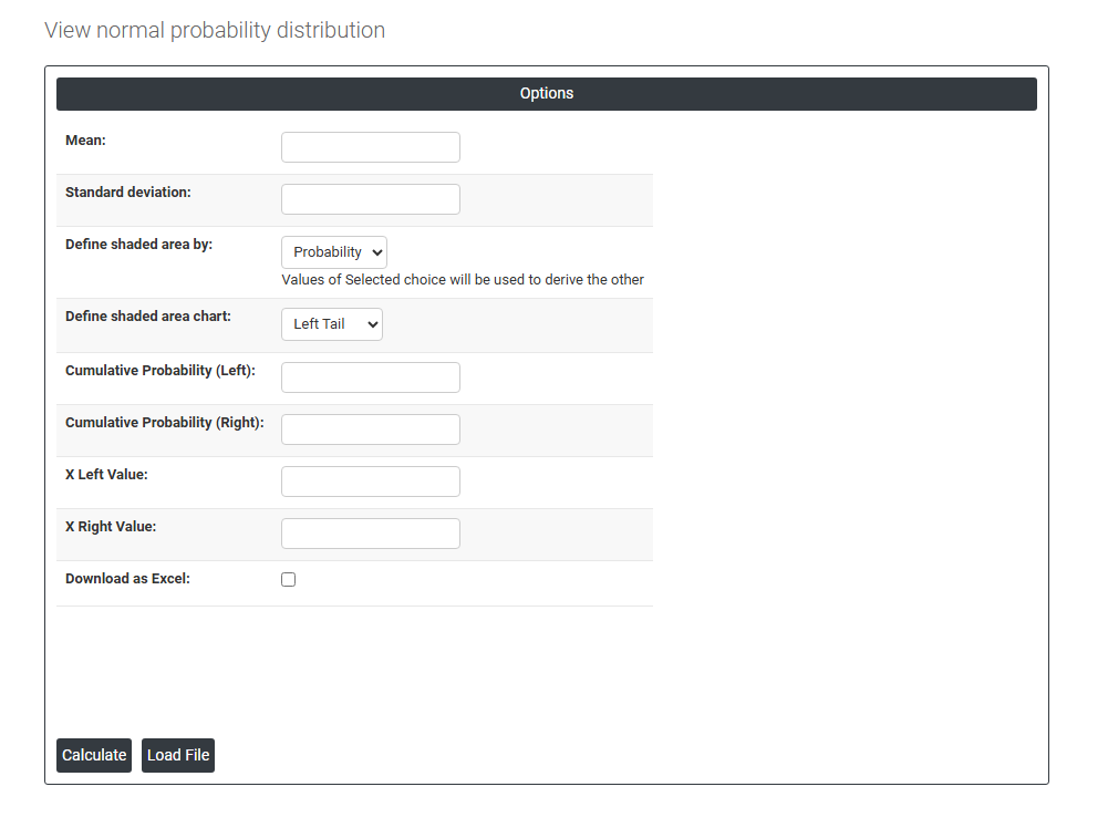
On the required field, we just need to give:
- Mean: The center of the bell curve. This is the average value around which the distribution is symmetric. Moving it shifts the entire curve left or right.
- Standard deviation: Controls how wide or narrow the bell curve is. A smaller value = a tall, tight curve (data clustered near the mean). A larger value = a short, wide curve (data spread out).
- Define shaded area by: This is the core toggle. You can approach the shading from two directions:
Probability — you tell it a probability (e.g., 0.95), and it calculates the X boundaries that enclose that area.
Values — you tell it specific X values (e.g., X = 1.5 and X = 3.0), and it calculates the probability of falling in that range.
- Define shaded area: The shape of the shaded region:
Left tail — shaded region on the left side (below some X value)
Right tail — shaded region on the right side (above some X value)
Two tails — both extremes shaded (used for two-sided hypothesis tests)
Middle — the central region shaded (e.g., a confidence interval)
- Cumulative Probability (Left): The probability that a random value falls to the left of the right boundary. Also written as P(X ≤ x).
- Cumulative Probability (Right): The probability that a random value falls to the right of the left boundary. This is 1 minus the left cumulative probability.
- X Left Value / X Right Value: The actual data values (on the horizontal axis) that define the boundaries of your shaded region.
- Download as Excel: This will display the result in an Excel format, which can be easily edited and reloaded for calculations using the load file option.