What is Xbar Chart ?
When to use Xbar Chart ?
- Use when data is continuous (measured values like dimensions, weight, temperature, pressure)
- Use when measurements are collected in subgroups of 2 or more at regular time intervals
- Use when you want to detect shifts in the process mean over time
- For subgroup sizes 2 to 8, pair with an R chart to also monitor variation
- For subgroup sizes greater than 8, pair with an S chart for more precise variation monitoring
- For individual measurements with no subgroups, use I-MR Chart instead
Guidelines for correct usage of Xbar Chart
- Subgroup size should remain consistent throughout the study — changing subgroup sizes affects control limit calculations and makes the chart unreliable
- Collect a minimum of 25 subgroups before drawing any conclusions about process stability
- Each subgroup should be a rational, homogeneous sample — avoid mixing data from different machines, operators, or shifts within a single subgroup
- Always pair the Xbar chart with an R or S chart — the Xbar chart alone does not tell you whether process variation is stable
- Always check the R or S chart first before interpreting the Xbar chart — if variation is out of control, the Xbar control limits are unreliable
- Data within subgroups should be approximately normally distributed for control limits to be statistically valid
Alternatives: When not to use Xbar Chart
- If data arrives as individual measurements with no subgroups, use I-MR Chart instead
- If subgroup sizes are inconsistent or cannot be standardised, consider I-MR Chart for more reliable results
- If you are monitoring proportion defective or defect counts, use P Chart, NP Chart, C Chart, or U Chart instead
- If data is severely non-normal, apply Box-Cox transformation first before using the Xbar chart
- If you are running short production runs or mixed part types on the same process, use Z-MR Chart instead
- If you only want to monitor variation without tracking the mean, use an R Chart or S Chart independently
Example of Xbar Chart
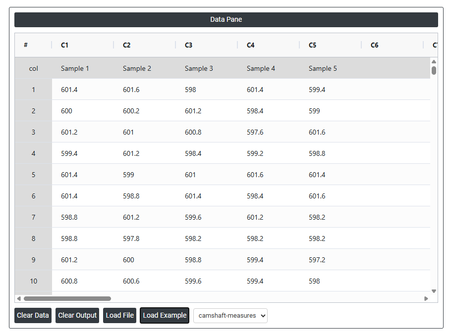
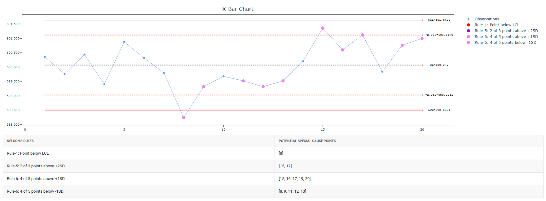
A quality engineer at an automotive parts plant monitors the lengths of camshafts. The engineer collects data in subgroup sizes of 5 every 30 minutes. He is interested in looking for special causes, if any in control chart. 1. Leave the process mean and process std.dev empty as they are unknown as of now. 2. Enable all 8 Nelson's rules. It performs the following steps:
- Gathered the necessary data.
- Now analyses the data with the help of https://qtools.zometric.com/ or https://intelliqs.zometric.com/.
- To find Xbar Chart choose https://intelliqs.zometric.com/> Statistical module> Control Charts>Xbar Chart .
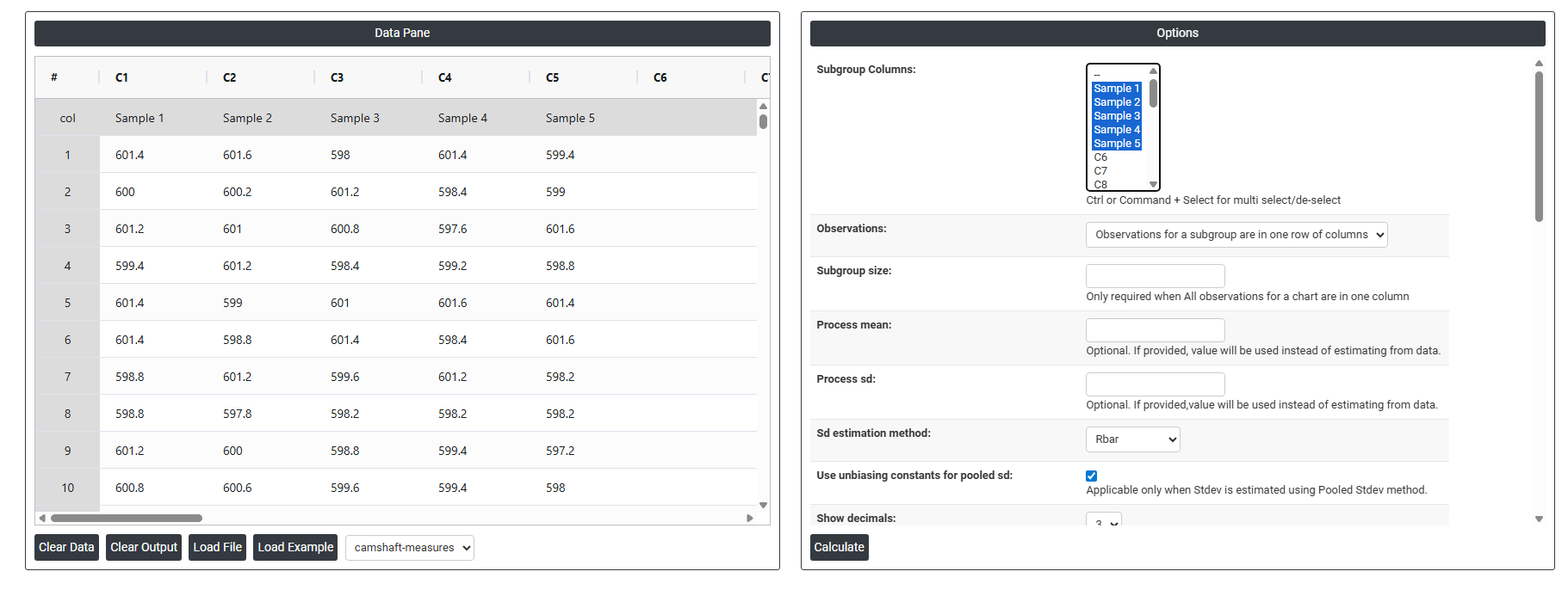
- Inside the tool, feeds the data along with other inputs as follows:
5. After using the above mentioned tool, fetches the output as follows:
How to do Xbar Chart
The guide is as follows:
- Login in to QTools account with the help of https://qtools.zometric.com/ or https://intelliqs.zometric.com/
- On the home page, choose Statistical Tool> Control Charts >Xbar Chart.
- Click on Xbar Chart and reach the dashboard.
- Next, update the data manually or can completely copy (Ctrl+C) the data from excel sheet and paste (Ctrl+V) it here.
- Next, you need to fill the required options .
- Finally, click on calculate at the bottom of the page and you will get desired results.
On the dashboard of Xbar Chart , the window is separated into two parts.
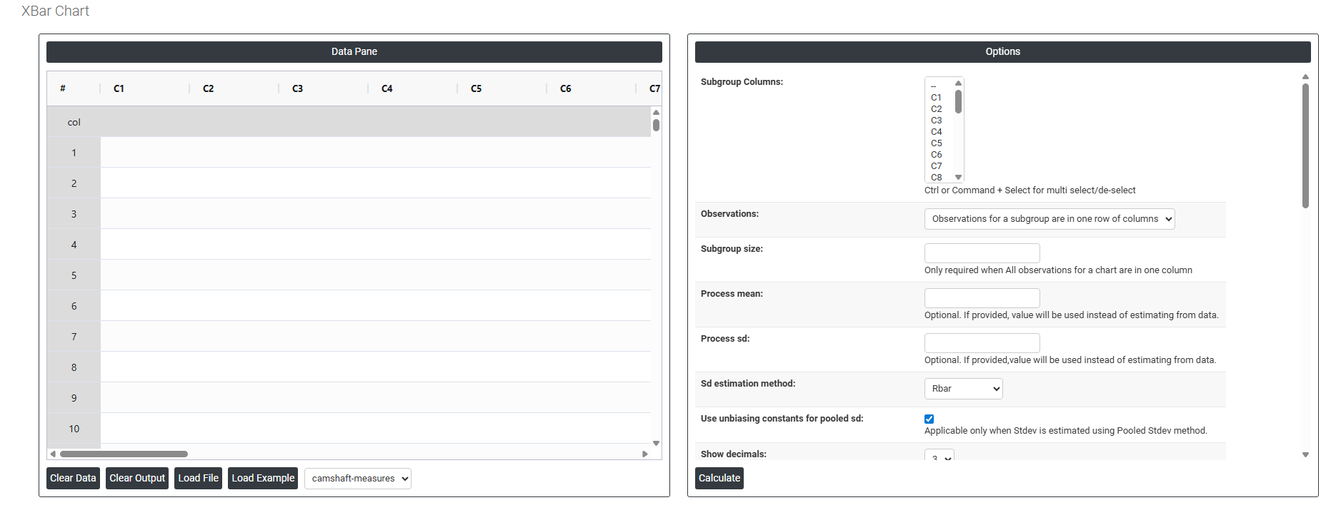
On the left part, Data Pane is present. In the Data Pane, each row makes one subgroup. Data can be fed manually or the one can completely copy (Ctrl+C) the data from excel sheet and paste (Ctrl+V) it here.
Load example: Sample data will be loaded.
Load File: It is used to directly load the excel data.
On the right part, there are many options present as follows:
- Subgroup Columns Allows you to select either a single column or multiple columns depending on how your data is structured. If each subgroup is spread across multiple columns (one column per measurement position), select all those columns. If all measurements are stacked in one column, select that single column and define the subgroup size separately. The selection here directly determines how the chart groups your data for calculating subgroup averages.
- Observations: This setting defines how your data is physically laid out in the worksheet. Choose the option that matches your data structure:
-
- Observations for a subgroup are in one row of columns — each row contains all measurements for a single subgroup, spread across multiple columns. For example, Row 1 has five measurements representing Subgroup 1 across five columns.
- All observations for a chart are in one column — all measurements are stacked vertically in a single column, and the subgroup size field is used to define how many rows belong to each subgroup.
Selecting the wrong layout here will cause the chart to group data incorrectly and produce invalid control limits.
- Subgroup Size Only required when all observations are stored in a single column. This tells the chart how many consecutive rows make up one subgroup. For example, if subgroup size is 5, the chart will treat rows 1–5 as subgroup 1, rows 6–10 as subgroup 2, and so on. If your data is already arranged in multiple columns (one per measurement), this field is not needed as the subgroup size is defined by the number of columns selected.
- Process mean: It is the average value of a set of measurements or observations from a process. It represents the central tendency of the process data over time and is a key indicator of the process performance. If not, Zometric Q-Tools calculates the centerline from the data provided.
- Process sd: It is a measure of the variability or dispersion of the process data around the mean. It provides an indication of how much individual data points within the process differ from the process average. If not, Zometric Q-Tools calculates from the data provided.
- Sd estimation method: This leaves the user with two choices for the calculation. Choosing Rbar as the estimation method or pooled standard deviation method changes the result.
-
- Rbar Sd estimation method: Rbar represents the average of the ranges within subgroups. The Rbar method is a widely used estimate of the standard deviation, particularly effective for subgroup sizes ranging from 2 to 8.
- Pooled Sd estimation method: The pooled standard deviation is the weighted average of subgroup variances, with larger subgroups having a greater impact on the overall estimate. This method offers a more accurate estimate of the standard deviation when the process is stable.
-
- Use unbiasing constants for pooled sd: This option is applicable only when Stdev is estimated using Pooled Stdev method.
- Show Decimals Controls how many decimal places are displayed on the chart for the plotted values, control limits, and centre line. Increasing decimals gives more precision in reading the chart; reducing them keeps the chart clean and easier to present. Choose the level that balances accuracy with readability for your audience.
- Check Rule 1: 1 point > K Stdev from center line: Test 1 is essential for identifying subgroups that significantly deviate from others, making it a universally recognized tool for detecting out-of-control situations. To increase sensitivity and detect smaller shifts in the process, Test 2 can be used in conjunction with Test 1, enhancing the effectiveness of control charts.
- Check Rule 2: K points in a row on same side of center line: Test 2 detects changes in process centering or variation. When monitoring for small shifts in the process, Test 2 can be used in conjunction with Test 1 to enhance the sensitivity of control charts.
- Check Rule 3: K points in a row, all increasing or all decreasing: Test 3 is designed to identify trends within a process. This test specifically looks for an extended sequence of consecutive data points that consistently increase or decrease in value, signaling a potential underlying trend in the process behavior.
- Check Rule 4: K points in a row, alternating up and down: Test 4 is designed to identify systematic variations within a process. Ideally, the pattern of variation in a process should be random. However, if a point fails Test 4, it may indicate that the variation is not random but instead follows a predictable pattern.
- Check Rule 5: K out of K + 1 points > 2 standard deviation from center line (same side): Test 5 detects small shifts in the process.
- Check Rule 6: K out of K + 1 points > 1 standard deviation from center line (same side):Test 6 detects small shifts in the process.
- Check Rule 7: K points in a row within 1 standard deviation of center line (either side):Test 7 identifies patterns of variation that may be incorrectly interpreted as evidence of good control. This test detects overly wide control limits, which are often a result of stratified data. Stratified data occur when there is a systematic source of variation within each subgroup, causing the control limits to appear broader than they should be.
- Check Rule 8: K points in a row > 1 standard deviation from center line (either side):Test 8 detects a mixture pattern. In a mixture pattern, the points tend to fall away from the center line and instead fall near the control limits.
- Additional CLs at Multiples of SD 1 Adds an extra control limit line at ±1 standard deviation from the centre line. This creates an inner boundary zone on the chart, useful for applying Western Electric or Nelson rules that look for unusual patterns within the control limits — such as a run of points consistently on one side of the centre line.
- Additional CLs at Multiples of SD 2 Adds an extra control limit line at ±2 standard deviations from the centre line. This creates a middle warning zone between the centre and the standard ±3 sigma control limits. Points falling between the 2-sigma and 3-sigma lines can signal an early warning of a process shift before a point actually goes out of control.
- Define Stages (Historical Groups) with This Variable Allows you to split the chart into distinct phases or stages using a grouping variable. Each stage gets its own set of control limits calculated independently. This is useful when a known process change occurred — such as a new machine, a process improvement, or a shift in raw material — and you want to compare process performance before and after that change on the same chart.
- X Scale Controls how the horizontal axis of the chart is displayed. You can adjust the scale to show time-based labels, subgroup numbers, or custom values. This is useful when your subgroups correspond to specific dates, shifts, or batches and you want the chart axis to reflect that context rather than just sequential numbers, making the chart easier to read and present.