What is Z-MR Chart?
A Z-MR Chart is a special type of control chart designed for short production runs or processes that produce different parts or products on the same equipment. Rather than plotting raw measurements, it standardises each measurement into a Z-score — expressing how far each value is from its target in units of standard deviation.
This standardisation allows you to combine data from multiple products or part numbers onto a single chart, making it possible to monitor process stability even when you do not have enough data from any single product to build a traditional control chart.
Simple Definition:A control chart that converts measurements from different products into a common scale, so you can monitor process stability even with small quantities or mixed production.
When to use Z-MR Chart?
- Use when production runs are too short to collect enough data for a standard control chart.
- Use when the same process or machine produces multiple part types and you want one unified chart.
- Use when each part number has a different target or specification but shares the same underlying process.
- Not suitable when process variation differs significantly between part types — standardisation assumes similar variability across parts.
Guidelines for correct usage of Z-MR Chart
- Each part type must have a known or estimated target value and standard deviation for the Z-score calculation to be valid.
- Verify that process variation is similar across all part types being plotted on the same chart.
- Use historical data or engineering knowledge to establish accurate target and standard deviation values — inaccurate inputs will produce misleading Z-scores.
- Review the MR portion of the chart first to confirm that short-term variation is stable before interpreting the Z chart.
- Label each plotted point with its part number or product code to maintain traceability across the combined chart.
Alternatives: When not to use Z-MR Chart
- If your process does not involve short runs and you have enough data from a single product, use an I-MR Chart instead — it is simpler, more straightforward, and more appropriate for standard full-length production runs.
- If you have enough subgrouped data from a single product, use Xbar-R or Xbar-S Chart instead — they provide more reliable control limits when sufficient data exists.
- If process variation differs significantly between part types, analyse each part type separately using individual charts rather than combining them on a Z-MR chart.
- If target values or standard deviations are unknown and cannot be reliably estimated from historical data or engineering knowledge, the Z-score cannot be calculated accurately — do not use this chart.
- If data is attribute-based (defect counts or proportions), use P, NP, C, or U charts or their short-run equivalents instead.
- If all products share the same target and specification, a standard I-MR or Xbar chart is sufficient and easier to interpret.
Example of Z-MR Chart
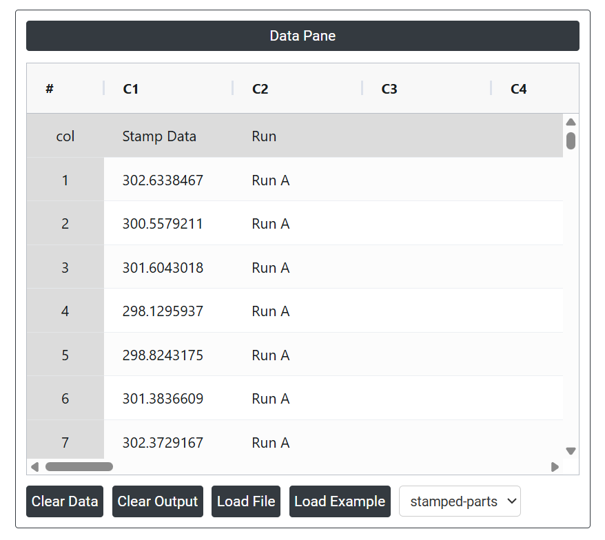
A manufacturer conducts short production runs to produce small batches of metal components. To evaluate the consistency of the stamping process, the quality manager measures parts from three different production runs. The following steps:
- Gathered the necessary data.
- Now analyses the data with the help of https://qtools.zometric.com/ or https://intelliqs.zometric.com/.
- To find Z-MR Chart choose https://intelliqs.zometric.com/> Statistical module> Control Chart > Z-MR Chart.
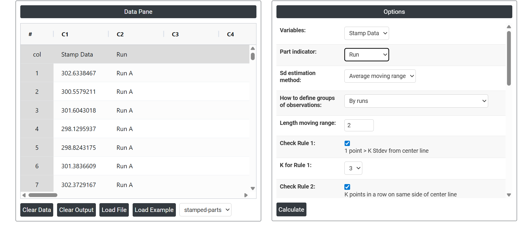
- Inside the tool, feed the data along with other inputs as follows:
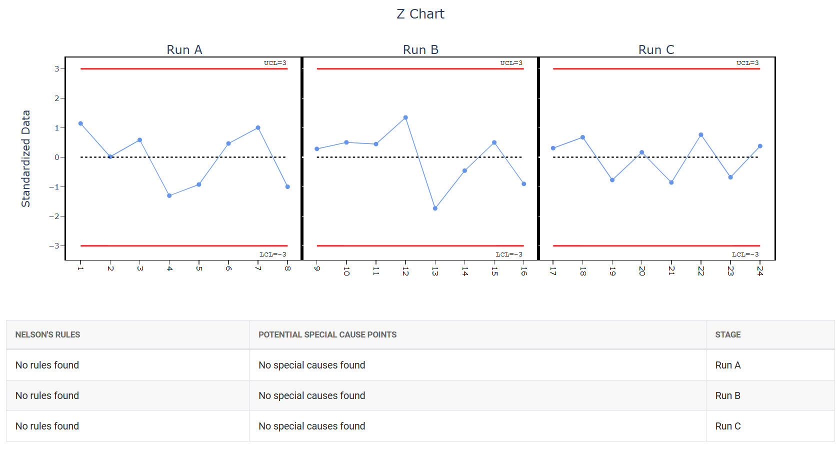
5. After using the above-mentioned tool, fetches the output as follows:

How to generate Z-MR Chart?
The guide is as follows:
- Login in to QTools account with the help of https://qtools.zometric.com/ or https://intelliqs.zometric.com/
- On the home page, choose Statistical Tool> Control Chart > Z-MR Chart.
- Click on Z-MR Chart and reach the dashboard.
- Next, update the data manually or can completely copy (Ctrl+C) the data from excel sheet or paste (Ctrl+V) it or else there is say option Load Example where the example data will be loaded.
- Next, you need to map the columns with the parameters.
- Finally, click on calculate at the bottom of the page and you will get desired results.
On the dashboard of Z-MR Chart, the window is separated into two parts.
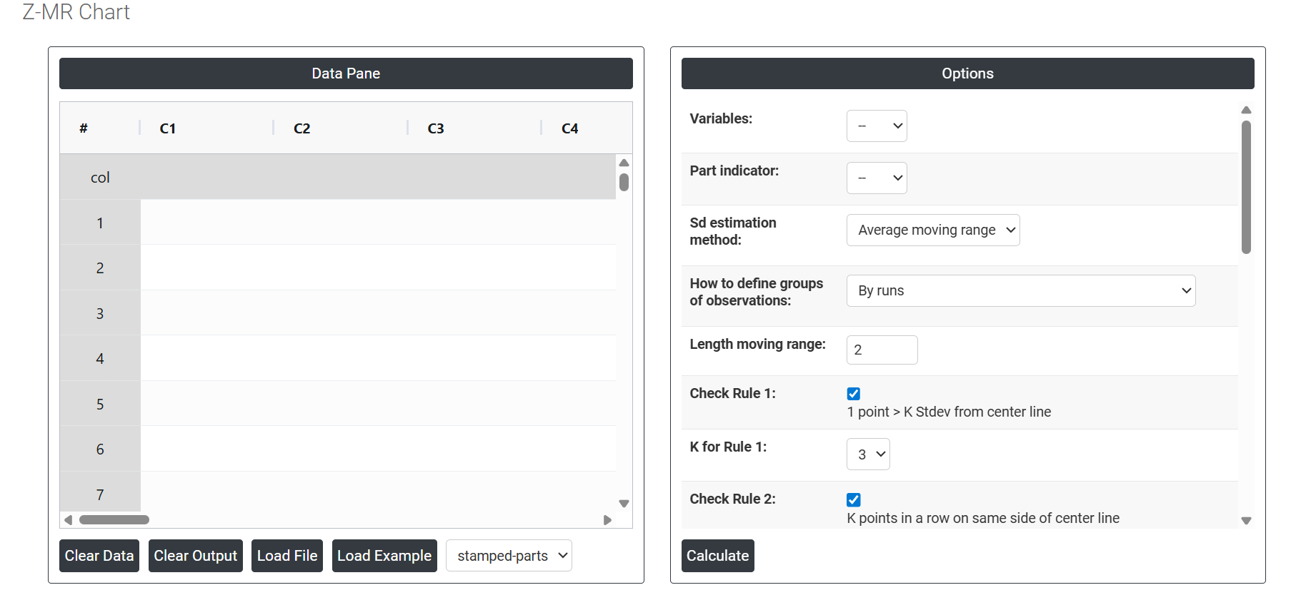
On the left part, Data Pane is present. In the Data Pane, each row makes one subgroup. Data can be fed manually or the one can completely copy (Ctrl+C) the data from excel sheet and paste (Ctrl+V) it here.
Load example: The sample data will be loaded.
Load File: It is used to directly load the excel data.
On the right part, there are many options present as follows:
- Variables: Select the column(s) that contain your actual measurement data. These are the values being monitored on the chart — such as dimensions, weights, or any continuous quality characteristic recorded across different parts or runs.
- Part Indicator: Select the column that identifies which part number or product type each measurement belongs to. This is essential for the Z-MR chart because it uses this information to match each measurement to its correct target and standard deviation, so the Z-score can be calculated accurately for each part type.
- SD Estimation method for Between subgroup: This leaves the user with two choices for the calculation. Choosing average moving range as the estimation method or median moving range method changes the result.
- Average moving range Sd estimation method: It involves calculating the difference between consecutive values in a data set and then taking the average of those differences.
- Median moving range Sd estimation method: The MMR is calculated by taking the median of the moving ranges between consecutive data points.
-
How to Define Groups of Observations: Determines how the chart organises and sequences the data points. Two options are available:
- By Runs — groups observations in the order they were collected, treating each production run as a continuous sequence. Best when time order is the most meaningful way to track process behaviour.
- By Parts (Combine all observations for same parts) — groups all measurements of the same part type together regardless of when they were collected. Best when you want to compare performance across part types rather than across time.
- Length Moving Range: Defines how many consecutive subgroup means are used to calculate each moving range value. The default is 2, meaning each moving range is the absolute difference between two consecutive subgroup averages. Increasing this value smooths the estimate but reduces sensitivity to short-term shifts.
- Check Rule 1: 1 point > K Stdev from center line: Test 1 is essential for identifying subgroups that significantly deviate from others, making it a universally recognized tool for detecting out-of-control situations. To increase sensitivity and detect smaller shifts in the process, Test 2 can be used in conjunction with Test 1, enhancing the effectiveness of control charts.
- Check Rule 2: K points in a row on same side of center line: Test 2 detects changes in process centering or variation. When monitoring for small shifts in the process, Test 2 can be used in conjunction with Test 1 to enhance the sensitivity of control charts.
- Check Rule 3: K points in a row, all increasing or all decreasing: Test 3 is designed to identify trends within a process. This test specifically looks for an extended sequence of consecutive data points that consistently increase or decrease in value, signaling a potential underlying trend in the process behavior.
- Check Rule 4: K points in a row, alternating up and down: Test 4 is designed to identify systematic variations within a process. Ideally, the pattern of variation in a process should be random. However, if a point fails Test 4, it may indicate that the variation is not random but instead follows a predictable pattern.
- Check Rule 5: K out of K + 1 points > 2 standard deviation from center line (same side): Test 5 detects small shifts in the process.
- Check Rule 6: K out of K + 1 points > 1 standard deviation from center line (same side):Test 6 detects small shifts in the process.
- Check Rule 7: K points in a row within 1 standard deviation of center line (either side):Test 7 identifies patterns of variation that may be incorrectly interpreted as evidence of good control. This test detects overly wide control limits, which are often a result of stratified data. Stratified data occur when there is a systematic source of variation within each subgroup, causing the control limits to appear broader than they should be.
- Check Rule 8: K points in a row > 1 standard deviation from center line (either side):Test 8 detects a mixture pattern. In a mixture pattern, the points tend to fall away from the center line and instead fall near the control limits.
- X Scale: Controls how the horizontal axis of the chart is labelled and displayed. You can adjust this to show run numbers, part identifiers, time stamps, or custom labels — making the chart easier to read and trace back to specific production events or part types.