What is Scatter Plot 3D?
A 3D scatter plot is a three-dimensional data visualization tool that represents data points using Cartesian coordinates across three axes: X, Y, and Z. Each data point is marked by a symbol whose position is determined by the values of three variables. This plot is an extension of the 2D scatter plot, adding a third variable along a vertical axis to illustrate the relationship between three variables simultaneously. The horizontal axes depict two independent variables, while the vertical axis represents the dependent variable. 3D scatter plots are particularly useful in exploratory data analysis for visualizing complex relationships in multidimensional data.
When to use Scatter Plot 3D?
Here are some scenarios where you might consider using a Scatter Plot 3D:
- Visualizing multivariate data: If you have a dataset with three continuous variables, a Scatter Plot 3D can help you understand how these variables interact with each other. It enables you to identify patterns, clusters, or trends that may not be evident in two-dimensional plots.
- Exploring spatial data: Scatter Plot 3D can be particularly useful when dealing with spatial data, such as geographical or geospatial data. By plotting data points in three dimensions, you can analyze relationships between variables and uncover spatial patterns or correlations.
- Time series analysis: If you have a time-dependent dataset with three variables, a Scatter Plot 3D can be used to examine how these variables change over time. By plotting the data in a three-dimensional space, you can observe the evolution of the variables and identify any relationships or patterns that emerge.
- Data clustering: Scatter Plot 3D can be employed to visualize clusters or groups within your data. If you have a clustering algorithm that assigns data points to clusters based on three variables, a 3D scatter plot can help you understand the spatial distribution of the clusters and assess their separability.
- Comparing multiple datasets: If you have multiple datasets with three variables each, a Scatter Plot 3D can be used to compare and contrast them. By plotting the data from different datasets in the same 3D space, you can visually analyze similarities, differences, or relationships between the variables.
Guidelines for correct usage of Scatter Plot 3D
- Use a medium to large sample size for effective representation of data.
- Larger samples help to reveal patterns in the data more clearly.
- Select the sample data randomly to ensure statistical validity.
- Random samples are used to make inferences about a population.
- Non-randomly collected data may not accurately represent the population.
Alternatives: When not to use Scatter Plot 3D
- Heatmap: If you have a large dataset and want to visualize the density or distribution of the data across three dimensions, a heatmap can be a good option. A heatmap uses color intensity to represent the values of the third variable, with higher intensity indicating higher values. This allows for a quick visual assessment of the distribution and patterns in the data.
Example of Scatter Plot 3D
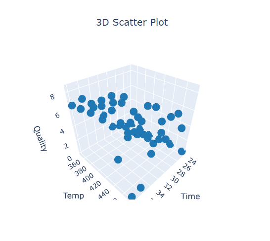
The goal of a food scientist is to find the best combination of time and temperature for heating a frozen dinner. To achieve this, the scientist conducts an experiment by preparing 14 samples at different durations and temperatures. A panel of professional food tasters evaluates each sample, providing ratings based on overall quality. To analyze the data, the scientist utilizes a 3D scatterplot to visualize and examine the outcomes. The following steps:
- Gathered the necessary data.
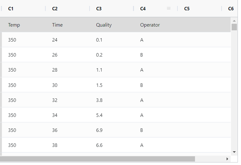
- Now analyses the data with the help of https://qtools.zometric.com/ or https://intelliqs.zometric.com/.
- To find Scatter Plot 3D choose https://intelliqs.zometric.com/> Statistical module> Graphical analysis >3D scatterplot.
- Inside the tool, feed the data along with other inputs as follows:
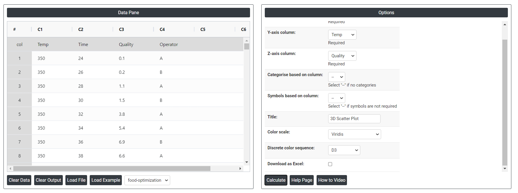
- After using the above mentioned tool, fetches the output as follows:
How to do Scatter Plot 3D
The guide is as follows:
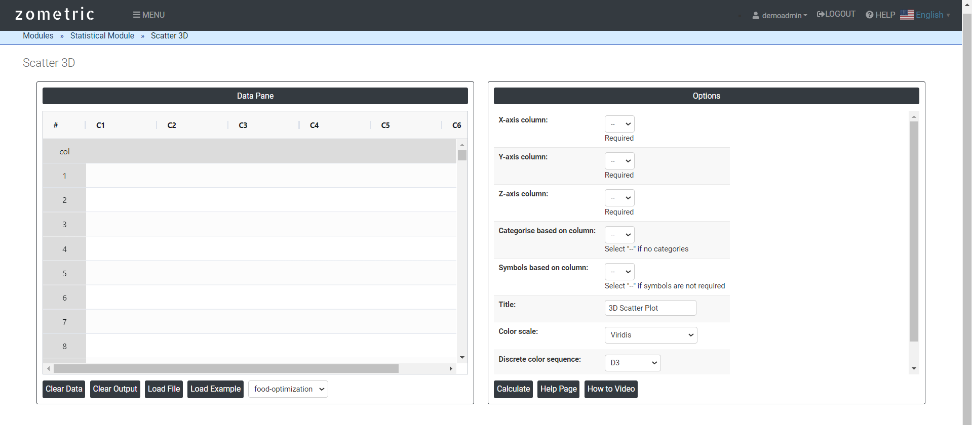
- Login in to QTools account with the help of https://qtools.zometric.com/ or https://intelliqs.zometric.com/
- On the home page, choose Statistical Tool> Graphical analysis > 3D scatterplot.
- Click on 3D scatterplot and reach the dashboard.
- Next, update the data manually or can completely copy (Ctrl+C) the data from excel sheet or paste (Ctrl+V) it or else there is say option Load Example where the example data will be loaded.
- Next, you need to map the columns with the parameters.
- Finally, click on calculate at the bottom of the page and you will get desired results.
On the dashboard of Scatter Plot 3D, the window is separated into two parts.
On the left part, Data Pane is present. In the Data Pane, each row makes one subgroup. Data can be fed manually or the one can completely copy (Ctrl+C) the data from excel sheet and paste (Ctrl+V) it here.
Load example: Sample data will be loaded.
Load File: It is used to directly load the excel data.
On the right part, we just need to give:
X, Y, and Z axes in a 3D scatter plot depends on the nature of the data and the specific relationships you want to explore.
Dependent Variable (Z-axis): This is often the outcome or response variable.
Independent Variables (X and Y axes): Choose two variables that have the most influence on the dependent variable. These are the predictors or explanatory variables.
Categories based on column: It is used to differentiate the data points based on their category membership. This can add an extra layer of information to the plot, allowing you to see how different categories of data points are distributed in the three-dimensional space.
Symbol based column: It will show it in symbol form.
Discrete color sequence: A Discrete Color Sequence refers to a set of distinct colors used to differentiate categorical data points in a plot, such as a 2D scatter plot. This approach is particularly useful when visualizing data with multiple categories or groups, as it allows for clear and immediate distinction between these groups.
Color scale: It allows you to better visualize the data patterns and highlight specific ranges of values.
Download as Excel: This will display the result in an Excel format, which can be easily edited and reloaded for calculations using the load file option.