
Density Heatmap
A density heatmap is a visualization technique used to represent the distribution of data points over a geographical or two-dimensional space. It provides a visual summary of the density or intensity of data points in specific areas or regions.
Last reviewed
Key takeaway
A density heatmap is a visualization technique used to represent the distribution of data points over a geographical or two-dimensional space.
On this page
What is Density Heatmap?
A density heatmap is a visualization technique used to represent the distribution of data points over a geographical or two-dimensional space. It provides a visual summary of the density or intensity of data points in specific areas or regions.
In a density heatmap, each data point is assigned a weight or intensity value, typically based on its frequency or density. The heatmap then uses color gradients to represent the varying intensities across the space. Higher densities are often represented by warmer colors like red or orange, while lower densities are represented by cooler colors like blue or green.
When to use Density Heatmap?
A density heatmap is a visualization technique used to display the density of data points in a particular area or region. It is particularly useful in the following scenarios:
- Spatial Analysis: Density heatmaps are commonly used in spatial analysis tasks, such as analyzing population distribution, crime rates, or disease outbreaks. By visualizing the density of data points on a map, you can identify hotspots or clusters of activity or events.
- Data Clustering: Density heatmaps can help identify natural groupings or clusters within a dataset. By examining the density of data points, you can identify areas where there is a high concentration of similar values or occurrences.
- Event or Activity Visualization: Density heatmaps can be used to visualize the intensity or frequency of events or activities in a particular area. For example, you can create a density heatmap to show the concentration of social media posts, taxi pickups, or customer visits at different locations.
- Traffic Analysis: Density heatmaps are commonly employed in traffic analysis to visualize traffic flow and congestion. By plotting the density of vehicles or traffic incidents on a map, you can identify areas with high traffic volume or recurring traffic issues.
- Resource Allocation: Density heatmaps can aid in the allocation of resources based on the density of certain events or occurrences. For instance, in retail, you can analyze customer density heatmaps to determine the ideal locations for opening new stores or adjusting staffing levels.
- Environmental Studies: Density heatmaps can assist in analyzing environmental data, such as air pollution levels or wildlife sightings. By visualizing the density of specific phenomena, you can identify patterns, potential sources, or areas of concern.
- User Behavior Analysis: Density heatmaps can be employed to analyze user behavior on websites or mobile apps. By tracking user interactions, such as clicks or cursor movements, and plotting them as a density heatmap, you can identify areas of high engagement or potential usability issues.
Guidelines for correct usage of Density Heatmap
- Data should include at least two columns of numeric or text data.
- The columns must have the same number of rows, excluding any columns with date/time data.
- A large sample size is preferable for clearer patterns in the data.
- Random selection of sample data is important for making generalizations or inferences about the population.
- Random sampling ensures that the results represent the population accurately.
Alternatives: When not to use Density Heatmap
- Box Plot: An alternative to density heatmaps in situations where the data is skewed or has outliers is the box plot. Box plots provide a visual representation of the median, quartiles, and outliers within a dataset, making it easier to identify any extreme values that may be skewing the data.
- Scatterplot: When dealing with small datasets, scatterplots provide a clear and concise representation of each data point. Heatmaps may not be as informative or necessary in such cases since they are better suited for visualizing the density or distribution of large datasets.
Example of Density Heatmap?
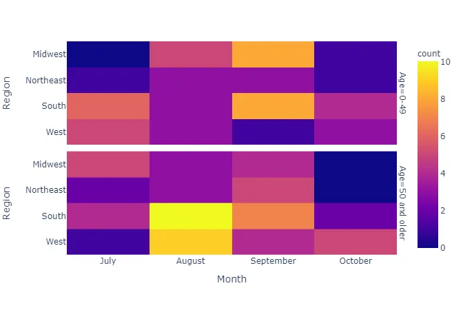
An epidemiologist seeks to investigate the spread of a virus across four distinct regions, tracking the daily infection counts over a six-month period. In each region, the number of infections is categorized into two age groups. She has performed this in following steps:
- She worked all day and gathered the necessary data.
- Now, she analyzes the data with the help of https://qtools.zometric.com/
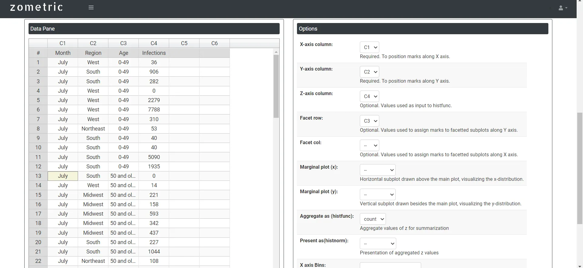
- Inside the tool, she feeds the data along with other inputs as follows:
- After using the above mentioned tool, she fetches the output as follows:
How to do Density Heatmap
The guide is as follows:
- Login in to QTools account with the help of https://qtools.zometric.com/
- On the home page, you can see Density Heatmap under Graphical Analysis.
- Click on Density Heatmap and reach the dashboard.
- Next, update the data manually or can completely copy (Ctrl+C) the data from excel sheet and paste (Ctrl+V) it here.
- Next, you need to map the parameters with the columns accordingly.
- Finally, click on calculate at the bottom of the page and you will get desired results.
On the dashboard of Density Heatmap, the window is separated into two parts.
On the left part, Data Pane is present. In the Data Pane, each row makes one subgroup. Data can be fed manually or the one can completely copy (Ctrl+C) the data from excel sheet and paste (Ctrl+V) it here.
On the right part, there are many options present as follows:
- Facet row: In a heatmap with faceted rows, the data elements are grouped and displayed in rows based on a specific categorical variable.
- Facet column: In a heatmap with faceted columns, the data elements are grouped and displayed in columns based on a categorical variable.
- Marginal plot: It provides a way to explore the relationship between two variables while simultaneously visualizing their individual distributions.
- Histfunc: It determines how the values within each cell are aggregated and presented. Some common histfunc options include:
- Sum: The values within each cell are summed to produce the aggregated value.
- Average: The mean or average of the values within each cell is calculated.
- Min: The minimum value within each cell is selected.
- Max: The maximum value within each cell is selected.
- Count: The count or frequency of values within each cell is calculated.
- Histnorm:
- Percent: Each bin's height represents the percentage of data points relative to the total number of data points in the dataset.
- Probability: Each bin's height represents the probability of a data point falling within that bin. The sum of all bin heights will equal 1.
- Density: The histogram values are normalized as a density estimate. Each bin's value is divided by the bin width and the total number of data points, providing an estimate of the probability density function.
- Bins: In the context of a heatmap, the term "bins" refers to the discrete intervals or categories along the x-axis and y-axis of the heatmap grid. The heatmap grid is divided into a set number of equally spaced bins or intervals based on the range and distribution of the data.