What is P Chart?
A P Chart is a control chart designed to monitor the proportion of defective items in a process where each item is categorized as either pass or fail. This chart is used to track the proportion of nonconforming units from samples taken at regular intervals (such as hours, shifts, days, weeks, or months) to detect and correct process instabilities over time.
To create a P Chart, an initial set of samples is used to estimate the process's proportion of nonconforming units. This estimated proportion helps establish control limits. It's important that the process is stable during this initial phase; if any points are out of control, the causes must be identified, and the affected samples should be excluded from the estimation.
Once control limits are set, the P Chart can be used for ongoing process monitoring. If a data point falls outside these limits, it indicates that the proportion of nonconforming units is out of control, suggesting a potential issue that needs to be investigated and addressed. Thus, P Charts are crucial for maintaining process stability and quality control by identifying deviations and enabling timely corrective actions.
When to use P Chart?
P charts are commonly used in manufacturing and quality control to ensure consistent production and detect patterns of variation that may impact quality. They can also be used in healthcare and other industries where process consistency is critical to ensure high levels of performance and safety.
- Monitoring Proportions: When you need to track the proportion of defective items or nonconforming units in a process where each item can only be classified as either pass or fail.
- Attribute Data: When the data collected is attribute data, meaning it records the presence or absence of a characteristic (e.g., defective or not defective).
- Variable Sample Sizes: When the sample sizes taken from the process vary. P Charts can handle different sample sizes, unlike some other control charts.
- Quality Control: When you aim to monitor and maintain the quality of a manufacturing or production process by detecting shifts or trends in the proportion of defective items.
- Identifying Process Instability: When you need to identify and address instabilities in a process, ensuring that it remains in control over time.
- Compliance and Standards: When adhering to industry standards or regulatory requirements that mandate continuous monitoring and control of defect rates in a process.
Guidelines for correct usage of P Chart
- Classify items into one of two categories: pass or fail
- Use appropriate charts based on whether you can determine only whether an item is defective or non defective or count the number of defects on each item
- Be aware of over dispersion or under dispersion in your data, as it can affect the accuracy of traditional attributes charts
- Ensure the data is in time order, with the oldest data at the top of the worksheet
- Collect data at equally spaced time intervals
- Collect data in subgroups that are similar and subject to the same process conditions
- Ensure the subgroups are large enough by using the formula to determine the required subgroup size based on the average proportion of defective items
- Include enough subgroups to obtain precise control limits
- Re-estimate control limits if you don't have enough subgroups to ensure precision
Alternatives: When not to use P chart
- When counting the number of defects on each item, you can use the U Chart or C Chart to plot the number of defects per unit.
- When your data exhibit over dispersion or under dispersion, relying on the traditional P chart might not be accurate. Over dispersion can lead to an increased number of points outside the control limits, while under dispersion can result in too few points outside the control limits.
Example of P Chart?
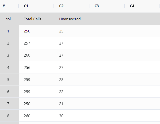
The call center supervisor aims to assess the effectiveness of the customer call answering process. For 21 days, the supervisor tracks the total number of incoming calls and the count of unanswered calls. A P chart is established by the supervisor to monitor the proportion of unanswered calls. The following data was collected:
- Gathered the necessary data.
2. Now analyses the data with the help of https://qtools.zometric.com/ or https://intelliqs.zometric.com/.
3. To find p chart choose https://intelliqs.zometric.com/> Statistical module> Control Chart> P Chart.
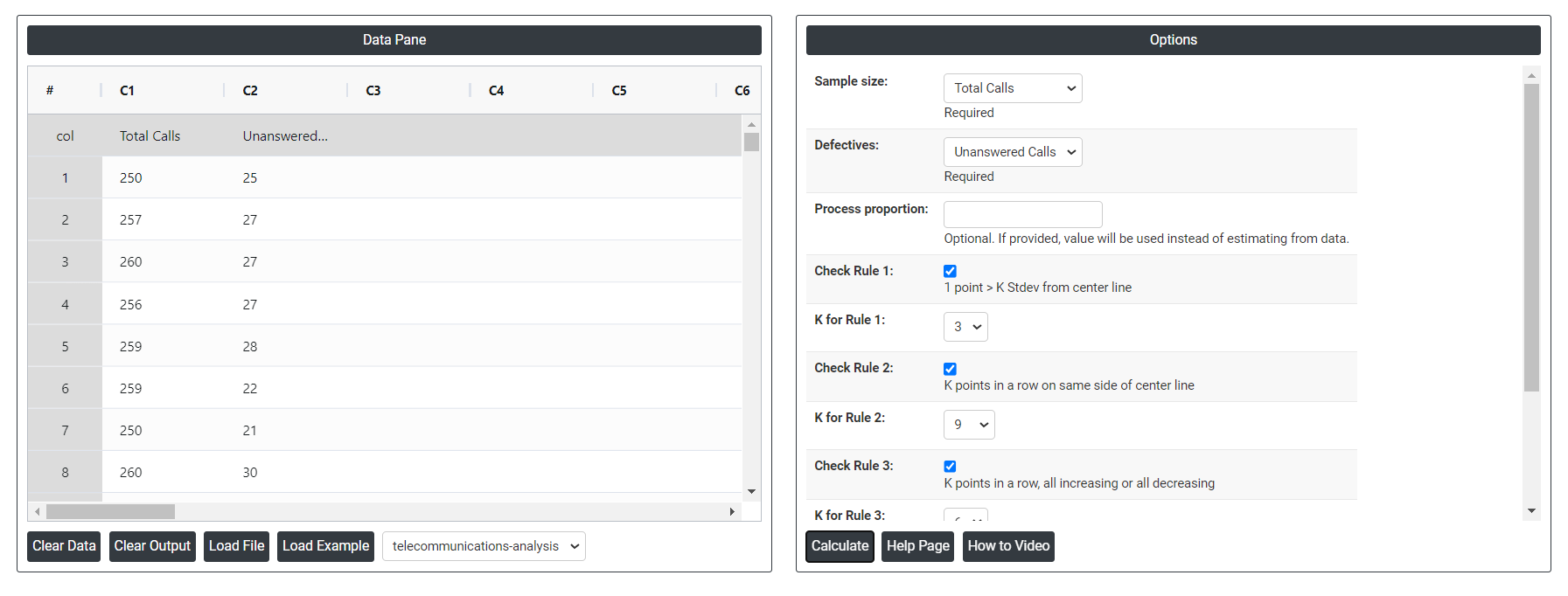
4. Inside the tool, feeds the data along with other inputs as follows:
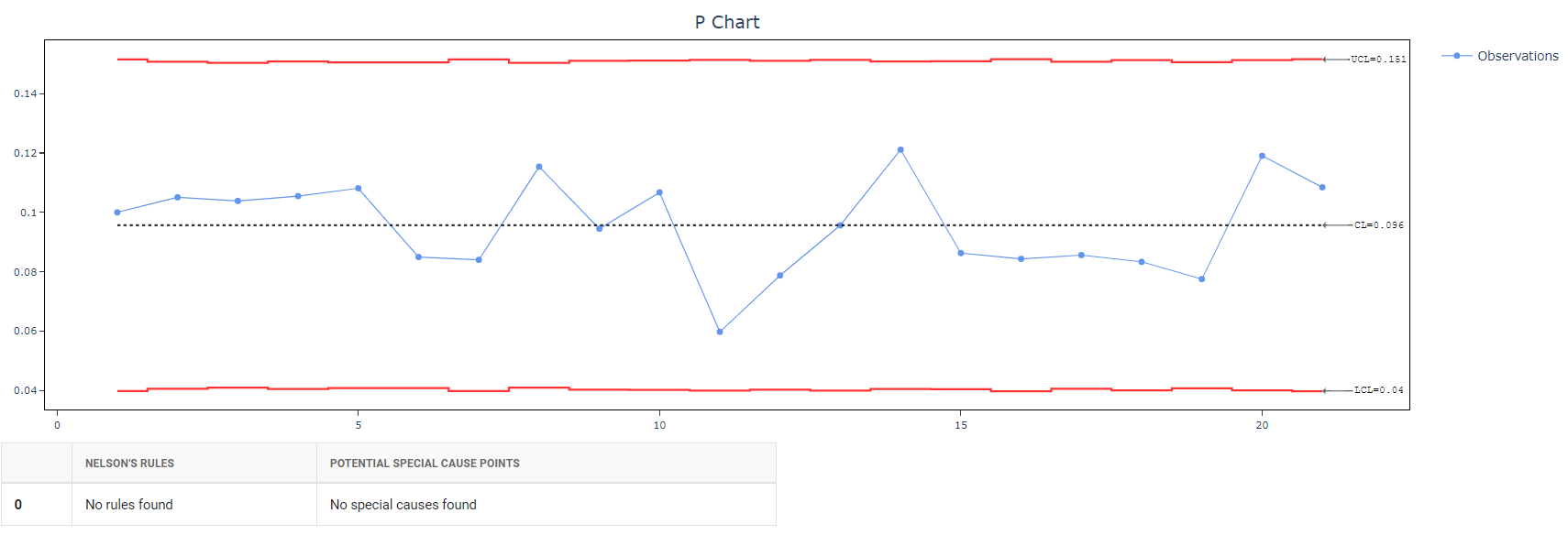
5. After using the above mentioned tool, fetches the output as follows:
How to generate P Chart?
The guide is as follows:
- Login in to QTools account with the help of https://qtools.zometric.com/ or https://intelliqs.zometric.com/
- On the home page, choose Statistical Tool> Control Chart>P Chart.
- Click on P Chart and will reach the dashboard.
- Next, update the data manually or can completely copy (Ctrl+C) the data from excel sheet and paste (Ctrl+V) it here.
- Next, you need to select the desired Check Rules.
- Finally, click on calculate at the bottom of the page and you will get desired results.
On the dashboard of P Chart, the window is separated into two parts.
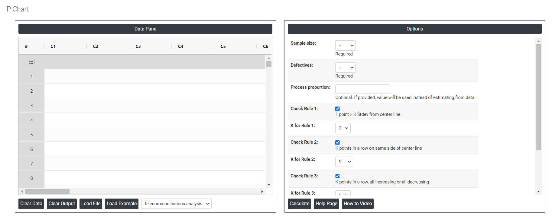
On the left part, Data Pane is present. Data can be fed manually or the one can completely copy (Ctrl+C) the data from excel sheet and paste (Ctrl+V) it here.
Load example: Sample data will be loaded.
Load File: It is used to directly load the excel data.
On the right part, there are many options present as follows:
- Process proportion: If process proportion is provided, this value is considered to be the centerline. If not, Zometric Q-Tools calculates the centerline from the data provided.
- Check Rule 1: 1 point > K Stdev from center line: Test 1 is essential for identifying subgroups that significantly deviate from others, making it a universally recognized tool for detecting out-of-control situations. To increase sensitivity and detect smaller shifts in the process, Test 2 can be used in conjunction with Test 1, enhancing the effectiveness of control charts.
- Check Rule 2: K points in a row on same side of center line: Test 2 detects changes in process centering or variation. When monitoring for small shifts in the process, Test 2 can be used in conjunction with Test 1 to enhance the sensitivity of control charts.
- Check Rule 3: K points in a row, all increasing or all decreasing: Test 3 is designed to identify trends within a process. This test specifically looks for an extended sequence of consecutive data points that consistently increase or decrease in value, signaling a potential underlying trend in the process behavior.
- Check Rule 4: K points in a row, alternating up and down:Test 4 is designed to identify systematic variations within a process. Ideally, the pattern of variation in a process should be random. However, if a point fails Test 4, it may indicate that the variation is not random but instead follows a predictable pattern.
- Download as Excel: This will display the result in an Excel format, which can be easily edited and reloaded for calculations using the load file option.