C Chart
A c chart, also known as a control chart for defects, count chart, or frequency chart, is utilized to monitor the number of defects in units of constant size. This type of chart tracks the total number of defects per unit, regardless of whether there is a single type of defect or multiple types.
Last reviewed
Key takeaway
A c chart, also known as a control chart for defects, count chart, or frequency chart, is utilized to monitor the number of defects in units of constant size.
On this page
What is C Chart?
A c chart, also known as a control chart for defects, count chart, or frequency chart, is utilized to monitor the number of defects in units of constant size. This type of chart tracks the total number of defects per unit, regardless of whether there is a single type of defect or multiple types. The c chart operates under the assumption that the data follows a Poisson distribution. Units can be individual items or specified sections, such as scratches on plated metal or insufficient soldering on a printed circuit board.
The c chart considers the number of defects in each defective unit or given sample. Unlike the p chart, which analyzes the proportion of defective items in a process, the c chart focuses on the count of defects within a unit.
The c chart is widely used in various industries, including manufacturing, electronics, and textiles, to detect and rectify problems before they impact product quality. It is an attribute control chart that provides a clear visual representation of the number of non-conformities or defects over time or across production runs.
To construct a c chart, the number of defects in each sample or subgroup is plotted over time. The chart includes two control limits: an upper control limit (UCL) and a lower control limit (LCL), which are calculated based on the historical average number of defects. These limits define the acceptable range of process performance. Data points outside these control limits indicate that the process is out of control and requires corrective action.
When to use C Chart?
C chart is particularly useful in situations where the subgroup size is relatively small and where there is a low expected number of defects or nonconformities. They are also suitable for use when the occurrence of defects or nonconformities is rare events. It is used for continuous improvement initiatives, helping organizations to identify trends, variations, and root causes of defects. By maintaining rigorous quality control through the use of c charts, companies can enhance process stability, product reliability, and customer satisfaction.
Therefore, the C chart is suitable for monitoring the count of defects or nonconformities in manufacturing processes, customer complaints, hospital readmissions, etc.
Guidelines for correct usage of C Chart
- Count the number of defects on each item or unit.
- Use appropriate charts based on whether the data is defective or non defective.
- Consider using U chart if your data exhibits overdispersion or underdispersion.
- Collect data in time order and at equally spaced time intervals.
- Collect data in subgroups that are representative of the output from the process.
- Subgroup sizes should be equal or nearly equal. Use U Chart if subgroup sizes are not equal.
- The subgroups must be large enough to obtain accurate control limits.
- Collect enough subgroups to obtain precise control limits.
Alternatives: When not to use C chart
- Use U Chart when subgroup sizes are not equal.
- For data that only indicate whether each item is defective or non defective, use P Chart to plot the proportion of defective items or use NP Chart to plot the number of defective items.
- A C Chart may show an increased number of points outside the control limits due to over dispersion, or too few points outside the control limits due to under dispersion. You can use the U Chart Diagnostic to test for over dispersion and under dispersion.
Example of C Chart
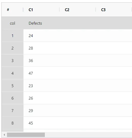
The stability of the wallpaper printing process is being evaluated by a quality engineer. Every hour, the engineer takes a 100-feet wallpaper sample and counts the number of printing defects, which includes missing ink, print smears, and pattern distortions. The performed analysis in following steps:
- Gathered the necessary data.
2. Now analyses the data with the help of https://qtools.zometric.com/ or https://intelliqs.zometric.com/.
3. To find C chart choose https://intelliqs.zometric.com/> Statistical module> Control Charts > C Chart.
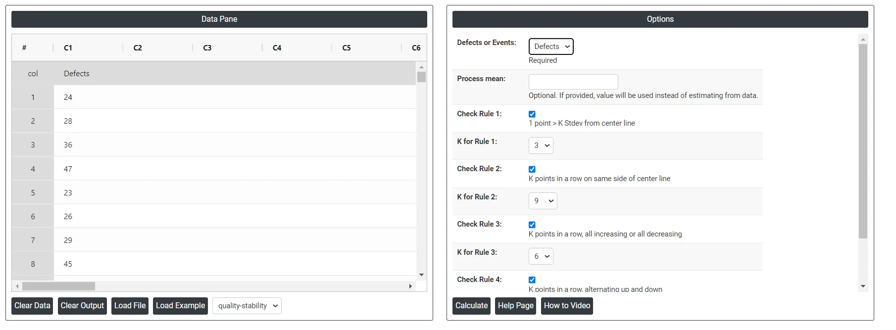
4. Inside the tool, feeds the data along with other inputs as follows:
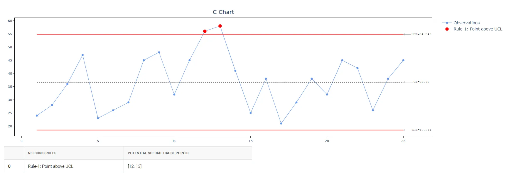
5. After using the above mentioned tool, fetches the output as follows:
How to generate C Chart?
The guide is as follows:
- Login in to QTools account with the help of https://qtools.zometric.com/ or https://intelliqs.zometric.com/
- On the home page, choose Statistical Tool> Control Charts >C Chart .
- Click on C Chart and will reach the dashboard.
- Next, update the data manually or can completely copy (Ctrl+C) the data from excel sheet and paste (Ctrl+V) it here.
- Next, you need to select the desired Check Rules.
- Finally, click on calculate at the bottom of the page and you will get desired results.
On the dashboard of C Chart, the window is separated into two parts.
On the left part, Data Pane is present. Data can be fed manually or the one can completely copy (Ctrl+C) the data from excel sheet and paste (Ctrl+V) it here.
Load example: Sample data will be loaded.
Load File: It is used to directly load the excel data.
On the right part, there are many options present as follows:
- Process proportion: If process proportion is provided, this value is considered to be the centerline. If not, Zometric Q-Tools calculates the centerline from the data provided.
- Use unbiasing constants for pooled sd: This option is applicable only when Stdev is estimated using Pooled Stdev method.
- Check Rule 1: 1 point > K Stdev from center line: Test 1 is essential for identifying subgroups that significantly deviate from others, making it a universally recognized tool for detecting out-of-control situations. To increase sensitivity and detect smaller shifts in the process, Test 2 can be used in conjunction with Test 1, enhancing the effectiveness of control charts.
- Check Rule 2: K points in a row on same side of center line: Test 2 detects changes in process centering or variation. When monitoring for small shifts in the process, Test 2 can be used in conjunction with Test 1 to enhance the sensitivity of control charts.
- Check Rule 3: K points in a row, all increasing or all decreasing: Test 3 is designed to identify trends within a process. This test specifically looks for an extended sequence of consecutive data points that consistently increase or decrease in value, signaling a potential underlying trend in the process behavior.
- Check Rule 4: K points in a row, alternating up and down:Test 4 is designed to identify systematic variations within a process. Ideally, the pattern of variation in a process should be random. However, if a point fails Test 4, it may indicate that the variation is not random but instead follows a predictable pattern.
- Download as Excel: This will display the result in an Excel format, which can be easily edited and reloaded for calculations using the load file option.