NP Chart
An np chart, also referred to as a control chart for defectives (d-chart), is utilized to track the number of non-conforming or defective items in a process. It uses the binomial distribution to determine the count of defective units within a sample.
Last reviewed
Key takeaway
An np chart, also referred to as a control chart for defectives (d-chart), is utilized to track the number of non-conforming or defective items in a process.
On this page
What is NP Chart?
An np chart, also referred to as a control chart for defectives (d-chart), is utilized to track the number of non-conforming or defective items in a process. It uses the binomial distribution to determine the count of defective units within a sample. The np chart closely resembles the p chart; however, the np chart displays the number of defective items, while the p chart shows the proportion of defective items.
In an np chart, the y-axis represents the number of defectives, and the x-axis indicates the number of samples. The centerline (np̅) is derived by dividing the total count of defectives or non-conforming units by the number of lots. This chart is particularly effective for processes where each item is classified as either pass or fail.
The np chart helps monitor process stability over time, enabling the identification and correction of any instabilities. It is named for its two parameters: N (the number of items in the sample) and P (the proportion of defective items in the sample). By plotting the number of defects relative to the sample size, managers can detect changes in the production process or other factors impacting quality control. The np chart is particularly advantageous for processes with a high rate of defects, as it can identify small shifts in the defect proportion within a sample.
When to use NP Chart?
An NP chart is used when monitoring the proportion of nonconforming items or defects in a process. It is used when the sample size is constant, and the data being collected are binary, meaning they are either conforming or nonconforming. It is used to evaluate process stability when counting the number or fraction defective.
The chart is particularly useful in processes where the proportion of nonconforming items is low but the consequences of nonconformity are severe, such as in manufacturing or healthcare. The chart helps to identify trends or shifts in the process that could be causing an increase in nonconforming items and helps to prevent further defects.
Guidelines for correct usage of NP Chart
- This chart should be used only for binomial distribution data, i.e when the outcome of a test / observation can only be one of the two categories. Example: good/bad, pass/fail, ok/defective, etc.
- If the defects can be counted on an unit inspected, then U chart or C chart should be used instead of NP or P chart
- The data should be arranged in ascending order of time of sample collection.
- The data should be collected at approximately equally spaced time intervals.
- If the frequency is too high, it increases the data collection efforts / cost
- If the frequency is too low, the time window for detecting changes or finding an RCA could be too wide.
- Select an optimum frequency based on knowledge and critically of the process.
- Each subgroups should be a collection of samples collected within a short period of time.
- Typically a subgroup consists of consecutive parts from a sampling point / manufacturing machine or line.
- The idea of a subgroup is that the time window is short enough to ensure there are no /insignificant variation in conditions such as personnel, settings, batch, environmental conditions, etc.
- Collecting right subgroup helps in distinguishing common cause from special causes.
- The subgroups must be large enough to show on an average 5 defectives or more in the NP chart. For example, if the defective rate is 0.06, then the subgroup size should be = roundup(5/0.06) = 84. If we use lee then optimal subgroup size, the ability to detect special causes is diminished.
- The control limits should be calculated based on 25 or more subgroups. Preliminary analysis can be done using 15 or more subgroups.
Alternatives: When not to use NP chart
- If you can count the number of defects on each item, use U Chart or C chart
- If your subgroup sizes are not equal you can still use NP chart, however the Centre line will not be straight. For unequal subgroup sizes, using p chart will generate a straight centerline.
Example Of NP Chart
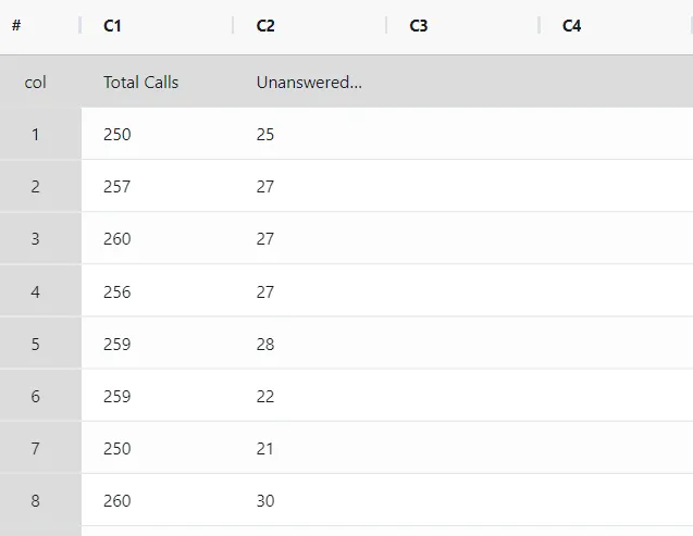
The call center supervisor aims to assess the effectiveness of the customer call answering process. For 21 days, the supervisor tracks the total number of incoming calls and the count of unanswered calls. A P chart is established by the supervisor to monitor the proportion of unanswered calls. The following sample data for NP Chart is as follows:
- Gathered the necessary data.
2. Now analyses the data with the help of https://qtools.zometric.com/ or https://intelliqs.zometric.com/.
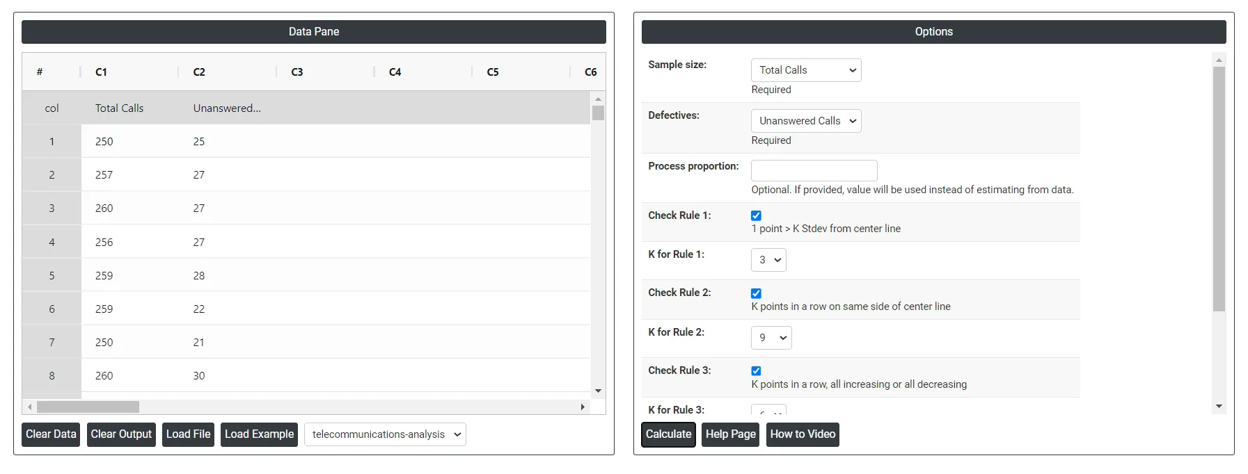
3. To find NP chart choose https://intelliqs.zometric.com/> Statistical module> Control Charts> NP Chart.
4. Inside the tool, feeds the data along with other inputs as follows:
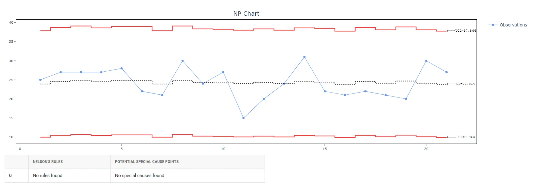
5. After using the above mentioned tool, fetches the output as follows:
How to generate NP Chart?
The guide is as follows:
- Login in to QTools account with the help of https://qtools.zometric.com/ or https://intelliqs.zometric.com/
- On the home page, choose Statistical Tool> Control Charts >NP Chart.
- Click on NP Chart and will reach the dashboard.
- Next, update the data manually or can completely copy (Ctrl+C) the data from excel sheet and paste (Ctrl+V) it here.
- Next, you need to select the desired Check Rules.
- Finally, click on calculate at the bottom of the page and you will get desired results.
On the dashboard of NP Chart, the window is separated into two parts.
On the left part, Data Pane is present. Data can be fed manually or the one can completely copy (Ctrl+C) the data from excel sheet and paste (Ctrl+V) it here.
Load example: Sample data will be loaded.
Load File: It is used to directly load the excel data.
On the right part, there are many options present as follows:
- Process proportion: If process proportion is provided, this value is considered to be the centerline. If not, Zometric Q-Tools calculates the centerline from the data provided.
- Check Rule 1: 1 point > K Stdev from center line: Test 1 is essential for identifying subgroups that significantly deviate from others, making it a universally recognized tool for detecting out-of-control situations. To increase sensitivity and detect smaller shifts in the process, Test 2 can be used in conjunction with Test 1, enhancing the effectiveness of control charts.
- Check Rule 2: K points in a row on same side of center line: Test 2 detects changes in process centering or variation. When monitoring for small shifts in the process, Test 2 can be used in conjunction with Test 1 to enhance the sensitivity of control charts.
- Check Rule 3: K points in a row, all increasing or all decreasing: Test 3 is designed to identify trends within a process. This test specifically looks for an extended sequence of consecutive data points that consistently increase or decrease in value, signaling a potential underlying trend in the process behavior.
- Check Rule 4: K points in a row, alternating up and down:Test 4 is designed to identify systematic variations within a process. Ideally, the pattern of variation in a process should be random. However, if a point fails Test 4, it may indicate that the variation is not random but instead follows a predictable pattern.
- Download as Excel: This will display the result in an Excel format, which can be easily edited and reloaded for calculations using the load file option.