Pie Chart
What is Pie Chart?
Pie chart is a circular statistical graphic which is divided into segments(“slices”) to illustrate numerical proportion of observation that are in each category. Then arc length of each slice is proportional to the quantity it represents. Pie charts are often used to show percentages, proportions, or distributions of data in a clear and visually appealing way. They are commonly used in presentations, reports, and other forms of data visualization to help convey information quickly and effectively. The circle of the chart represents the total or 100% of the data being analyzed. The individual sectors or slices within the circle are labelled and color-coded to differentiate between different categories or data points. The larger the slice, the larger the quantity or percentage it represents.
When to use Pie Chart?
They are best used in the following situations:
- If you want your audience to have a general sense of the part-to-whole relationship in your data and comparing the precise sizes of the slices is less important.
- To convey that one segment of the total is relatively small or large.
- Few Categories: When dealing with a small number of categories (ideally less than 5-7), a pie chart can clearly show the distribution of each category.
- Highlighting Specific Categories: If you have one or two dominant categories or you want to emphasize certain parts of the data (like slices that are 1/3 or 1/4 of the whole), a pie chart can visually highlight these without overwhelming with other details.
- Simplified Presentation: Use a pie chart when you need a simplified, high-level view of the data and when combining smaller categories into an "other" group would still effectively communicate the main insights.
- Presenting to Non-Technical Audiences: For presentations to audiences less familiar with data interpretation or when you want to quickly convey the main takeaway (like a marketing report or executive summary), a pie chart can be more engaging and intuitive than other types of charts.
Guidelines for correct usage of Pie Chart
- Collect summary data or raw data
- Summarized data can be a count or a calculated value (mean), while raw data consists of individual occurrences or defects
- Raw data should be organized in one column with each observation in a separate row
- Select sample data randomly to ensure accurate statistical inferences
- Random samples are necessary to make generalizations about a population
- Non-randomly collected data may not accurately represent the population
Alternatives: When not to use Pie Chart
- Bar Charts: Pie charts face a primary limitation: accurately comparing slice sizes is challenging, especially with numerous or similar-sized categories. Distinguishing between slices becomes difficult, hampering precise data interpretation. In such cases, bar charts or stacked bar charts serve as superior alternatives. Bar charts utilize rectangular bars, simplifying comparisons between categories, while stacked bar charts additionally reveal category subdivisions.
- Scatter Plot or Line Chart: When your focus is on showcasing data trends or patterns, a scatter plot or line chart with data points connected by lines can be more informative than a pie chart. These charts display individual data points, allowing you to identify correlations, clusters, or outliers more easily. Scatter plots are particularly useful for displaying relationships between two variables.
- Making them three-dimensional can lead to egregious misrepresentations of data.
- When the data cannot be distributed or converted into percentages.
- When the percentages add up to a value greater than 100, as can happen in surveys where the participants are allowed to choose more than one answer.
- When you have a lot of categories, even if the data is in percentages that add up to 100. A pie chart with too many slices will only confuse the data.
- If the values or percentages of your data categories are very close to each other (within 5 to 10 percentage points), it’s best to use some other type of chart/graph to represent them. A pie chart with similar percentages is not impactful. The readers won’t know what to get out of the data.
- When you have continuous data with many possible values, such as age, weight, speed, or temperature.
- When you want to show precise comparisons between different data sets, while a pie chart may show major differences between different data groups, it fails to demonstrate smaller differences efficiently.
- When you don’t have exclusive data categories.
- Don't use the pie chart if you want a visualization tool to show data changes over time.
- Pie charts face a primary limitation: accurately comparing slice sizes is challenging, especially with numerous or similar-sized categories. Distinguishing between slices becomes difficult, hampering precise data interpretation. In such cases, bar charts or stacked bar charts serve as superior alternatives. Bar charts utilize rectangular bars, simplifying comparisons between categories, while stacked bar charts additionally reveal category subdivisions.
- When your focus is on showcasing data trends or patterns, a scatter plot or line chart with data points connected by lines can be more informative than a pie chart. These charts display individual data points, allowing you to identify correlations, clusters, or outliers more easily. Scatter plots are particularly useful for displaying relationships between two variables.
Example of Pie Chart
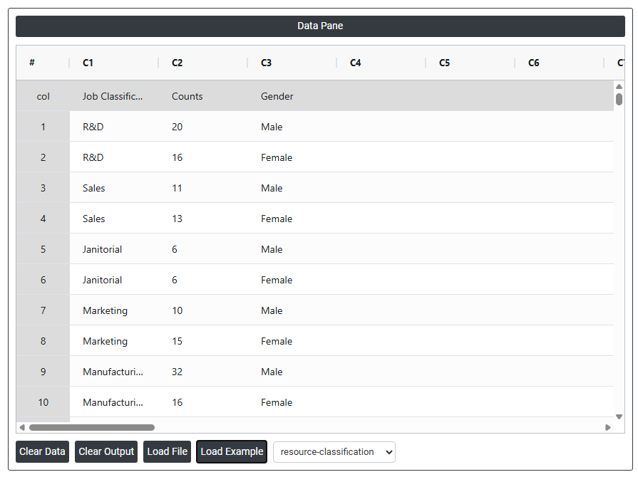
A human resources manager classifies all a company's jobs and tallies the number of employees who belong to each job class. The following steps:
- Gathered the necessary data.
- Now analyses the data with the help of https://qtools.zometric.com/ or https://intelliqs.zometric.com/.
- To find pie chart choose https://intelliqs.zometric.com/> Statistical module> Graphical analysis> Pie Chart.
- Inside the tool, feeds the data along with other inputs as follows:
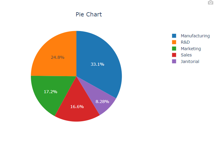
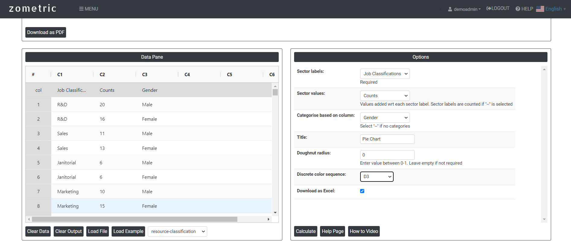 After using the above mentioned tool, fetches the output as follows:
How to do Pie Chart
The guide is as follows:
- Login in to QTools account with the help of https://qtools.zometric.com/ or https://intelliqs.zometric.com/
- On the home page, choose Statistical Tool> Graphical analysis >Pie Chart.
- Click on Pie Chart and reach the dashboard.
- Next, update the data manually or can completely copy (Ctrl+C) the data from excel sheet or paste (Ctrl+V) it or else there is say option Load Example where the example data will be loaded.
- Next, you need to map the columns with the parameters.
- Finally, click on calculate at the bottom of the page and you will get desired results.
On the dashboard of Pie Chart, the window is separated into two parts.
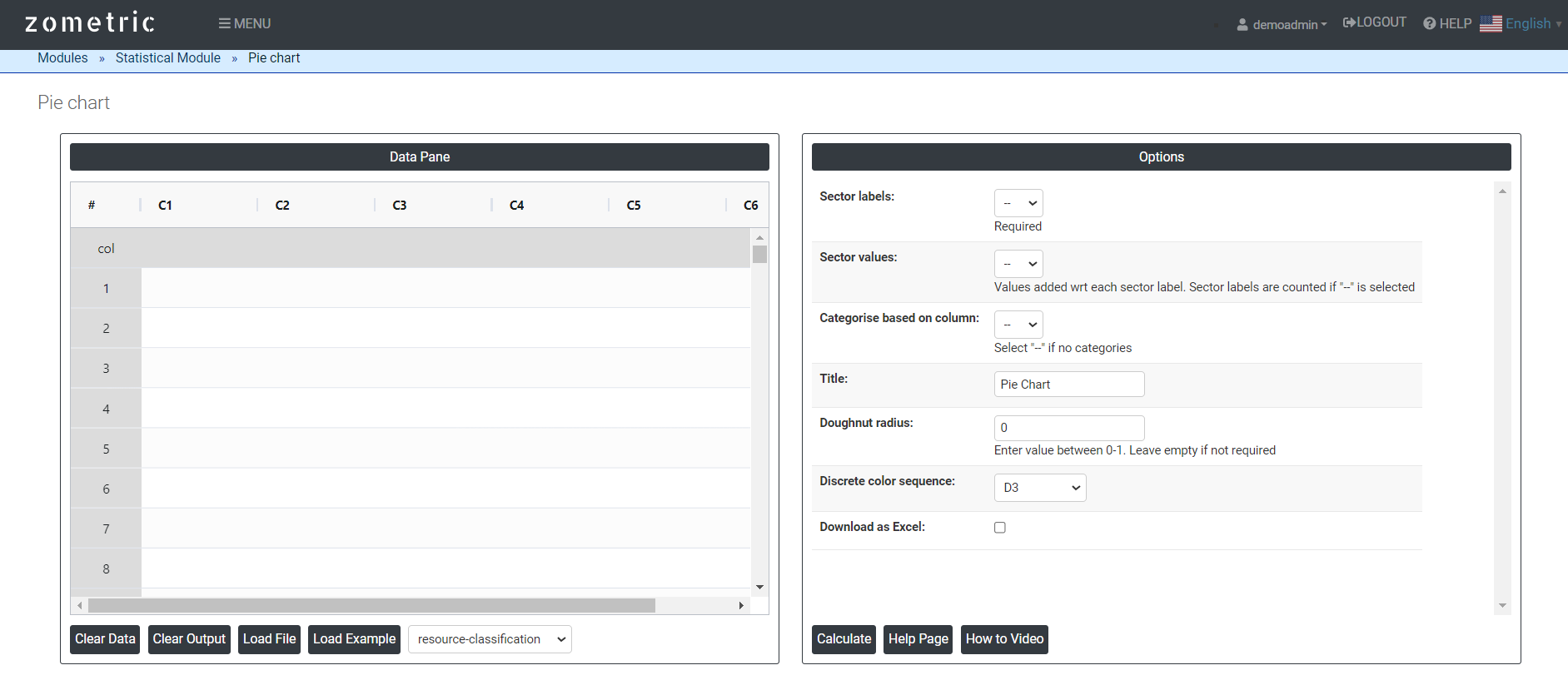
On the left part, Data Pane is present. In the Data Pane, each row makes one subgroup. Data can be fed manually or the one can completely copy (Ctrl+C) the data from excel sheet and paste (Ctrl+V) it here.
Load example: Sample data will be loaded.
Load File: It is used to directly load the excel data.
On the right part, there are many options present as follows:
- Sector Labels: Sector labels in a pie chart are the textual representations of the categories or data points being represented by each sector of the chart. In a pie chart, each sector corresponds to a specific category or data point, and the sector labels provide information about what each sector represents.
- Sector values: Sector values in a pie chart represent the numerical data associated with each sector or category. Each sector in a pie chart is proportional to its corresponding value, indicating the relative size or proportion of that category within the whole data set.
- Categories based on column: A pie chart is a powerful way to represent the distribution of categorical data visually. By creating a pie chart from a categories-based column, you can easily see the relative proportions of each category, making it useful for quick comparisons and analysis
- Discrete color sequence: A discrete color sequence in a pie chart refers to using a specific, distinct set of colors for different categories or slices. Each category is assigned a unique color, which helps in distinguishing them easily and making the chart visually appealing and easier to interpret.
- Donut radius: It refers to the width or the thickness of the empty space in the centre of the chart.
- Download as Excel: This will display the result in an Excel format, which can be easily edited and reloaded for calculations using the load file option.