Timeline Chart
A timeline chart is a graphical representation that illustrates the sequence of events or data points over time. It features a horizontal axis representing chronological intervals and a vertical axis depicting events or data categories.
Last reviewed
Key takeaway
A timeline chart is a graphical representation that illustrates the sequence of events or data points over time.
On this page
What is Timeline Chart?
A timeline chart is a graphical representation that illustrates the sequence of events or data points over time. It features a horizontal axis representing chronological intervals and a vertical axis depicting events or data categories. Widely utilized in project management, historical analysis, research, and data visualization, timelines offer a clear and intuitive portrayal of temporal information. They serve to track milestones, historical occurrences, project stages, and various other temporal progressions across different domains.
When to use Timeline Chart?
A timeline chart is a visual tool that represents events or milestones over a specific period of time. It is commonly used to illustrate the chronological sequence of events and their durations. Here are a few situations where you might consider using a timeline chart:
- Project Management: These charts are frequently used in project management to plan and track the progress of tasks and milestones. They provide a clear overview of project timelines, dependencies, and critical deadlines, allowing project managers to identify potential bottlenecks or delays.
- Historical Events: These charts are useful for presenting historical events in a chronological order. They can help visualize the sequence of important occurrences and their relationship to one another. This is often seen in textbooks, documentaries, or museum exhibits to present historical narratives.
- Product Development: When developing a new product or launching a marketing campaign, a timeline chart can help you outline key activities, deadlines, and stages of the development process. It allows you to track milestones and ensure that tasks are completed within the desired timeframe.
- Personal or Professional Achievements: Individuals can use timeline charts to document and showcase their personal or professional achievements. For example, a resume or portfolio may include a timeline chart to highlight the progression of employment, education, or notable accomplishments.
- Event Planning: These charts are valuable for event planners to organize and coordinate various activities leading up to an event. They provide a visual representation of the event schedule, including tasks such as booking venues, sending invitations, arranging transportation, and more.
- Legal Cases: In legal proceedings, timeline charts can be used to present a chronological order of events relevant to a case. They help attorneys, judges, and juries understand the sequence and timing of important occurrences, which can be crucial in building a case or determining liability.
Remember, the key purpose of a timeline chart is to visualize events or milestones over time. Its flexibility and simplicity make it a versatile tool applicable in various fields where temporal relationships are important.
Guidelines for correct usage of Timeline Chart
When using a timeline chart, it's important to follow certain guidelines to ensure its correct and effective usage. Here are some guidelines to consider:
- Determine the Purpose: Clearly define the purpose of the timeline chart. Are you trying to show the progression of events, track milestones, identify dependencies, or illustrate a historical narrative? Understanding the purpose will guide the content and design of your timeline chart.
- Select an Appropriate Format: Choose a format that best suits your needs. Common timeline chart formats include linear timelines, Gantt charts, swimlane diagrams, or vertical/horizontal bar charts. Consider the amount of data you need to display, the level of detail required, and the audience's preferences when selecting the format.
- Use Consistent Time Units: Decide on the time units (e.g., days, weeks, months, years) to be used consistently throughout the timeline chart. This ensures that the events or milestones are accurately represented in relation to one another.
- Label Events Clearly: Clearly label each event or milestone on the timeline. Use concise and descriptive labels that convey the purpose or significance of each event. Including dates or timeframes alongside the labels helps provide context.
- Show Durations: If applicable, indicate the duration of each event or milestone on the timeline. This can be done using bars, lines, or shaded regions. Clearly differentiate between ongoing events and discrete events with specific start and end dates.
- Include Dependencies: If there are dependencies between events or milestones, illustrate them on the timeline chart. This can be done using arrows, lines, or connecting elements to indicate the sequence or relationship between different events.
- Highlight Key Events: If certain events or milestones are particularly important or have a significant impact, consider highlighting them in some way. This can be done by using a different color, adding annotations, or using bold or larger font sizes.
- Keep it Clear and Uncluttered: Avoid overcrowding the timeline chart with too much information. Keep it clean and uncluttered, ensuring that the events or milestones are easily distinguishable. Use appropriate spacing, font sizes, and colors to enhance readability.
- Update and Review: If the timeline chart is being used for a dynamic project or ongoing events, make sure to regularly update and review it. This ensures that it remains accurate and reflects the current status of the events or milestones.
- Consider the Audience: Tailor the timeline chart to your specific audience. If it's for a general audience, use clear and non-technical language. If it's for a specialized audience, consider including more detailed information or technical terminology.
By following these guidelines, you can create a timeline chart that effectively communicates the chronological sequence of events and provides clarity to your audience.
Alternatives: When not to use Timeline Chart
- Bar Chart: Bar charts are a versatile chart type that can be used to show timelines by grouping data by time intervals, such as days, weeks, or months.
- Scatter Plot: A scatter plot is a useful chart type for visualizing the relationship between two variables. It is useful when the data is not sequential or when you want to show trends over time.
Example of Timeline Chart
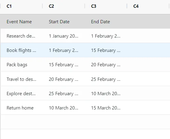
An engineer plans the different steps involved in planning a trip, as well as the dates on which each step is expected to be completed. This information can be helpful for planning and tracking the progress of the project. The following steps:
- Gathered the necessary data.
- Now analyses the data with the help of https://qtools.zometric.com/ or https://intelliqs.zometric.com/.
- To find Timeline Chart/ Gantt Chart choose https://intelliqs.zometric.com/> Statistical module> Graphical analysis > Timeline Chart/ Gantt Chart.
- Inside the tool, feed the data along with other inputs as follows:
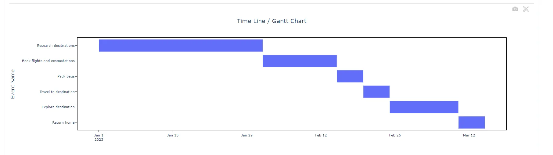
6. After using the above-mentioned tool, fetches the output as follows:
How to do Timeline Chart
The guide is as follows:
- Login in to QTools account with the help of https://qtools.zometric.com/ or https://intelliqs.zometric.com/
- On the home page, choose Statistical Tool> Graphical analysis > Timeline Chart/ Gantt Chart.
- Click on Timeline Chart and reach the dashboard.
- Next, update the data manually or can completely copy (Ctrl+C) the data from excel sheet or paste (Ctrl+V) it or else there is say option Load Example where the example data will be loaded.
- Next, you need to map the columns with the parameters.
- Finally, click on calculate at the bottom of the page and you will get desired results.
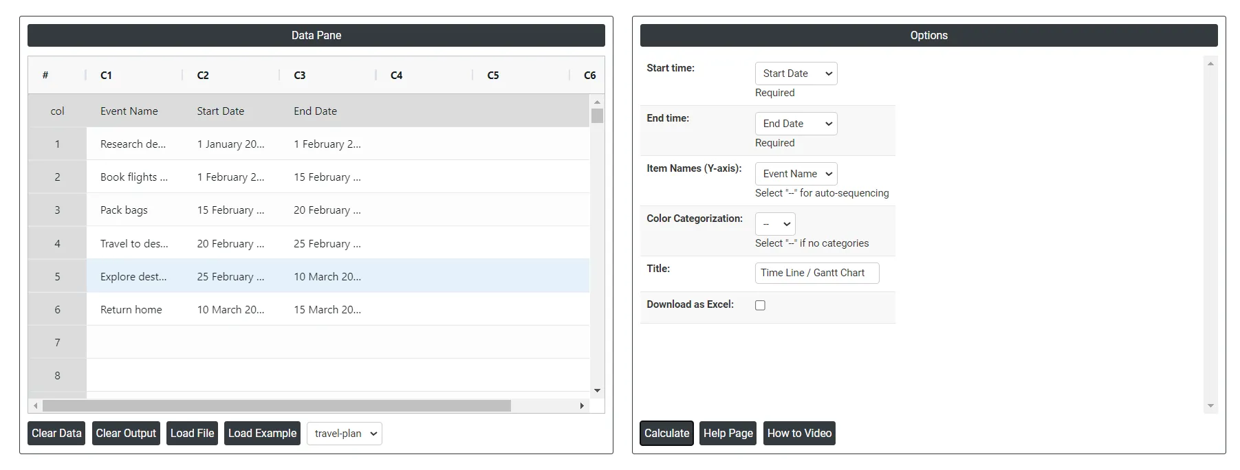
On the dashboard of Timeline Chart, the window is separated into two parts.
On the left part, Data Pane is present. In the Data Pane, each row makes one subgroup. Data can be fed manually or the one can completely copy (Ctrl+C) the data from excel sheet and paste (Ctrl+V) it here.
Load example: Sample data will be loaded.
Load File: It is used to directly load the excel data.
On the right part, we just need to give:
Color Categorization: In a timeline chart, color categorization refers to the practice of assigning different colors to different categories or groups within the timeline. It allows for visual differentiation and easier identification of different segments or events based on their category or grouping.
Download as Excel: This will display the result in an Excel format, which can be easily edited and reloaded for calculations using the load file option.