
Xbar-R Chart
X Bar R charts are essential tools for monitoring the stability of processes involving variable data across various industries. These charts are particularly useful for examining continuous data to assess process performance.
Last reviewed
Key takeaway
X Bar R charts are essential tools for monitoring the stability of processes involving variable data across various industries.
On this page
What is Xbar-R Chart?
X Bar R charts are essential tools for monitoring the stability of processes involving variable data across various industries. These charts are particularly useful for examining continuous data to assess process performance. By collecting data from subgroups at set intervals, X Bar R charts provide two plots: one for monitoring the process mean (X Bar chart) and another for monitoring process variation (R chart) over time.
X Bar R charts are crucial in identifying variability in both the process mean and range. They are instrumental in evaluating the effects of process improvement initiatives. The X Bar chart detects shifts in the process mean, while the R chart highlights changes in process variability. Together, they enable comprehensive control and assessment of process consistency over time. It helps in identifying trends and patterns that may indicate underlying issues in the process. By providing a clear visual representation of process behavior, these charts support data-driven decision-making and continuous improvement efforts. They are particularly valuable in environments where maintaining tight control over process parameters is critical for ensuring product quality and operational efficiency.
When to use Xbar-R Chart?
The Xbar-R chart is used when the subgroup size is greater than one and the sample size is small or medium (less than 10). It is used to monitor the central tendency (mean) and variability (range) of a process over time when normality can be assumed. The Xbar-R chart is helpful in detecting changes in the process mean and variability, which can indicate the need for process improvement. It is commonly used in manufacturing and other industries where quality control is important.
Guidelines for correct usage of Xbar-R Chart
- Use continuous data for variable control charts, and attribute data for P Chart or U Chart.
- Enter data in time order, with oldest data at the top.
- Collect data at equally spaced time intervals.
- Use rational subgroups, which are small samples of similar items produced under the same conditions.
- Subgroup size should be 8 or fewer more for Xbar-S Chart, and I-MR Chart for no subgroups.
- Collect an appropriate amount of data based on subgroup size.
- Control charts can still work with non-normal data if collected in subgroups.
- Avoid correlated data points within subgroups to prevent control limits being too narrow.
Alternatives: When not to use Xbar-R chart
- For subgroups with 9 or more observations, opt for the Xbar-S Chart, unless there is a consistent source of variation within the subgroups, in which case, use the I-MR-R/S Chart.
- If there are no subgroups, use the I-MR Chart.
- If your data pertains to counts of defectives or defects, employ an attribute control chart like the P Chart or U Chart.
Example of Xbar-R Chart?
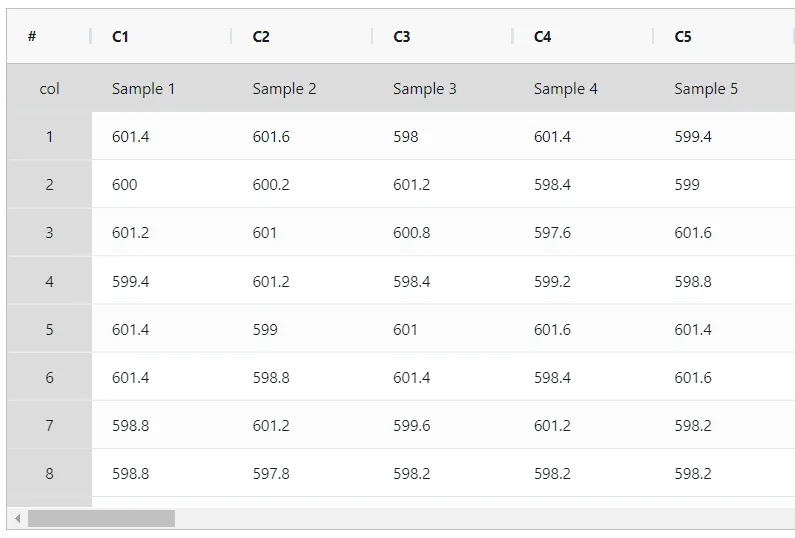
Let us understand how to make Xbar chart and R chart with the help of an example. Suppose an engineer wants to monitor a manufacturing process that produces camshaft for their automotive OEM customer. 5 samples were collected in each subgroup. A subgroup consists of samples collected within a short period, typically consecutive parts produced from a single production machine. The subgroup data were collected approximately once every 30 minutes. The following data was collected:
- Gathered the necessary data.
2. Now analyses the data with the help of https://statsai.zometric.com/ or https://intelliqs.zometric.com/.
3. To find X Bar R Chart choose https://intelliqs.zometric.com/> Statistical module> Control Charts> X Bar R Chart.
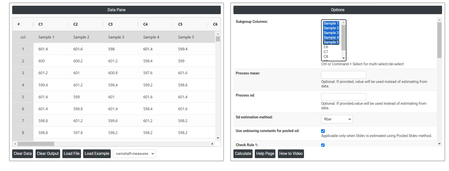
4. Inside the tool, feeds the data along with other inputs as follows:
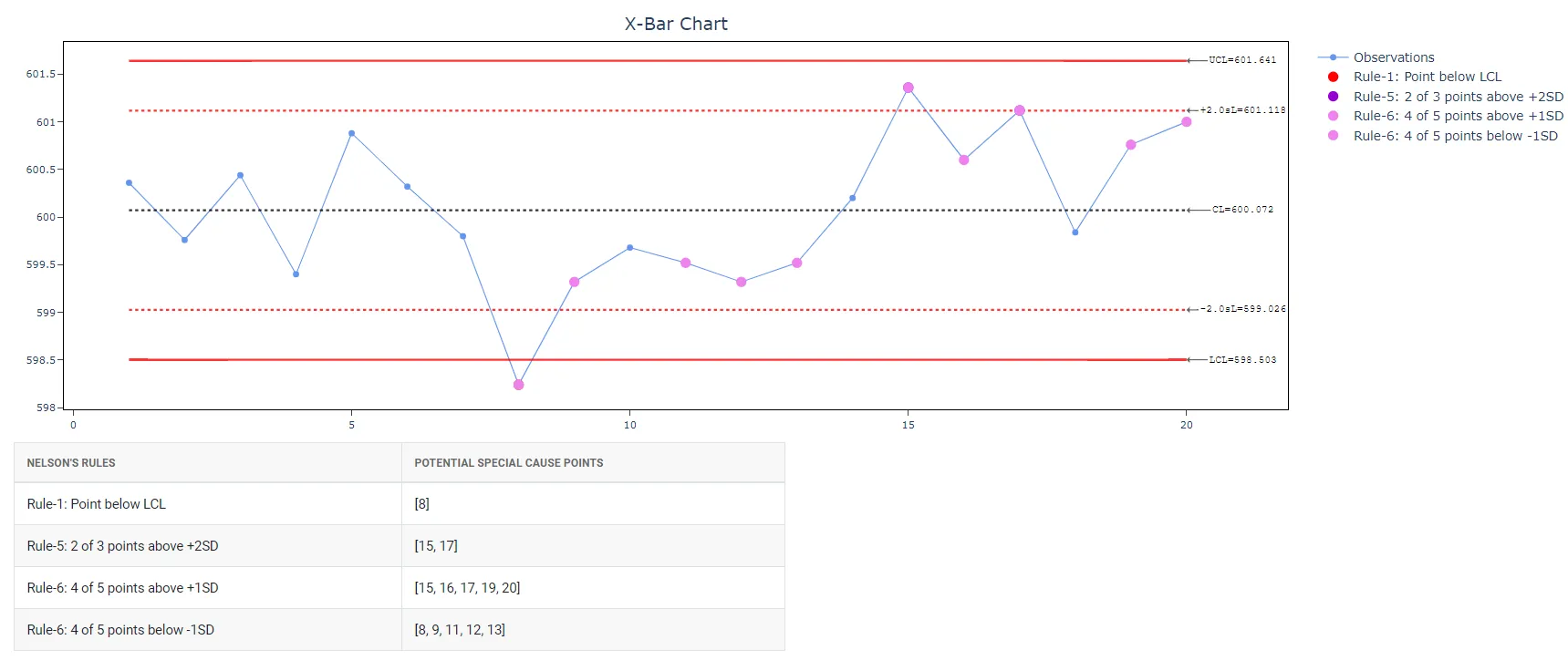
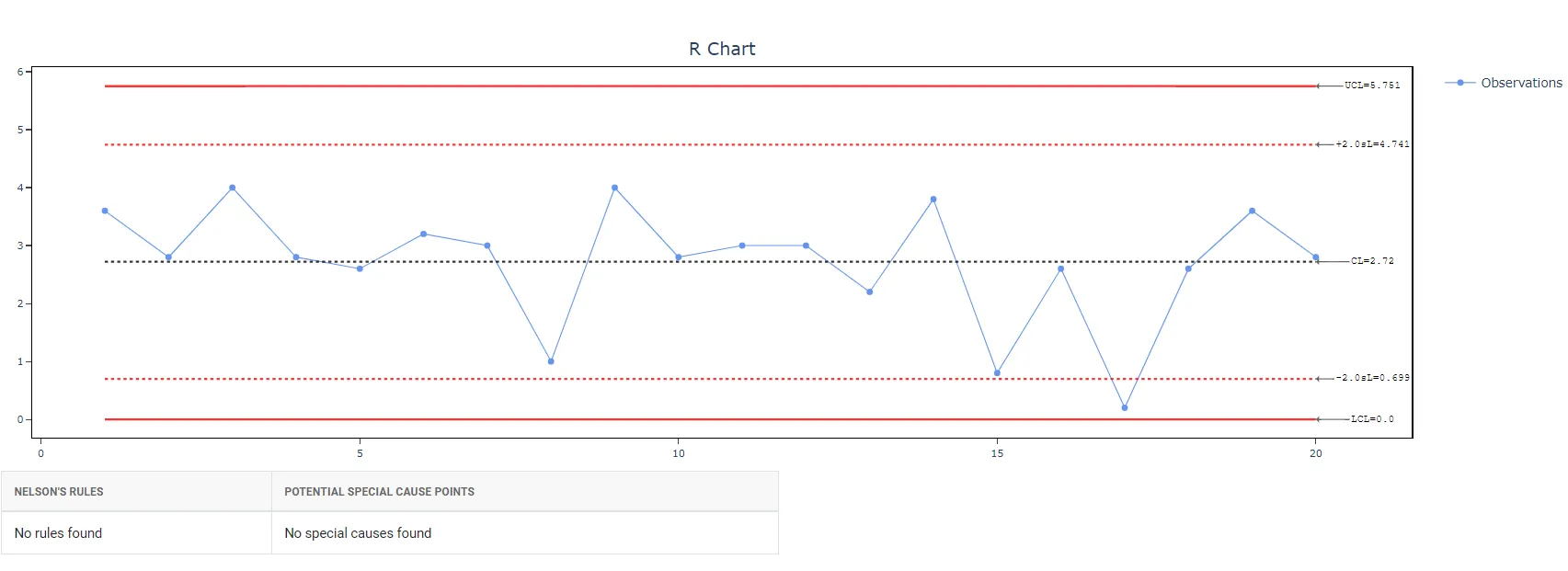
5. After using the above mentioned tool, fetches the output as follows:
How to generate Xbar-R Chart?
The guide is as follows:
- Login in to your Zometric Stats AI account at: https://statsai.zometric.com/or https://intelliqs.zometric.com/
- On the home page, choose Statistical Tool> Control Charts >Xbar R Chart.
- Click on Xbar-R Chart and will reach the dashboard.
- Next, update the data manually or can completely copy (Ctrl+C) the data from excel sheet and paste (Ctrl+V) it here.
- Next, you need to choose Sd estimation method along with the desired Check Rules.
- Finally, click on calculate at the bottom of the page and you will get desired results.
On the dashboard of Xbar-R chart, the window is separated into two parts.
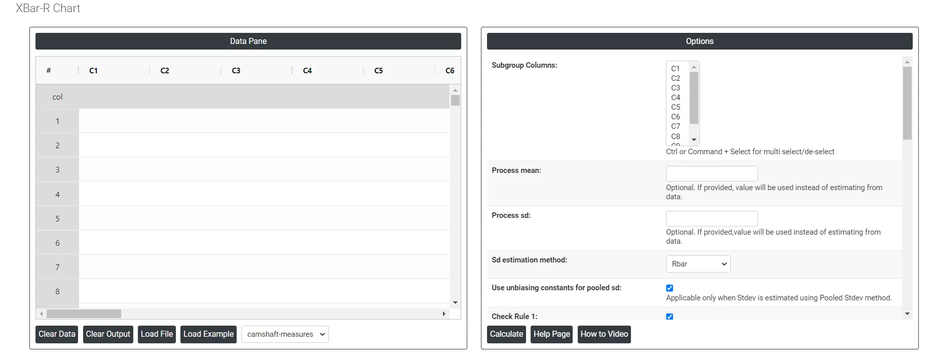
On the left part, Data Pane is present. In the Data Pane, each row makes one subgroup. Data can be fed manually or the one can completely copy (Ctrl+C) the data from excel sheet and paste (Ctrl+V) it here.
Load example: Sample data will be loaded.
Load File: It is used to directly load the excel data.
On the right part, there are many options present as follows:
- Process mean: It is the average value of a set of measurements or observations from a process. It represents the central tendency of the process data over time and is a key indicator of the process performance. If not, Zometric Q-Tools calculates the centerline from the data provided.
- Process sd: It is a measure of the variability or dispersion of the process data around the mean. It provides an indication of how much individual data points within the process differ from the process average. If not, Zometric Q-Tools calculates from the data provided.
- Sd estimation method: This leaves the user with two choices for the calculation. Choosing Rbar as the estimation method or pooled standard deviation method changes the result.
- Rbar Sd estimation method: Rbar represents the average of the ranges within subgroups. The Rbar method is a widely used estimate of the standard deviation, particularly effective for subgroup sizes ranging from 2 to 8.
- Pooled Sd estimation method: The pooled standard deviation is the weighted average of subgroup variances, with larger subgroups having a greater impact on the overall estimate. This method offers a more accurate estimate of the standard deviation when the process is stable.
- Use unbiasing constants for pooled sd: This option is applicable only when Stdev is estimated using Pooled Stdev method.
- Check Rule 1: 1 point > K Stdev from center line: Test 1 is essential for identifying subgroups that significantly deviate from others, making it a universally recognized tool for detecting out-of-control situations. To increase sensitivity and detect smaller shifts in the process, Test 2 can be used in conjunction with Test 1, enhancing the effectiveness of control charts.
- Check Rule 2: K points in a row on same side of center line: Test 2 detects changes in process centering or variation. When monitoring for small shifts in the process, Test 2 can be used in conjunction with Test 1 to enhance the sensitivity of control charts.
- Check Rule 3: K points in a row, all increasing or all decreasing: Test 3 is designed to identify trends within a process. This test specifically looks for an extended sequence of consecutive data points that consistently increase or decrease in value, signaling a potential underlying trend in the process behavior.
- Check Rule 4: K points in a row, alternating up and down: Test 4 is designed to identify systematic variations within a process. Ideally, the pattern of variation in a process should be random. However, if a point fails Test 4, it may indicate that the variation is not random but instead follows a predictable pattern.
- Check Rule 5: K out of K + 1 points > 2 standard deviation from center line (same side): Test 5 detects small shifts in the process.
- Check Rule 6: K out of K + 1 points > 1 standard deviation from center line (same side):Test 6 detects small shifts in the process.
- Check Rule 7: K points in a row within 1 standard deviation of center line (either side):Test 7 identifies patterns of variation that may be incorrectly interpreted as evidence of good control. This test detects overly wide control limits, which are often a result of stratified data. Stratified data occur when there is a systematic source of variation within each subgroup, causing the control limits to appear broader than they should be.
- Check Rule 8: K points in a row > 1 standard deviation from center line (either side):Test 8 detects a mixture pattern. In a mixture pattern, the points tend to fall away from the center line and instead fall near the control limits.
- Download as Excel: This will display the result in an Excel format, which can be easily edited and reloaded for calculations using the load file option.
Xbar-R Chart Formula
In this section we describe how the control limits of Xbar chart and R charts are calculated. To begin with, note the description of the terms used in the calculations that will follow.
TermDescription
x_{ij}
jth observation in the ith subgroup
n_i
number of observations in subgroup i
\sum x
sum of all individual observations
\sum n
total number of observations
μ
process mean
k
parameter for Test 1 (The default is 3)
σ
process standard deviation
d_2 (.)
value of unbiasing constant d2 that corresponds to the value specified in parentheses
d_3 (.)
value of unbiasing constant d3 that corresponds to the value specified in parentheses
r_i
range for subgroup i
m
number of subgroups
\overline x_i
mean of subgroup i
µ_ν
mean of the subgroup variances
c_4 (.)
value of the unbiasing constant c4 that corresponds to the value that is specified in parentheses
c_5 (.)
value of the unbiasing constant c5 that corresponds to the value that is specified in parentheses
Γ()
gamma function
Formula for Xbar Chart
- Plotted Points: Each plotted point, \overline x_i , represents the mean of the observations for subgroup, i .
\overline x_i = \frac{\sum\limits_{j=1}^{n_i} x_{ij}}{n_i}
- Center Line: The center line represents the process mean (µ).
\overline{\overline{X}} = \frac{∑x}{∑n}
- Control Limits:
- Lower Control Limit: The value of the lower control limit for each subgroup, i , is calculated as follows:
LCL_i= µ- \frac{kσ}{√(n_i )}
- Upper Control Limit: The value of the upper control limit for each subgroup, i , is calculated as follows:
- Upper Control Limit: The value of the upper control limit for each subgroup, i , is calculated as follows:
UCL_i= µ+ \frac{kσ}{√(n_i )}
Formula for R Chart
- Plotted Points: Each plotted point, r_i , represents the range for subgroup i .
- Center Line: The value of the center line for each subgroup, \overline R_i , is calculated as follows:
\overline R_i= d_2(n_i) × σ
- Control Limit:
- Lower Control Limit: The value of the lower control limit for each subgroup i is equal to the greater of the following:
LCL_i= [d_2(n_i) × σ] - [kσ×d_3(n_i)]
or
LCL_i= 0
- Upper Control Limit: The value of the upper control limit for each subgroup i is calculated as follows:
UCL_i= [d_2(n_i) × σ] + [kσ×d_3(n_i)]
Formula for estimation of sigma (within standard deviation)
- Many times people mistakenly assume the σ used in the above calculations is the usual sample or population standard deviation that can be obtained using standard spreadsheet calculations. However, note that its an estimated standard deviation based on the principle that we need to use the standard deviation that is only inherent to the process, and we need to exclude the between subgroup variation. There are two popular methods of estimating the within subgroup variation.
- Using Rbar Method: We use the range of each subgroup, r_i , to calculate S_r , which is an unbiased estimator of σ:
S_r = \frac{\sum\limits_{i}^{} (\frac{f_i r_i}{d_2 (n_i)})}{\sum\limits_{i}^{} {f_i}}
where
f_i = \frac{[d_2 (n_i)]^2}{[d_3 (n_i)]^2}
When the subgroup size is constant, the formula simplifies to the following:
S_r = \frac{\overline R}{d_2 (n_i)}
where
\overline R = \frac{\sum r_i}{m}
- Using pooled standard deviation method: The pooled standard deviation (Sp) is given by the following formula.
S_p = \sqrt\frac{\sum\limits_{i}^{} \sum\limits_{j}^{} (x_{ij}-\overline x_i)^2 }{\sum\limits_{i}^{} (n_{i}-1)}
When the subgroup size is constant, Sp can also be calculated as follows:
S_p = \sqrt µ_ν
Formulae for unbiasing constants
- The uniting constants used in the above formulas are usually obtained from standard statistical tables. However, the following formula can also be used to calculate the values of the unbiasing constants.
- d_2 () : For values of N from 51 to 100, use the following approximation for d2(N):
d_2 (N) = 3.4873 + 0.0250141 × N - 0.00009823 × N^2
- d_3 () and d_4 () : For values of N from 26 to 100, use the following approximations for d3(N) and d4(N):
d_3 (N) = 0.80818 - 0.0051871 × N + 0.00005098×N^2 - 0.00000019 × N^3
d_4 (N) = 2.88606 + 0.051313 × N - 0.00049243×N^2 + 0.00000188 × N^3
- c_4 () and c_5 () :
c_4 (N) = {\sqrt \frac {2}{N-1}}\frac{Γ\frac{N}{2}}{Γ\frac{N-1}{2}}
c_5 (N) = \sqrt {1 - c_4(N)^2}