What is I-MR Chart?
An I-MR (Individual-Moving Range) chart is a type of statistical process control chart used to monitor and control processes over time by tracking variation in a single variable. It is particularly useful for analyzing data sets with small sample sizes, where traditional control charts such as X-bar and R or X-bar and S charts are not feasible. The I-MR chart consists of two charts: the Individual chart, which shows the data points of a single variable over time, and the Moving Range chart, which shows the differences between consecutive data points in the Individual chart. This chart is used to monitor the mean of the process and the variation between and within subgroups, where each subgroup represents a different part or batch. By tracking process stability over time, the I-MR chart helps identify and correct instabilities, trends, and shifts in the data.
When to use I-MR Chart?
- Identifying Assignable Causes: For detecting assignable causes in the process that may lead to it being out of control.
- Evaluating Process Performance: To monitor process performance before and after implementing process improvements.
- Handling Slow Production Rates: When production rates are slow, making it impractical to wait for additional samples.
- Costly Measurement Systems: When measurement systems are prohibitively expensive, such as those involving destructive testing.
- Monitoring Batch Processes: Ideal for use in batch processes to control variation within and between batches.
- Tracking Continuous Data: Suitable for continuous data measured over time, such as production rates, customer satisfaction scores, or machine speeds.
- Detecting Special Causes of Variation: To identify special causes of variation that could indicate problems with the process or equipment.
- Industry Applications: Widely used in manufacturing, healthcare, and service sectors to ensure process stability and quality control.
Guidelines for correct usage of I-MR Chart
- Data should be continuous, collected at appropriate time intervals, and in time order.
- Use attribute control chart for count data, and Xbar-R/S chart for subgroup data.
- Have at least 100 total observations for more precise control limits.
- Data should be moderately normal, consider Box-Cox transformation if data is very skewed.
- Observations should not be correlated with each other, as it can lead to narrow control limits and false out-of-control signals.
Alternatives: When not to use I-MR chart
- Use Xbar-R or Xbar-S chart for data collected in subgroups
- Use P chart or NP Chart for defectives (binomial distribution)
- Use C chart or U chart for count data or defects (poisson distribution)
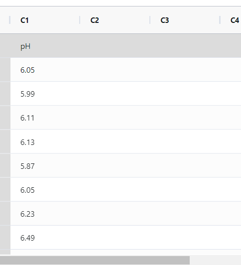
Example of I-MR Chart
The pH of 25 successive batches of liquid detergent is measured by a quality engineer who aims to evaluate whether the manufacturing process is under control. The following steps:
- Measured the size of all the camshafts produced in a day by all machines.
- Now analyses the data with the help of https://qtools.zometric.com/ or https://intelliqs.zometric.com/.
- To find I- MR charts choose https://intelliqs.zometric.com/> Statistical module> Control Charts > I- MR charts.
- Inside the tool, feed the data along with other inputs as follows:
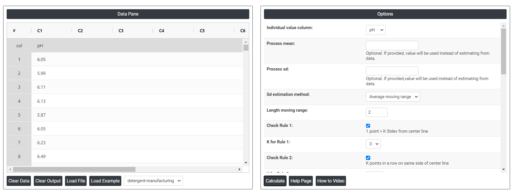
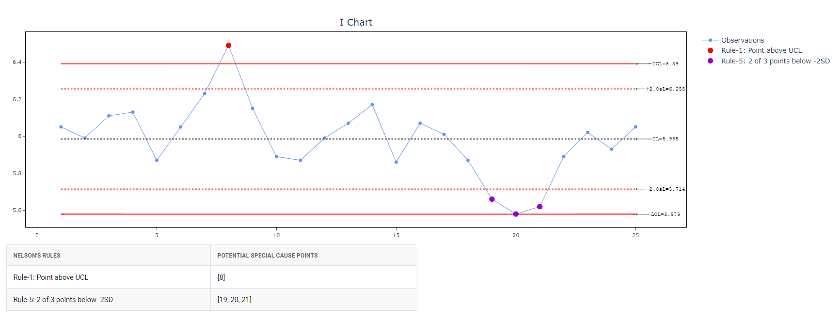
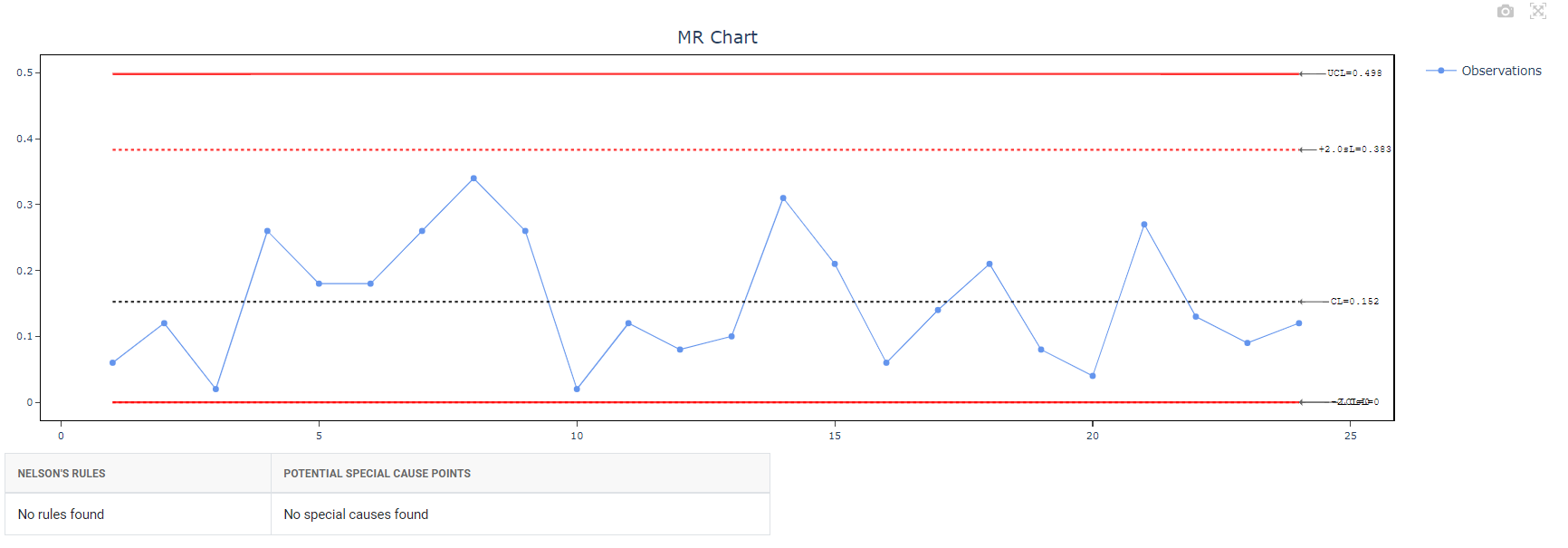
5. After using the above-mentioned tool, fetches the output as follows:
How to generate I-MR Chart?
The guide is as follows:
- Login in to QTools account with the help of https://qtools.zometric.com/ or https://intelliqs.zometric.com/
- On the home page, choose Statistical Tool>Control Charts > I-MR Chart.
- Click on I-MR Chart and reach the dashboard.
- Next, update the data manually or can completely copy (Ctrl+C) the data from excel sheet or paste (Ctrl+V) it or else there is say option Load Example where the example data will be loaded.
- Next, you need to map the columns with the parameters.
- Finally, click on calculate at the bottom of the page and you will get desired results.
On the dashboard of I-MR chart, the window is separated into two parts.
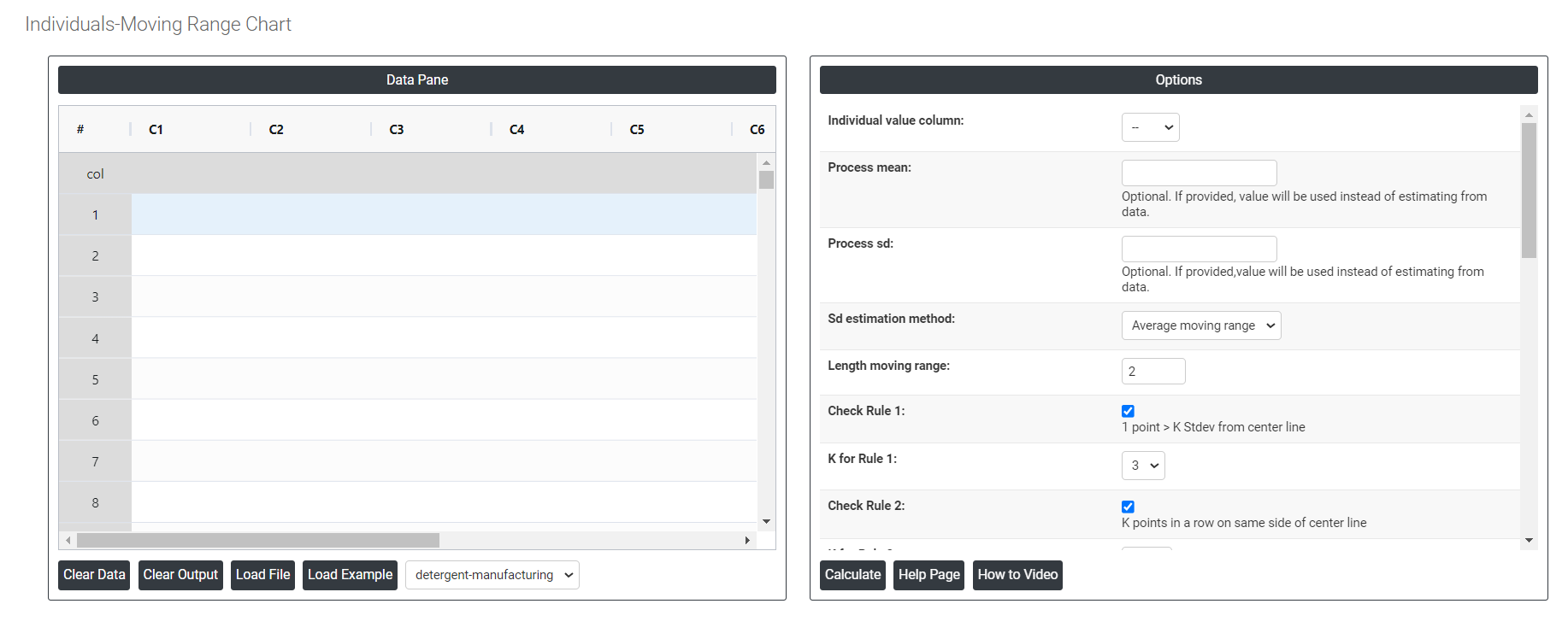
On the left part, Data Pane is present. In the Data Pane, each row makes one subgroup. Data can be fed manually or the one can completely copy (Ctrl+C) the data from excel sheet and paste (Ctrl+V) it here.
Load example: The sample data will be loaded.
Load File: It is used to directly load the excel data.
On the right part, there are many options present as follows:
- Process mean: It is the average value of a set of measurements or observations from a process. It represents the central tendency of the process data over time and is a key indicator of the process performance. If not, Zometric Q-Tools calculates the centerline from the data provided.
- Process sd: It is a measure of the variability or dispersion of the process data around the mean. It provides an indication of how much individual data points within the process differ from the process average. If not, Zometric Q-Tools calculates from the data provided.
- Sd estimation method: This leaves the user with two choices for the calculation. Choosing average moving range as the estimation method or median moving range method changes the result.
- Average moving range Sd estimation method: It involves calculating the difference between consecutive values in a data set and then taking the average of those differences.
- Median moving range Sd estimation method: The MMR is calculated by taking the median of the moving ranges between consecutive data points.
- Length moving range: In an I-MR chart, the length moving range (LMR) is the difference between the largest and smallest values within a subgroup or sample. It is used to calculate the control limits of the chart and to evaluate the variability or dispersion of the process being monitored.
- Check Rule 1: 1 point > K Stdev from center line: If a data point is K standard deviations from the center line, it means that it is K times the standard deviation away from the mean. This is important in statistical process control because it indicates whether a data point is within acceptable limits or whether there may be a problem with the process that needs to be addressed. Typically, data points that are more than three standard deviations from the center line are considered outliers and may require further investigation.
- Check Rule 2: K points in a row on same side of center line: If there are K points in a row on the same side of the center line in a dataset, it suggests that there may be a bias or trend in the data that is causing the values to cluster together. This could be due to a variety of factors, such as measurement error, sampling bias, or a true underlying pattern in the data.
- Check Rule 3: K points in a row, all increasing or all decreasing: If there are K points in a row, it is certain that at least one of two things must be true:
- The points are all increasing (i.e. each point has a greater y-coordinate than the one before it)
- The points are all decreasing (i.e. each point has a smaller y-coordinate than the one before it)
- Check Rule 4: K points in a row, alternating up and down: If the trend is upwards, it indicates that the process is becoming less consistent and more variable over time. This can be caused by factors such as equipment deterioration, operator error or changes in raw material quality. If the trend is downwards, it indicates that the process is becoming more consistent and less variable over time. This could be due to process improvements or tighter control measures being implemented.
- Check Rule 5: K out of K + 1 points > 2 standard deviation from center line (same side): According to the statement, if K out of K+1 data points fall on the same side of the center line and are more than two standard deviations away from it, it suggests that the process might be out of control, and special causes should be investigated to identify and fix the problem.
- Check Rule 6: K out of K + 1 points > 1 standard deviation from center line (same side): In this statement, K represents the number of consecutive observations that are above the center line (on the same side) and are greater than one standard deviation away from it. This indicates a potential shift in the mean of the process. The K+1 point serves as a reference point to compare the K consecutive observations against.
- Check Rule 7: K points in a row within 1 standard deviation of center line (either side): If K points in a row are within 1 standard deviation of the center line, it suggests that the data points are clustered around the expected value, and there is no significant trend or deviation from the expected pattern.
- Check Rule 8: K points in a row > 1 standard deviation from center line (either side): If K points in a row are more than 1 standard deviation away from the center line, it suggests that there may be a trend or pattern in the data that is moving away from the expected value.
Download as Excel: This will display the result in an Excel format, which can be easily edited and reloaded for calculations using the load file option.