
Xbar-S Chart
The Xbar-S chart is a sophisticated statistical control tool designed to monitor the mean and variability of a process when working with continuous data and subgroup sizes of nine or more. This chart comprises two key components: the Xbar chart, which tracks the average values over time to identify any shifts in the process mean, and the S chart, which displays the standard deviation over time to detect changes in process variability.
Last reviewed
Key takeaway
The Xbar-S chart is a sophisticated statistical control tool designed to monitor the mean and variability of a process when working with continuous data and subgroup…
On this page
What is Xbar-S Chart?
The Xbar-S chart is a sophisticated statistical control tool designed to monitor the mean and variability of a process when working with continuous data and subgroup sizes of nine or more. This chart comprises two key components: the Xbar chart, which tracks the average values over time to identify any shifts in the process mean, and the S chart, which displays the standard deviation over time to detect changes in process variability.
Xbar-S charts are particularly advantageous for larger sample sizes, offering a more precise understanding of data spread compared to range-based charts. They are widely utilized in quality control and process improvement contexts to ensure process stability and to promptly identify and address potential issues. The Xbar-S chart, by highlighting variations and trends in process data, plays a critical role in maintaining and enhancing overall process performance.
When to use Xbar-S Chart?
- Rational Subgrouping: When you can logically collect measurements in groups (subgroups), representing a "snapshot" of the process at specific points in time.
- Time-Ordered Data: When your data is time-ordered, meaning it is entered in the sequence it was generated, to accurately detect trends or shifts in the process.
- Subgroup Sizes Greater than Ten: Always opt for X-bar and S charts for subgroup sizes larger than ten, as the range statistic becomes a poor estimator of process sigma for large subgroups. The subgroup sigma provides a better estimate of variation than the subgroup range.
- Subgroup Sizes Less than or Equal to Ten: Use X-bar and S charts when the sample size is less than or equal to ten, as they are designed to handle smaller sample sizes and processes where the mean and standard deviation are not stable.
- Continuous and Normally Distributed Data: When the data collected is continuous and normally distributed.
- Large Shifts Detection: When you need to detect relatively large shifts in the process average, typically shifts of ±1.5 sigma or larger. X-bar and S charts are efficient for this purpose.
- Increased Sensitivity: For increased sensitivity to shifts, especially with larger subgroups, X-bar and S charts are more effective, assuming a rational subgroup can be formed.
- Unstable Processes: When the process is not stable, meaning that the process mean and standard deviation are not known or are changing over time.
- Industry Applications: Suitable for manufacturing, healthcare, financial services, and other industries where process quality control is important.
If the subgroup size is one, consider using an Individual-X / Moving Range chart, EWMA, or Cusum charts for more appropriate monitoring. For more sensitivity to smaller process shifts, EWMA or Cusum charts are recommended.
Guidelines for correct usage of Xbar-S Chart
- Use attribute control charts, such as P Chart or U Chart, for counts of defectives or defects.
- Enter data in time order to detect changes over time.
- Collect data at equally spaced time intervals to identify changes soon after they occur.
- Use rational subgroups to represent the process's output.
- Use Xbar-R Chart for subgroups that have 2-8 observations; Use Xbar-S Chart for subgroups with 9 or more observations; Use I-MR Chart if you don't have subgroups.
- Collect at least 60 total observations for reliable results.
- Non normal data can still give good results with subgroups of appropriate size.
- Avoid correlated observations within subgroups to ensure accurate control limits.
Alternatives: When not to use Xbar-S chart
- If your subgroups contain between 2-8 observations, it's best to use the Xbar-R Chart.
- If there's a consistent source of variation within the subgroups, the I-MR-R/S Chart is more suitable.
- If there are no subgroups, then use the I-MR Chart.
- If you're dealing with data on defectives or defects, then it's recommended to use an attribute control chart such as the P Chart or U Chart.
Example of Xbar-S Chart
The weight of cans in a canning company's can-filling process is being monitored by a quality engineer to determine if it is under control. The engineer collects a subgroup of 10 cans every hour and ensures that the cans are collected in a short time period to reduce within-subgroup variation. To track the weight, an Xbar-S chart is created by the quality engineer. She has performed this in following steps:
- Worked all day and measured the size of all the camshafts produced in a day by all machines.
- Now, she analyzes the data with the help of https://statsai.zometric.com/
- Inside the tool, she feeds the data. Also, she chooses Sbar as the sd estimation method.
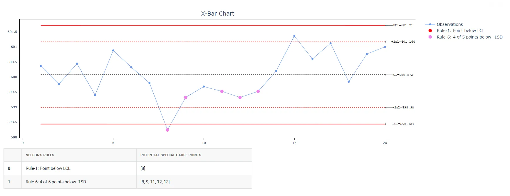
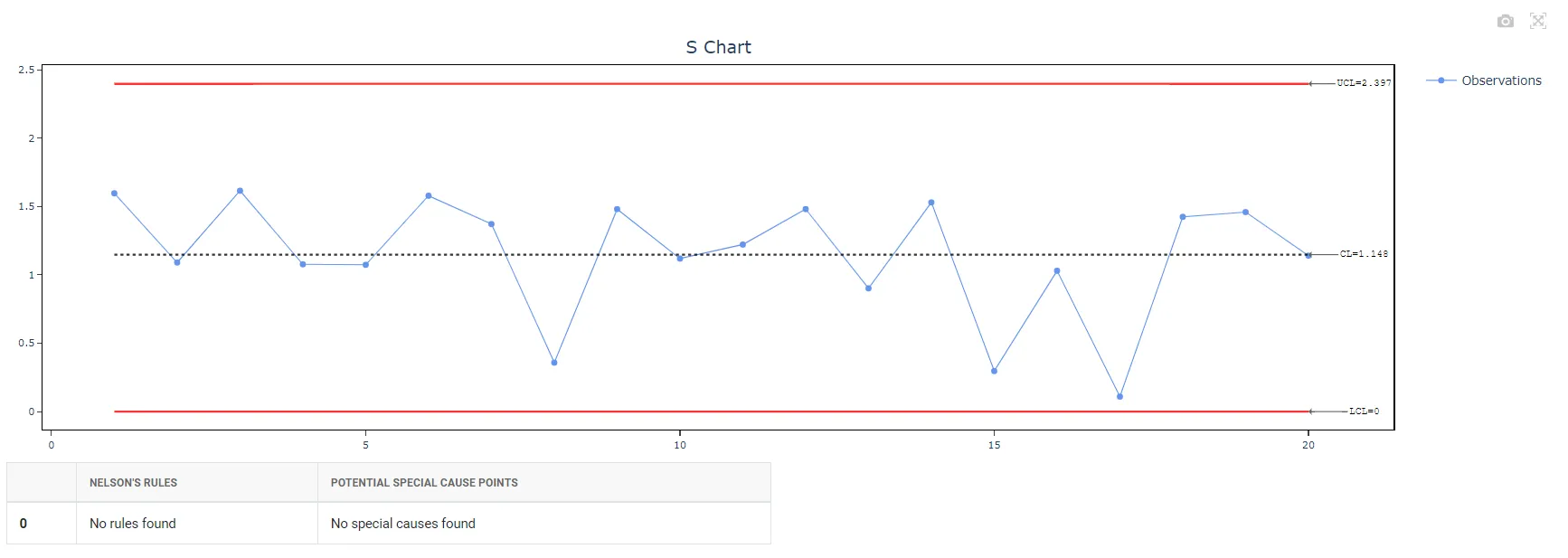
- After using the above mentioned tool, fetches the useful graphs as follows:
How to generate Xbar-S Chart
The guide is as follows:
- Login in to Stats AI account with the help of https://statsai.zometric.com/ or https://intelliqs.zometric.com/
- On the home page, choose Statistical Tool> Control Charts > Xbar-S Chart.
- Click Xbar-S Chart and reach the dashboard.
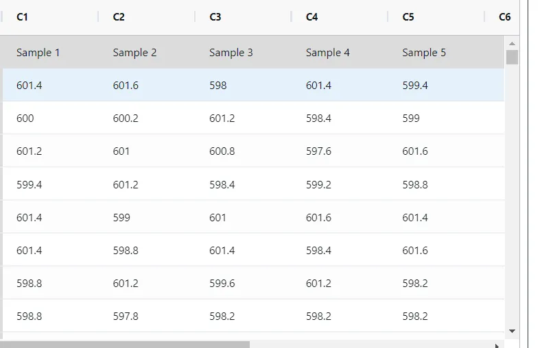
- Next, update the data manually or can completely copy (Ctrl+C) the data from excel sheet or paste (Ctrl+V) it or else there is say option Load Example where the example data will be loaded.
- Next, you need to map the columns with the parameters.
- Finally, click on calculate at the bottom of the page and you will get desired results.
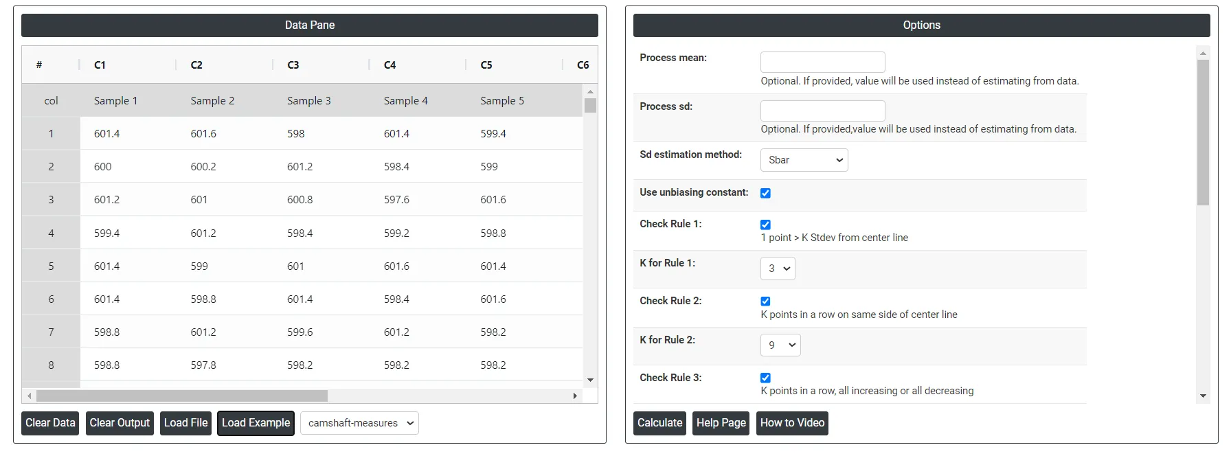
On the dashboard of Xbar-S chart, the window is separated into two parts.
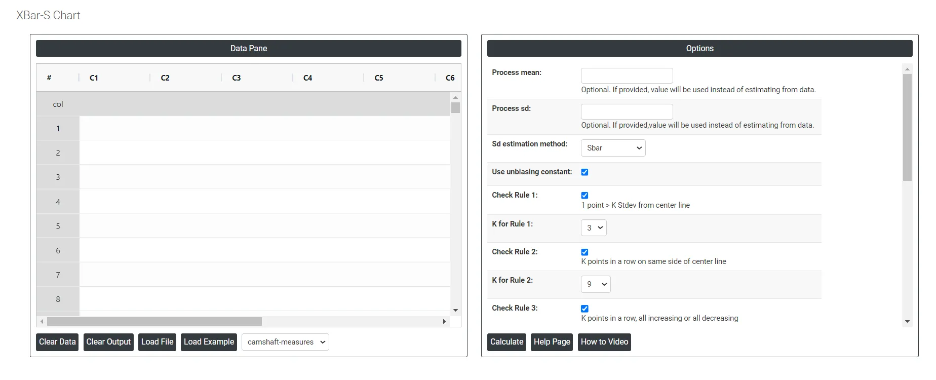
On the left part, Data Pane is present. In the Data Pane, each row makes one subgroup. Data can be fed manually or the one can completely copy (Ctrl+C) the data from excel sheet and paste (Ctrl+V) it here.
Load example: The sample data will be loaded.
Load File: It is used to directly load the excel data.
On the right part, we just need to give:
- Process mean: It is the average value of a set of measurements or observations from a process. It represents the central tendency of the process data over time and is a key indicator of the process performance. If not, Zometric Q-Tools calculates the centerline from the data provided.
- Process sd: It is a measure of the variability or dispersion of the process data around the mean. It provides an indication of how much individual data points within the process differ from the process average. If not, Zometric Q-Tools calculates from the data provided.
- Sd estimation method: This leaves the user with two choices for the calculation. Choosing Sbar as the estimation method or pooled standard deviation method changes the result.
- Sbar Sd estimation method: It calculates the average standard deviation (Sbar) of subgroups to monitor process variability. Sbar is crucial for setting control limits on the S chart, indicating changes in data dispersion over time. This method ensures consistent and accurate assessment of process variation in quality control practices.
- Pooled Sd estimation method: The pooled standard deviation is the weighted average of subgroup variances, with larger subgroups having a greater impact on the overall estimate. This method offers a more accurate estimate of the standard deviation when the process is stable.
- Use unbiasing constants for pooled sd: This option is applicable only when Stdev is estimated using Pooled Stdev method.
- Check Rule 1: 1 point > K Stdev from center line: If a data point is K standard deviations from the center line, it means that it is K times the standard deviation away from the mean. This is important in statistical process control because it indicates whether a data point is within acceptable limits or whether there may be a problem with the process that needs to be addressed. Typically, data points that are more than three standard deviations from the center line are considered outliers and may require further investigation.
- Check Rule 2: K points in a row on same side of center line: If there are K points in a row on the same side of the center line in a dataset, it suggests that there may be a bias or trend in the data that is causing the values to cluster together. This could be due to a variety of factors, such as measurement error, sampling bias, or a true underlying pattern in the data.
- Check Rule 3: K points in a row, all increasing or all decreasing: If there are K points in a row, it is certain that at least one of two things must be true:
- The points are all increasing (i.e. each point has a greater y-coordinate than the one before it)
- The points are all decreasing (i.e. each point has a smaller y-coordinate than the one before it)
- Check Rule 4: K points in a row, alternating up and down: If the trend is upwards, it indicates that the process is becoming less consistent and more variable over time. This can be caused by factors such as equipment deterioration, operator error or changes in raw material quality. If the trend is downwards, it indicates that the process is becoming more consistent and less variable over time. This could be due to process improvements or tighter control measures being implemented.
- Check Rule 5: K out of K + 1 points > 2 standard deviation from center line (same side): According to the statement, if K out of K+1 data points fall on the same side of the center line and are more than two standard deviations away from it, it suggests that the process might be out of control, and special causes should be investigated to identify and fix the problem.
- Check Rule 6: K out of K + 1 points > 1 standard deviation from center line (same side): In this statement, K represents the number of consecutive observations that are above the center line (on the same side) and are greater than one standard deviation away from it. This indicates a potential shift in the mean of the process. The K+1 point serves as a reference point to compare the K consecutive observations against.
- Check Rule 7: K points in a row within 1 standard deviation of center line (either side): If K points in a row are within 1 standard deviation of the center line, it suggests that the data points are clustered around the expected value, and there is no significant trend or deviation from the expected pattern.
- Check Rule 8: K points in a row > 1 standard deviation from center line (either side): If K points in a row are more than 1 standard deviation away from the center line, it suggests that there may be a trend or pattern in the data that is moving away from the expected value.
Download as Excel: This will display the result in an Excel format, which can be easily edited and reloaded for calculations using the load file option.
Xbar-S Chart Formula
In this section we describe how the control limits of Xbar chart and S charts are calculated. To begin with, note the description of the terms used in the calculations that will follow.
TermDescription
x_{ij}
jth observation in the ith subgroup
n_i
number of observations in subgroup i
\sum x
sum of all individual observations
\sum n
total number of observations
μ
process mean
k
parameter for Test 1 (The default is 3)
σ
process standard deviation
S_i
standard deviation of subgroup i
m
number of subgroups
\overline x_i
mean of subgroup i
µ_ν
mean of the subgroup variances
c_4 ()
value of the unbiasing constant c4 that corresponds to the value that is specified in parentheses
c_5 ()
value of the unbiasing constant c5 that corresponds to the value that is specified in parentheses
Γ()
gamma function
Formula for Xbar Chart
- Plotted Points: Each plotted point, \overline x_i , represents the mean of the observations for subgroup, i .
\overline x_i = \frac{\sum\limits_{j=1}^{n_i} x_{ij}}{n_i}
- Center Line: The center line represents the process mean (µ).
\overline{\overline{X}} = \frac{∑x}{∑n}
- Control Limits:
- Lower Control Limit: The value of the lower control limit for each subgroup, i , is calculated as follows:
LCL_i= µ- \frac{kσ}{√(n_i )}
- Upper Control Limit: The value of the upper control limit for each subgroup, i , is calculated as follows:
- Upper Control Limit: The value of the upper control limit for each subgroup, i , is calculated as follows:
UCL_i= µ+ \frac{kσ}{√(n_i )}
Formula for S Chart
- Plotted Points: Each plotted point, s_i , represents the range for subgroup i .
- Center Line: The center line represents the average standard deviation for a subgroup. If you do not use an unbiasing constant, then Zometric uses the process standard deviation, σ:
\overline S = σ
...........................If you use an unbiasing constant(default), then Zometric calculates the center line value for each subgroup, i, as follows:
\overline S_i = c_4 (n_i) σ
- Control Limits:
- Lower Control Limit:
If the unbiasing constant is used:
LCL_i = [c_4 (n_i)×σ]-[kσ× c_5 (n_i)]
If the unbiasing constant is not used:
LCL_i = σ-k[\frac{c_5 (n_i)}{c_4 (n_i)}]σ
Upper Control Limit:
If the unbiasing constant is used
LCL_i = [c_4 (n_i)×σ]+[kσ× c_5 (n_i)]
If the unbiasing constant is not used:
LCL_i = σ+k[\frac{c_5 (n_i)}{c_4 (n_i)}]σ
Formula for estimation of sigma (within standard deviation)
Using Sbar Method:
............................If you do not use an unbiasing constant, then the \overline S is the mean of the subgroup standard deviations:
\overline S = \frac{\sum S_i}{m}
............................If you use the unbiasing constant, c4(ni), then \overline S is calculated as follows:
h_i = \frac {c_4 (n_i)^2}{1-c_4 (n_i)^2}
............................When the subgroup size is constant, \overline S is:
\overline S = \frac {\sum S_i}{m×c_4(n_i)}
Using pooled standard deviation method:
The pooled standard deviation (Sp) is given by the following formula:
S_p = \sqrt\frac{\sum\limits_{i}^{} \sum\limits_{j}^{} (x_{ij}-\overline x_i)^2 }{\sum\limits_{i}^{} (n_{i}-1)}
When the subgroup size is constant, Sp can also be calculated as follows:
S_p = \sqrt µ_ν
Formulae for unbiasing constants
- c_4 () and c_5 () :
c_4 (N) = {\sqrt \frac {2}{N-1}}\frac{Γ\frac{N}{2}}{Γ\frac{N-1}{2}}
c_5 (N) = \sqrt {1 - c_4(N)^2}