
Multi-vari Chart
A Multi-Vari Chart is a graphical tool designed to display the sources and magnitude of variation in a process across multiple factors simultaneously. It organises data by grouping factors into three classic categories of variation within-piece variation, piece-to-piece variation, and time-to-time variation — and displays them all on a single chart so that the dominant source of variation is immediately visible.
Last reviewed
Key takeaway
A Multi-Vari Chart is a graphical tool designed to display the sources and magnitude of variation in a process across multiple factors simultaneously.
On this page
What is Multi-vari Chart?
A Multi-Vari Chart is a graphical tool designed to display the sources and magnitude of variation in a process across multiple factors simultaneously. It organises data by grouping factors into three classic categories of variation within-piece variation, piece-to-piece variation, and time-to-time variation — and displays them all on a single chart so that the dominant source of variation is immediately visible.
Rather than running separate analyses for each factor, the Multi-Vari chart lets you see the complete picture of variation across nested or grouped factors all at once making it an essential tool in root cause investigation and process optimisation.
When to use Multi-vari Chart?
- Use during root cause investigation when you need to identify which factor — time, operator, machine, or batch — is the dominant source of process variation.
- Use in measurement system studies to visually compare variation from different appraisers, parts, or measurement conditions.
- Use when you have nested or hierarchical data structures — for example, multiple readings per part, multiple parts per batch, and multiple batches per shift.
- Use as a pre-screening tool before a designed experiment (DOE) to focus attention on the factors that contribute most to variation.
Understanding the Three Types of Variation
Type
What It Measures
Example
Within-Piece
Variation within a single unit or item
Diameter differences across one part
Piece-to-Piece
Variation between consecutive items
Weight differences between parts in a batch
Time-to-Time
Variation across different time periods
Shift-to-shift or day-to-day changes
Guidelines for correct usage of Multi-vari Chart
- Plan your data collection structure carefully before starting — the chart is only meaningful when data is collected in a structured, hierarchical way.
- Collect data in a balanced, systematic manner — the same number of readings per part, same parts per batch — to make visual comparisons fair and valid.
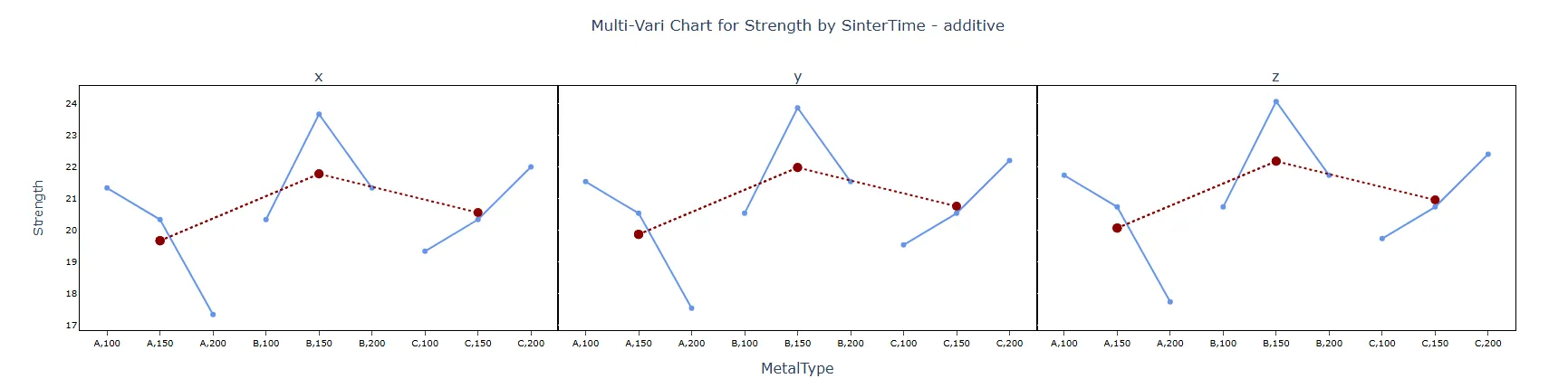
- The factor that produces the largest vertical spread on the chart is the dominant source of variation and should be the first target for investigation.
- Collect at least 3 time periods, 3–5 parts per period, and 2–3 readings per part for a reliable and informative chart.
- Use the Multi-Vari chart as a directional screening tool, not a formal statistical test — follow up with ANOVA or a designed experiment for quantitative confirmation.
Alternatives: When not to use Multi-vari Chart
Situation
Use Instead
Need formal statistical quantification of variation sources
Variance Components Analysis (ANOVA)
Only one factor or grouping variable exists
Boxplot or Individual Value Plot
Need to detect trends over time only
Run Chart or Control Chart
Need to study relationships between two variables
Scatterplot or Regression Analysis
Need to formally optimise process factor settings
Designed Experiment (DOE)
Example of Multi-vari Chart
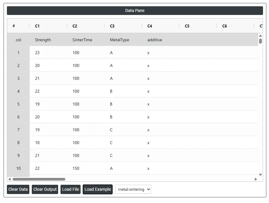
An engineer wants to assess the effect of sintering time and an additive on the compressive strength of three different metals. The engineer measures the compressive strength of three specimens of each metal type at each sintering time: 100 minutes, 150 minutes, and 200 minutes repeated for each of the additives. The following steps:
- Gathered the necessary data.
- Now analyses the data with the help of https://statsai.zometric.com/ or https://intelliqs.zometric.com/.
- To find Multi-vari Chart choose https://intelliqs.zometric.com/> Statistical module> Graphical analysis > Multi-vari Chart.
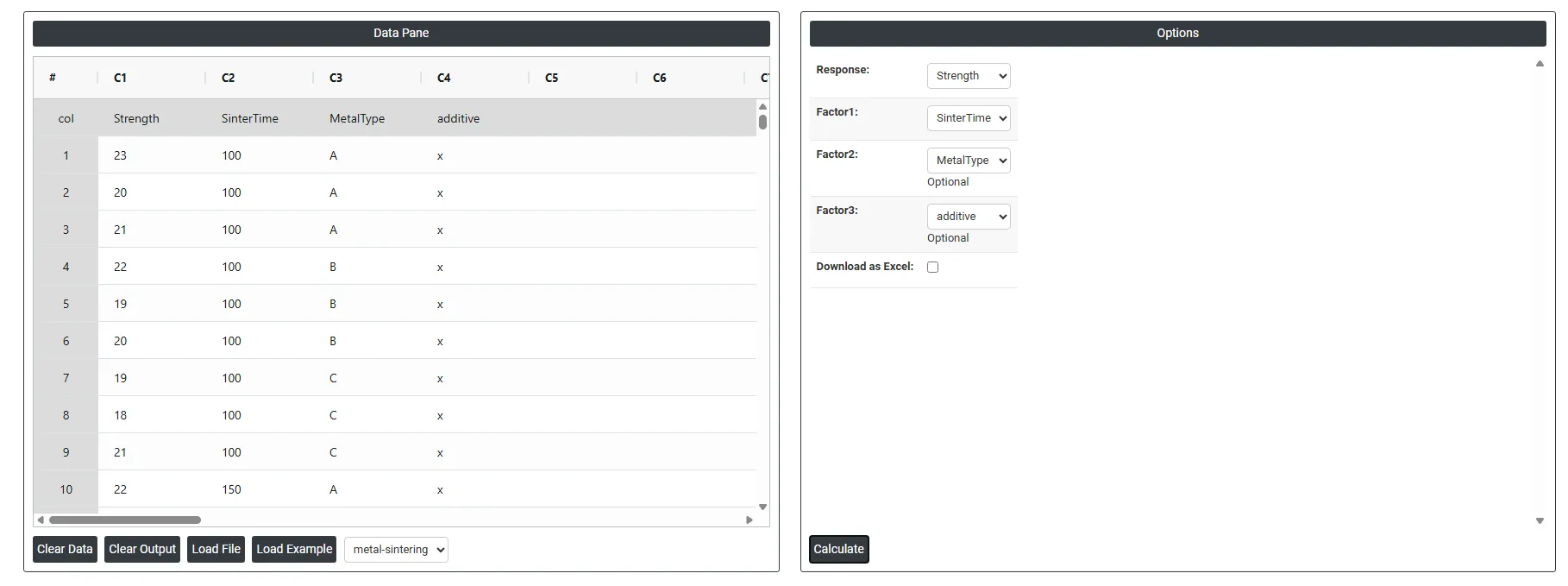
- Inside the tool, feed the data along with other inputs as follows:
6. After using the above-mentioned tool, fetches the output as follows:
How to do Multi-vari Chart
The guide is as follows:
- Login in to Stats AI account with the help of https://statsai.zometric.com/ or https://intelliqs.zometric.com/
- On the home page, choose Statistical Tool> Graphical analysis > Multi-vari Chart.
- Next, update the data manually or can completely copy (Ctrl+C) the data from excel sheet or paste (Ctrl+V) it or else there is say option Load Example where the example data will be loaded.
- Next, you need to fill the required options.
- Finally, click on calculate at the bottom of the page and you will get desired results.
On the dashboard of Multi-vari Chart, the window is separated into two parts.
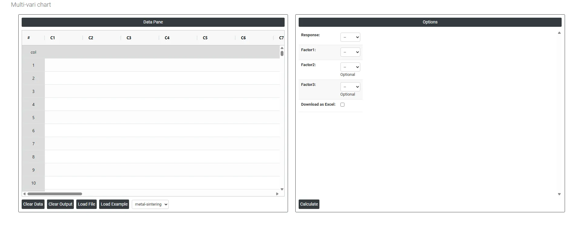
On the left part, Data Pane is present. In the Data Pane, each row makes one subgroup. Data can be fed manually or the one can completely copy (Ctrl+C) the data from excel sheet and paste (Ctrl+V) it here.
Load example: Sample data will be loaded.
Load File: It is used to directly load the excel data.
On the right part, we just need to give:
Response: The outcome or measurement you are studying the variable whose variation you want to understand and explain. This is always a numeric column such as Strength, SinterTime, or any of C5 through C30.
- Example: if you are studying metal part strength, you would select Strength as the Response.
- The chart plots the values of this variable on the vertical (Y) axis.
Factor 1: The first and most important grouping variable. The data is primarily split and displayed according to the categories or levels of this factor along the horizontal (X) axis.
Factor 2(Optional): A second grouping variable layered on top of Factor 1. Within each level of Factor 1, the data is further split by the levels of Factor 2.
Factor 3 (Optional): A third grouping variable that adds another layer of stratification on top of Factor 1 and Factor 2. This is optional and used when you want to study a third source of variation simultaneously.
Download as Excel: This will display the result in an Excel format, which can be easily edited and reloaded for calculations using the load file option.