
G Chart (Opportunities Between Events)
On this page
Purpose
A G Chart is the discrete-count counterpart to the T chart: instead of charting count-per-interval (the c/u chart approach), it charts the NUMBER OF OPPORTUNITIES (units produced, prescriptions dispensed, transactions processed, etc.) between successive occurrences of a rare discrete event. This makes it far more sensitive than a p/u chart to a real shift in a low-frequency defect or error rate, because it reacts to every new gap instead of waiting for enough events to accumulate within a fixed sampling interval.
Key Capabilities
- Charts count-between-events data directly using the Geometric distribution, the natural discrete analogue of the T chart's continuous time-between-events model.
- Full Nelson's-rules special-cause detection (4 configurable rules).
- Row inclusion/exclusion and a separate “estimate parameters from” subgroup selector to baseline control limits on a known-stable period.
- Configurable X-axis scale for labeling the opportunity-count axis.
Statistical Methods
The number of opportunities between successive rare discrete events follows a Geometric distribution with success probability p (the underlying per-opportunity event rate). The tool estimates p from the observed mean gap: p̂ = 1 / (mean gap + 1) — the standard method-of-moments estimator, accounting for the convention that a plotted gap value of g corresponds to g+1 Geometric trials — and reports it in the output as “Event Probability (P).”
The center line and control limits are then the fitted Geometric distribution's own quantiles, shifted back onto the plotted (opportunities-between-events) scale: CL = max(0, geom.ppf(0.5, p̂) − 1), LCL = max(0, geom.ppf(0.00135, p̂) − 1), UCL = max(0, geom.ppf(0.99865, p̂) − 1) — the same ±3σ-equivalent tail probabilities the T chart uses on its continuous fitted distribution, applied here to the discrete inverse-CDF of the Geometric distribution.
Nelson's rules are evaluated against these limits exactly as on the app's other control charts.
Input Fields & Options
Field | Description |
Opportunities between events | Required. The column giving the number of non-events (units, days, etc.) between successive rare events, in chronological order. |
Check Rule 1–4 / K for Rule 1–4 | The four Nelson special-cause rules, each independently toggled (defaults K = 3, 9, 6, 14). |
X scale | Optional custom labeling for the opportunity-count axis. |
Include or Exclude / Specify which rows / Row numbers | Controls which rows are plotted. |
Specify subgroups to estimate parameters / Subgroups | Optionally restricts which rows are used to fit the Geometric distribution and set control limits, while still plotting all rows. |
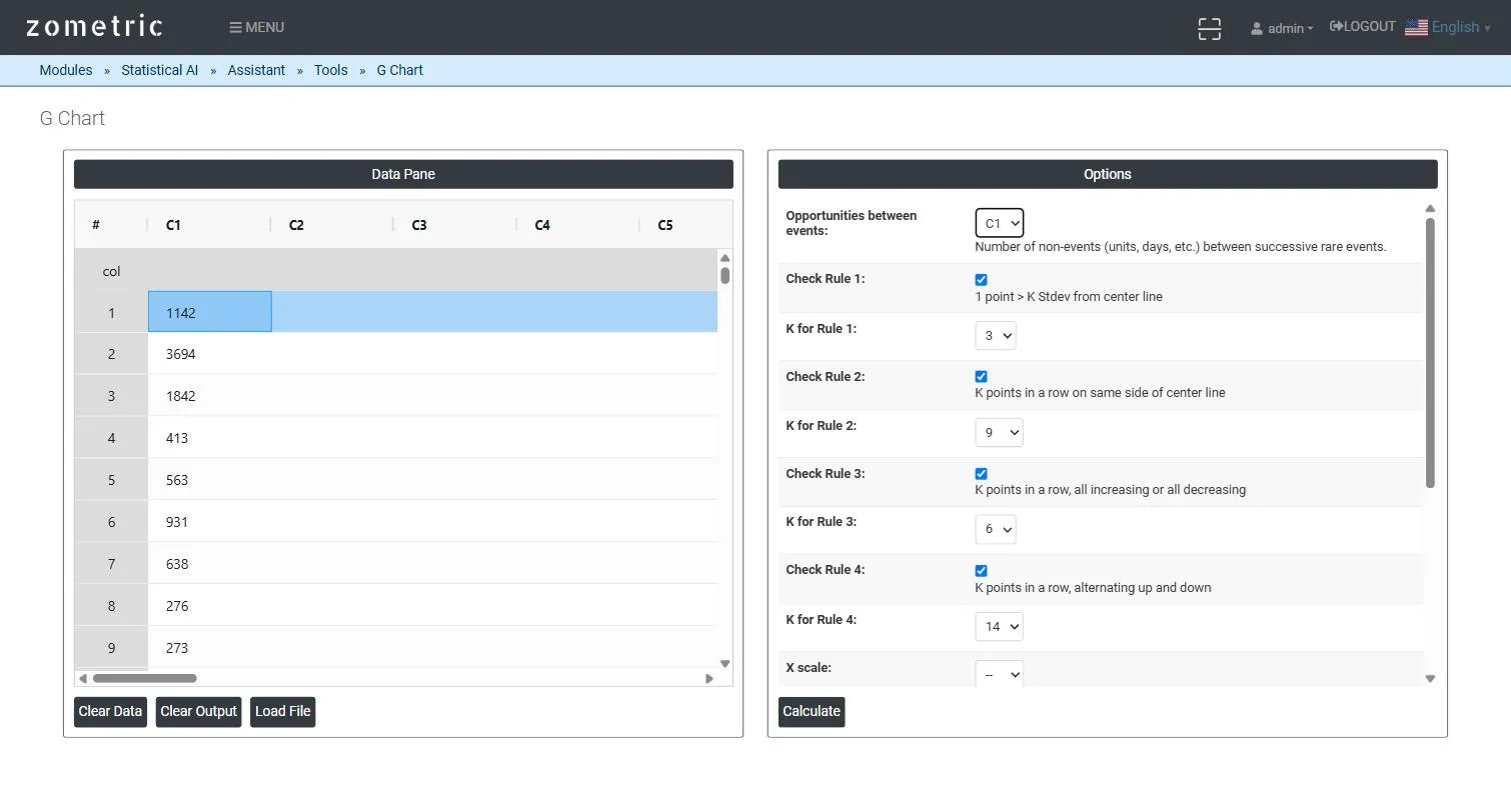
Figure 1 — 20 count-between-errors gaps pasted into C1, with Opportunities between events set to C1.
Output Descriptions
- G Chart plot — the opportunities-between-events series in chronological order with UCL, center line and LCL from the fitted Geometric distribution.
- Fit summary table — the estimated event probability (P), center line, LCL and UCL.
- Nelson's Rules / Potential Special Cause Points — which rules were checked and which points (if any) violated them.
- PDF export via Download as PDF.
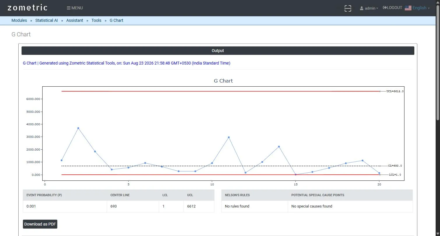
Figure 2 — G Chart output: the plotted gap series with UCL/CL/LCL, and the event-probability/center-line/UCL/LCL summary table.
Worked Example
A hospital pharmacy tracks dispensing errors by counting the number of prescriptions dispensed between successive errors (20 successive gaps, column C1). The tool fits a Geometric model (Event probability P ≈ 0.001, Center Line ≈ 693, UCL ≈ 6612, LCL ≈ 1) and plots all 20 gaps — a run of shorter-than-usual gaps late in the series (a rising error rate) becomes visually obvious well before enough errors accumulate for a traditional p/u chart to react.