
Hotelling T² Chart (Multivariate)
On this page
Purpose
A Hotelling T² chart monitors two or more correlated quality characteristics TOGETHER, instead of watching each one on its own Individuals or Xbar chart. Two correlated variables can each look perfectly in-control on separate univariate charts while their relationship to each other has broken down — a Hotelling T² chart catches exactly that case by tracking the Mahalanobis distance of each observation (or subgroup) from the process's joint mean, using the process's own covariance structure.
Key Capabilities
- Supports both individual-observation data (one row per unit, no subgrouping) and subgrouped data via an optional Subgroup indicator column.
- Uses the full covariance structure among the selected variables, so it is sensitive to a break in the normal correlation between variables even when neither variable alone looks unusual.
- Configurable alpha (false-alarm rate), defaulting to the app-wide 0.0027 (3-sigma-equivalent) convention.
- Row inclusion/exclusion and a separate “estimate parameters from” selector to baseline the mean vector and covariance matrix on a known-stable period.
Statistical Methods
When no Subgroup indicator is selected (individual observations, one row per unit), the tool computes for each observation x_i the squared Mahalanobis distance from the estimated process mean vector x̄, using the sample covariance matrix S of the p selected variables across the m observations used to estimate parameters: T²_i = (x_i − x̄)′ S⁻¹ (x_i − x̄). The upper control limit follows the exact F-distribution-based formula for individual observations: UCL = [p(m−1)(m+1)] / [m(m−p)] · F(1−alpha; p, m−p), where alpha is the chosen false-alarm rate (default 0.0027). The center line displayed is p, the statistic's expectation under an in-control process.
When a Subgroup indicator is selected (n replicate rows per subgroup), the tool instead computes, for each subgroup j, T²_j = n·(x̄_j − x̄_grand)′ Sp⁻¹ (x̄_j − x̄_grand), where x̄_j is that subgroup's mean vector, x̄_grand is the grand mean across subgroup means, and Sp is the pooled within-subgroup covariance matrix (the average of the m individual within-subgroup sample covariance matrices). The control limit is UCL = [p(m−1)(n−1)] / (mn − m − p + 1) · F(1−alpha; p, mn − m − p + 1).
In both modes, T² is a one-sided, non-Normal statistic, so only Rule 1 (a point exceeding the UCL) is evaluated — the Western-Electric/Nelson zone rules built for Normally distributed control-chart statistics are not applied here, by design.
Input Fields & Options
Field | Description |
Variables | Required. Select 2 or more correlated variables measured on each observation. |
Subgroup indicator | Optional. Leave blank if each row is one individual observation. Select a column identifying the subgroup if several rows form one subgroup (n > 1 replicates). |
Alpha (false alarm rate) | Default 0.0027, matching the standard 3-sigma-equivalent false alarm rate used elsewhere in the app. |
X scale | Optional custom labeling for the observation axis. |
Include or Exclude / Specify which rows / Row numbers | Controls which rows are plotted. |
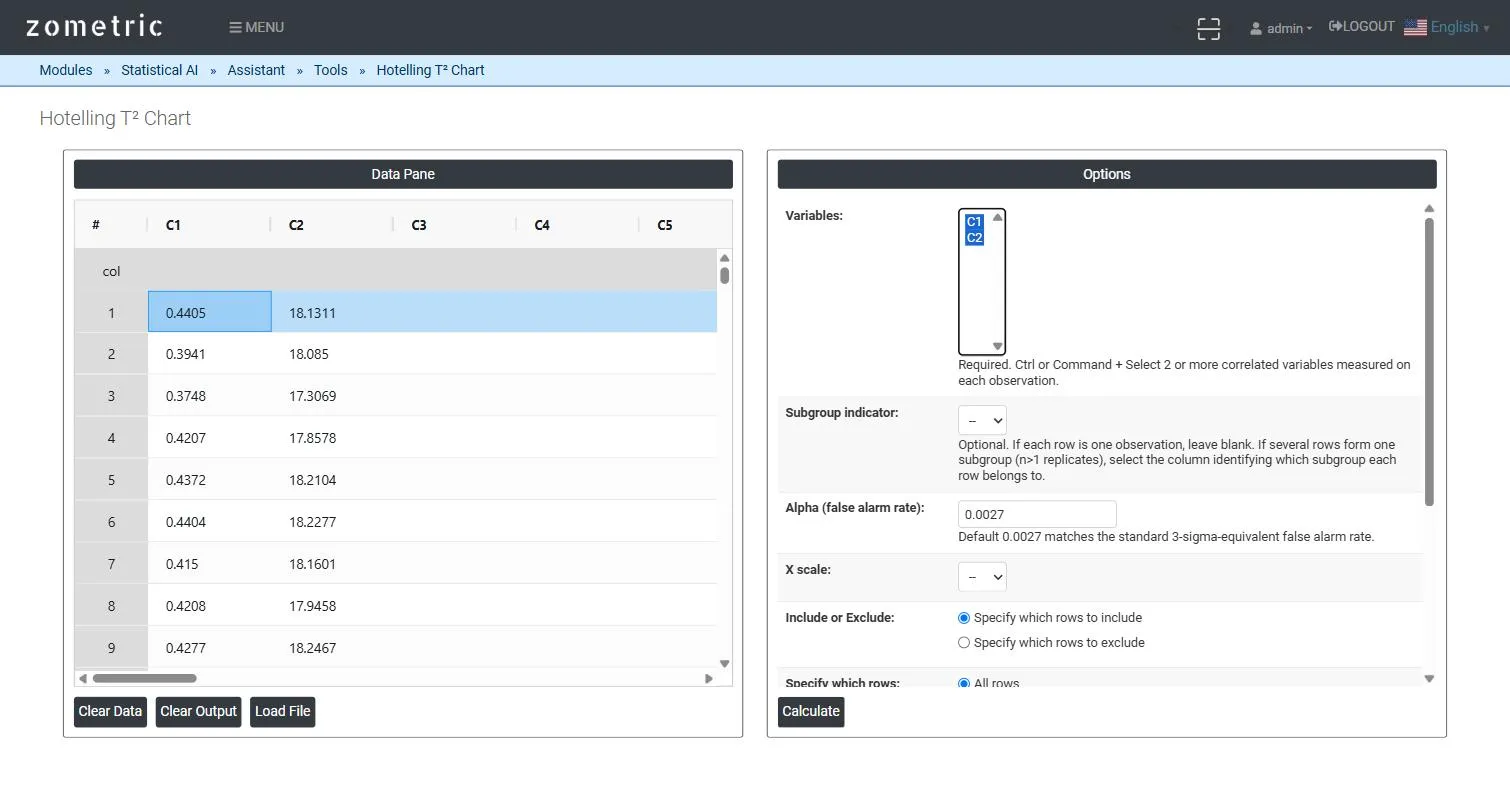
Figure 1 — 30 paired wall-thickness/weight readings pasted into C1–C2, both selected as Variables, Alpha at its 0.0027 default.
Output Descriptions
- T² Chart plot — the Hotelling T² statistic for each observation (or subgroup) in time order, with UCL and center line.
- Summary table — the variables used, p (number of variables), m (observations/subgroups used to estimate parameters), Alpha, the center line (E[T²]) and UCL.
- Nelson's Rules / Potential Special Cause Points — which points (if any) exceeded the control limit.
- PDF export via Download as PDF.
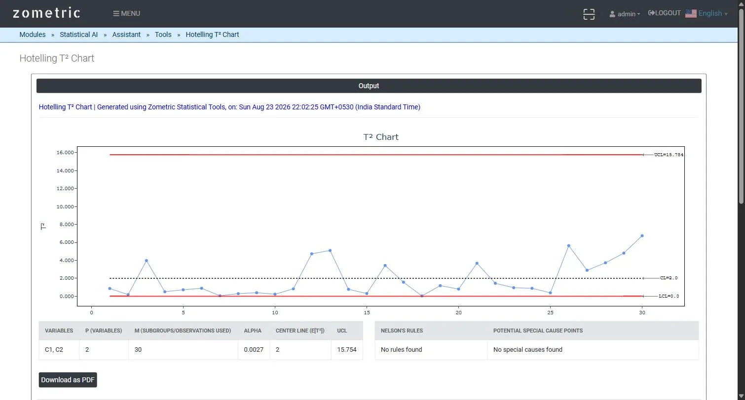
Figure 2 — T² Chart output: the plotted T² statistic per observation with UCL, and the Variables/p/m/Alpha/Center Line/UCL summary table.
Worked Example
A blow-molding process produces bottles where wall thickness (C1, mm) and weight (C2, g) are normally correlated — thinner walls mean lower weight. With both variables selected and Alpha at its 0.0027 default across 30 consecutive bottles, the tool computes UCL ≈ 15.75 for p = 2 variables and m = 30 observations; even though the last 5 bottles (where the normal thickness/weight relationship was deliberately broken in the demo dataset) don't individually breach the limit here, the T² series visibly trends upward exactly where the correlation structure was disturbed — the behavior a univariate chart on either variable alone would miss entirely.