
G Chart (Opportunities Between Events)
A G chart monitors rare discrete events by charting the number of opportunities between successive occurrences, in chronological order. It fits a geometric distribution, estimating the event probability from the mean gap, and sets the centre line and limits from its quantiles. Four configurable Nelson rules flag special causes. Output is the chart plus event probability, centre line, LCL and UCL.
Last reviewed
Key takeaway
A G chart plots the number of opportunities, such as units or prescriptions, between successive rare discrete events, using a geometric distribution to set control limits and detect shifts in a low event rate.
On this page
Purpose
A G Chart is the discrete-count counterpart to the T chart: instead of charting count-per-interval (the c/u chart approach), it charts the NUMBER OF OPPORTUNITIES (units produced, prescriptions dispensed, transactions processed, etc.) between successive occurrences of a rare discrete event. This makes it far more sensitive than a p/u chart to a real shift in a low-frequency defect or error rate, because it reacts to every new gap instead of waiting for enough events to accumulate within a fixed sampling interval.
Key Capabilities
- Charts count-between-events data directly using the Geometric distribution, the natural discrete analogue of the T chart's continuous time-between-events model.
- Full Nelson's-rules special-cause detection (4 configurable rules).
- Row inclusion/exclusion and a separate “estimate parameters from” subgroup selector to baseline control limits on a known-stable period.
- Configurable X-axis scale for labeling the opportunity-count axis.
Statistical Methods
The number of opportunities between successive rare discrete events follows a Geometric distribution with success probability p (the underlying per-opportunity event rate). The tool estimates p from the observed mean gap: p̂ = 1 / (mean gap + 1) — the standard method-of-moments estimator, accounting for the convention that a plotted gap value of g corresponds to g+1 Geometric trials — and reports it in the output as “Event Probability (P).”
The center line and control limits are then the fitted Geometric distribution's own quantiles, shifted back onto the plotted (opportunities-between-events) scale: CL = max(0, geom.ppf(0.5, p̂) − 1), LCL = max(0, geom.ppf(0.00135, p̂) − 1), UCL = max(0, geom.ppf(0.99865, p̂) − 1) — the same ±3σ-equivalent tail probabilities the T chart uses on its continuous fitted distribution, applied here to the discrete inverse-CDF of the Geometric distribution.
Nelson's rules are evaluated against these limits exactly as on the app's other control charts.
Input Fields & Options
Field | Description |
Opportunities between events | Required. The column giving the number of non-events (units, days, etc.) between successive rare events, in chronological order. |
Check Rule 1–4 / K for Rule 1–4 | The four Nelson special-cause rules, each independently toggled (defaults K = 3, 9, 6, 14). |
X scale | Optional custom labeling for the opportunity-count axis. |
Include or Exclude / Specify which rows / Row numbers | Controls which rows are plotted. |
Specify subgroups to estimate parameters / Subgroups | Optionally restricts which rows are used to fit the Geometric distribution and set control limits, while still plotting all rows. |
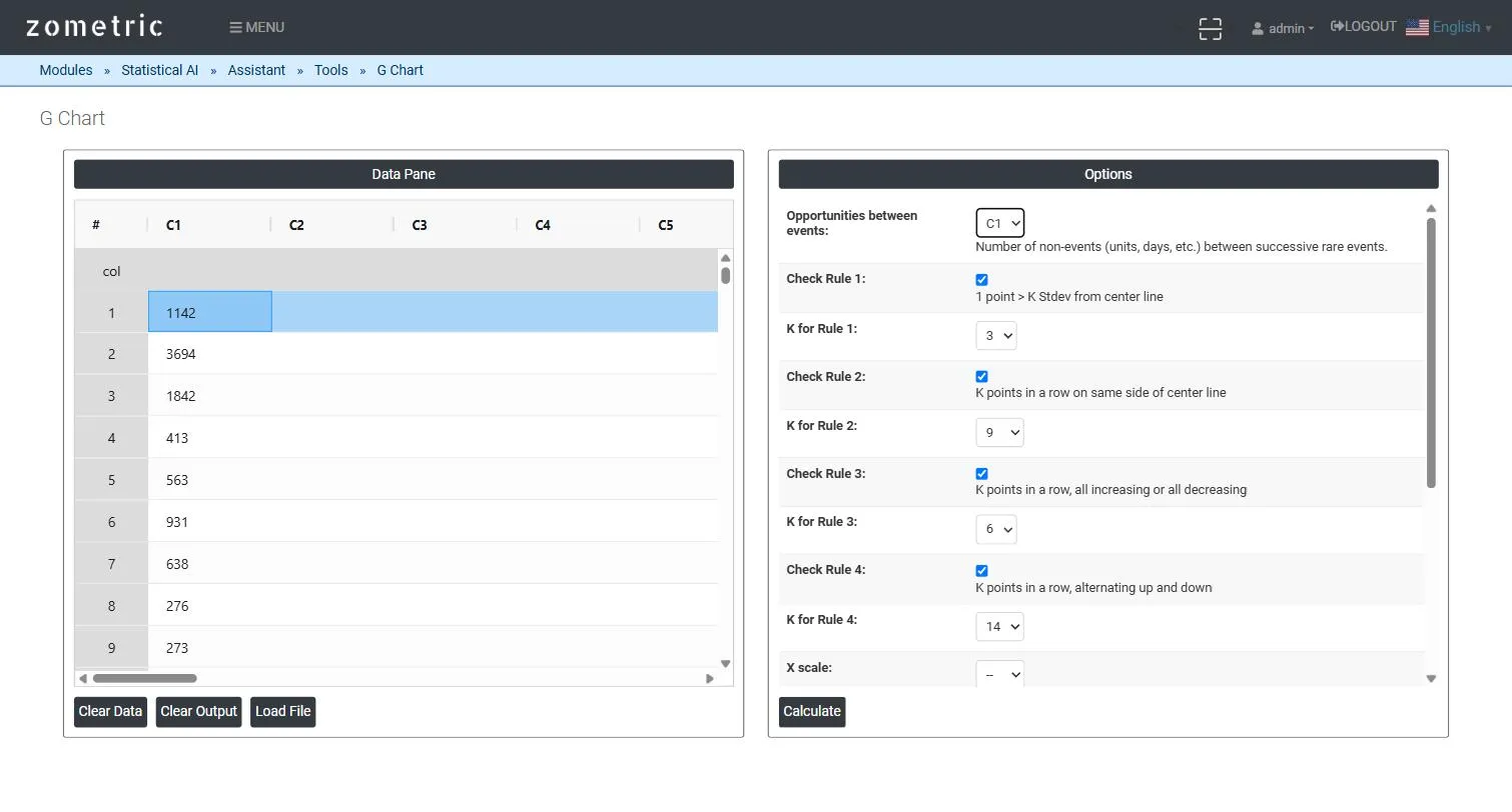
Figure 1 — 20 count-between-errors gaps pasted into C1, with Opportunities between events set to C1.
Output Descriptions
- G Chart plot — the opportunities-between-events series in chronological order with UCL, center line and LCL from the fitted Geometric distribution.
- Fit summary table — the estimated event probability (P), center line, LCL and UCL.
- Nelson's Rules / Potential Special Cause Points — which rules were checked and which points (if any) violated them.
- PDF export via Download as PDF.
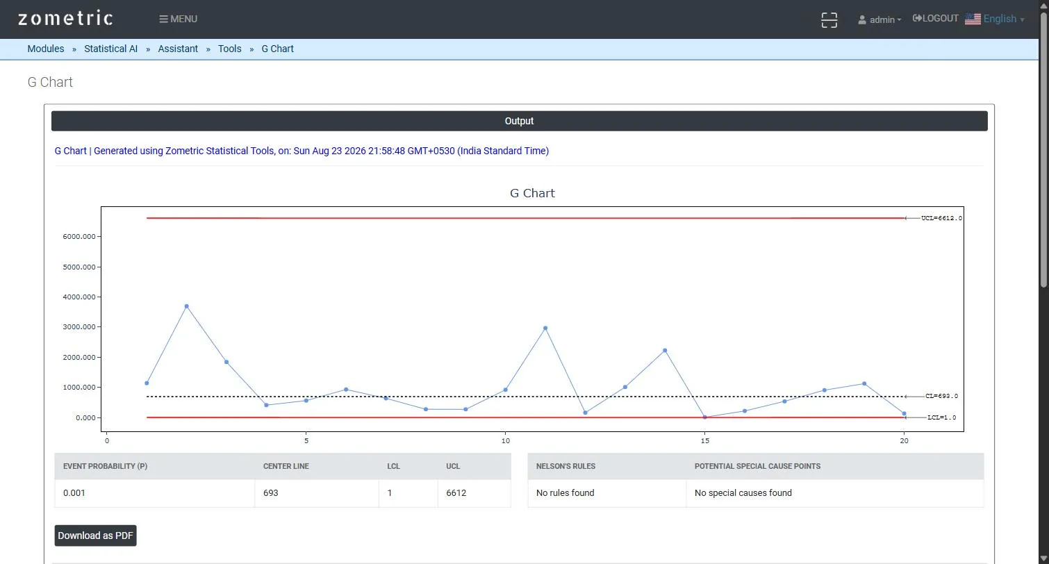
Figure 2 — G Chart output: the plotted gap series with UCL/CL/LCL, and the event-probability/center-line/UCL/LCL summary table.
Worked Example
A hospital pharmacy tracks dispensing errors by counting the number of prescriptions dispensed between successive errors (20 successive gaps, column C1). The tool fits a Geometric model (Event probability P ≈ 0.001, Center Line ≈ 693, UCL ≈ 6612, LCL ≈ 1) and plots all 20 gaps — a run of shorter-than-usual gaps late in the series (a rising error rate) becomes visually obvious well before enough errors accumulate for a traditional p/u chart to react.
Frequently asked questions
What is a G chart used for?
A G chart monitors rare discrete events, such as dispensing errors, by plotting the number of opportunities (units produced, prescriptions dispensed, transactions processed) between successive occurrences. Because it reacts to every new gap instead of waiting for events to accumulate within a fixed sampling interval, it is more sensitive than a p or u chart to a real shift in a low-frequency rate.
How are G chart control limits calculated?
The tool estimates the event probability as p = 1 / (mean gap + 1) and fits a geometric distribution. The centre line and control limits are the distribution's own quantiles shifted back onto the opportunities-between-events scale, using the 0.5, 0.00135 and 0.99865 probabilities, which are the same 3-sigma-equivalent tail probabilities the T chart uses.
What is the difference between a G chart and a T chart?
A G chart is the discrete-count counterpart to the T chart. The T chart models continuous time between events, while the G chart counts the number of opportunities between rare discrete events and uses the geometric distribution, the natural discrete analogue of the T chart's model.
How do you interpret a G chart?
Short gaps mean events are happening more often. In the hospital pharmacy example, 20 gaps between dispensing errors gave an event probability of about 0.001 and a centre line near 693, and a run of shorter-than-usual gaps late in the series signalled a rising error rate before a traditional p or u chart would react. Nelson rules flag special-cause points.